
Why Does My Website Get Traffic but No Enquiries?
Why does your website get traffic but no enquiries? Check visitor fit, your message, trust, mobile experience and contact path to find the cause.


Written by Thiam Hock NgFounder
12 min read
Why does my website get traffic but no enquiries? Usually, visitors can’t tell if your service fits them, why they should trust you or what to do next. For Singapore service businesses, the first task is to find out whether the visitors are right for your service, then check where the website makes it hard to enquire.
Table of Contents
- Are the people visiting your website likely to become clients?
- Is your headline clear about who you help?
- Does your website show proof that helps visitors trust you?
- Is pricing hidden when visitors need it?
- Can a ready-to-enquire visitor see what to do next?
- Does your page match what brought the visitor there?
- Is your website easy to use on a mobile phone?
- Does your enquiry form ask for too much?
- How can you find the actual conversion bottleneck?
- Frequently asked questions
- What to do next
Are the people visiting your website likely to become clients?
Traffic only helps when it comes from people who might need your service. If you run a tuition centre in Singapore, a visitor looking for free worksheets may not be ready to ask about classes. A spike in visits from a place you don’t serve may also have little value.
Start with your analytics. Compare traffic sources, the pages people land on and the actions they take. Then look at the words that bring people from search. Do those searches match the service and location you want to sell? Google Search Console’s Performance report lets site owners review search queries and page performance.
Check for odd patterns too. A sudden rise in visits with almost no time on the page or no next-page views may point to automated traffic or poor tracking. Don’t assume every new visitor is a potential client. Compare the numbers with actual enquiries and the source of each lead.
If the right visitors aren’t arriving, work on the source and search intent first. If they are arriving but leaving, focus on what they see next.
Is your headline clear about who you help?
A visitor should be able to tell what you do and who you do it for without having to decode your headline. “We provide trusted solutions” could describe almost any business. “Maths tuition for secondary students in Singapore” gives a parent a clearer reason to keep reading.
Try the five-second check: show your homepage to someone who doesn’t know your business. Ask what you offer, who it’s for and what makes it different. If they can’t answer, rewrite the first screen using plain words your clients use.
Then check whether the rest of the page supports that promise. A career coach might explain who they work with, the kind of change clients seek and what the first session involves. A headline that promises one thing followed by a page about something else can send the right visitor away.
HockWorks builds websites around what a client needs to understand before making contact. Its website development for Singapore businesses starts with discovery and a website blueprint, so each page has a clear job.
Pro Tip: Read your headline aloud. If it sounds like language only your team would use, replace it with the words a customer would use to describe their problem.
Does your website show proof that helps visitors trust you?
When a visitor is considering a service, they’re looking for signs that you understand their needs and can do the work. A list of claims is less helpful than a specific example. Explain what kind of client you helped and what the work involved, but don’t promise a result you can’t prove.
Look at your homepage and key service pages. Can a visitor find a relevant client example, a clear explanation of your process or a useful review without searching through the whole site? Place proof near the claim it supports. A testimonial about lessons is more useful beside the tuition offer than at the bottom of an unrelated page.
Use real reviews only, with permission where needed. Keep them accurate and easy to understand. If you’re a professional firm, proof might be a short case study that explains the starting problem and the work done. A visitor should be able to judge whether the example is close to their own situation.
Don’t add trust badges or guarantees just to fill space. If you can’t explain what a badge means or support a guarantee with clear terms, it may raise more questions than it answers.
Is pricing hidden when visitors need it?
When a visitor can’t tell whether your service is within reach, they may leave rather than ask. You don’t need to publish one fixed fee if every project differs. You can still explain what affects the price, set a starting point or describe the scope that changes the cost.
Check the questions people ask before they agree to speak with you. If the same person often asks what’s included or whether you suit their budget, your page may need to answer those questions sooner. A tuition centre could explain how fees vary by class type. A consultant could set out what a first engagement covers.
Clear price guidance can also help screen out poor-fit enquiries. Say what the price includes and what might change it. Don’t use a low starting figure without explaining the conditions that apply. That can create a mismatch between what the visitor expects and what you later quote.
Not every service needs a price list. But if a fee depends on scope, say what information you need to give a useful estimate and what happens after someone submits an enquiry.
Can a ready-to-enquire visitor see what to do next?
A visitor may be interested and still leave if the next step is hard to spot. Put one main action where it’s easy to find, such as “Ask about tuition” or “Book a first discussion”. A vague button such as “Learn more” doesn’t tell people what will happen after they click.
Check the first screen on your homepage and service pages. Is the main action visible without scrolling? Does the button go to a working form or a clear contact page? Test it yourself on a phone as well as a computer. A link that looks fine but leads to an error can stop a serious prospect cold.
Explain what happens after the visitor acts. They may want to know whether you’ll reply by email, what details you need or whether the first conversation is a sales meeting. A short, honest note can reduce that uncertainty.
HockWorks’ Homepage Restructure rewrites and restructures your current homepage without breaking what already ranks. It may suit an established service business whose site attracts visitors but doesn’t make the offer or next step clear. See the Homepage Restructure service for details.
Does your page match what brought the visitor there?
Visitors from different sources may have different needs. Someone who searches for a named service is likely to expect a page about that service. If they land on a broad homepage instead, they may have to work too hard to find the answer.
Compare the wording in your search listing, advert or referral link with the page visitors land on. Does the page answer the same question? If an advert promises help for a specific business problem, the landing page should address that problem early. Don’t send every visitor to the same generic page if you have distinct services or audiences.
Use your analytics to compare each source with actions that matter: visits to a service page, contact-page views and completed forms. A source with many visits but no signs of intent may be a poor fit. A smaller source that brings relevant enquiries may deserve more attention.
For search visitors, review the queries and pages shown in Search Console. Look for a gap between the question they searched and the page they reached. A mismatch calls for a better page or a more focused route, not automatically more traffic. HockWorks shares more ways to increase right-fit enquiries without treating raw visitor counts as the goal.
Is your website easy to use on a mobile phone?
Try to enquire from your own phone. Can you read the headline without zooming? Is the main button easy to tap? Does the page load without making you wait? A layout that works on a desktop can feel cramped on a small screen, especially when the form is hard to use.
Check the full path, not only the homepage. Open a service page, tap the enquiry button, fill in the form and submit it. Make sure the keyboard doesn’t cover the fields or the submit button. If you can, test on more than one phone and connection.
Also check the basics of accessibility. Text needs enough contrast, controls should have clear labels and people should be able to move through the page with a keyboard.
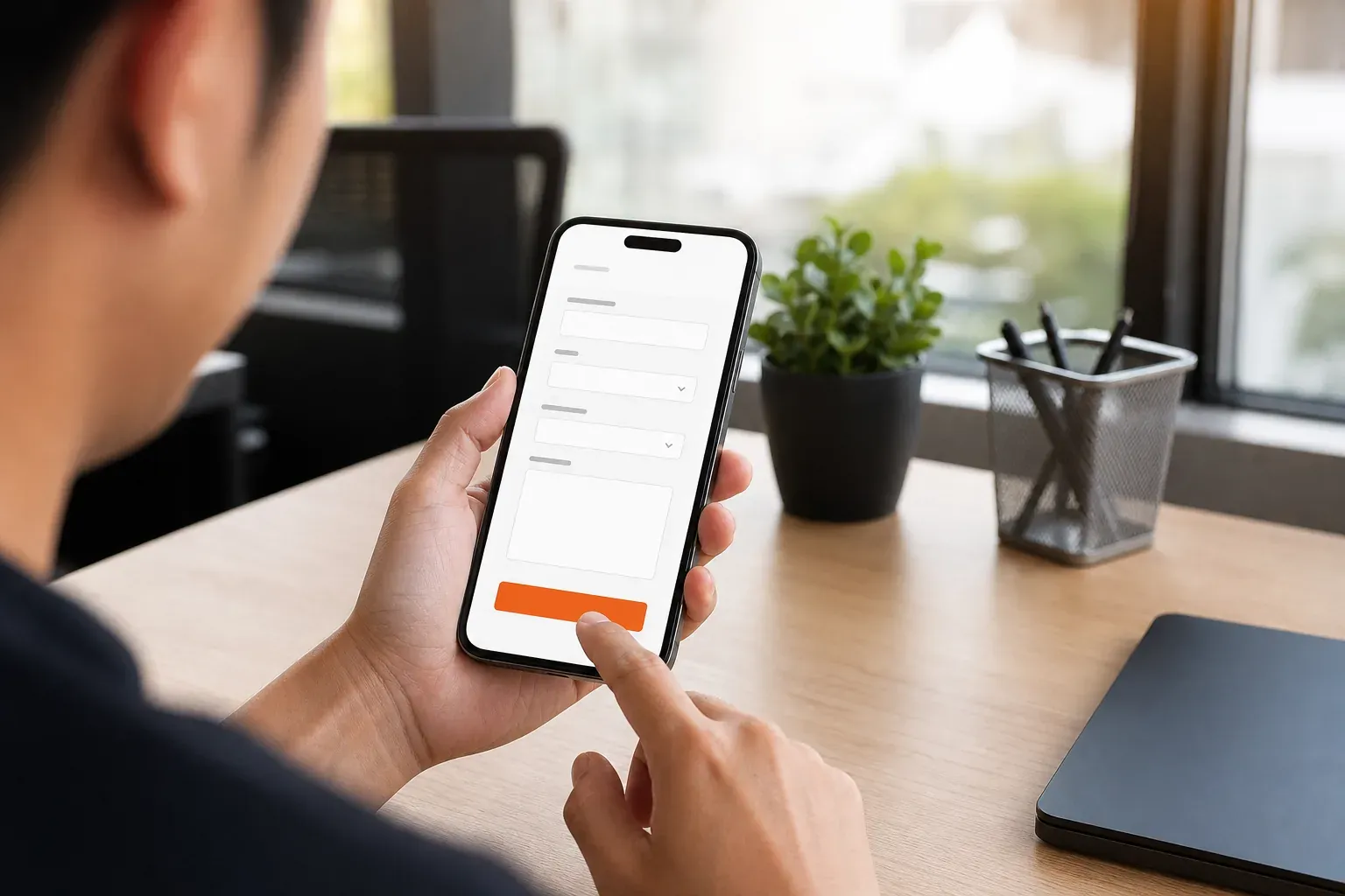
If the page feels slow or difficult to use, fix the point that blocks the next action first. A small-screen visitor shouldn’t need to hunt for the contact path.
Does your enquiry form ask for too much?
A form can put off a ready visitor if it feels like a full application. Ask only for details you need to respond well. For many first contacts, a name, an email address and a short note may be enough to start a useful conversation.
Review every field and ask what you’ll do with its answer. If you can ask for a detail later, remove it from the first form. Keep labels clear and explain what to enter. If the form shows an error, say which field needs attention and how to fix it.
Then test the full form yourself. Submit it on a phone and a computer. Check that the confirmation message appears and that the enquiry reaches the right inbox. A form that looks neat but fails to send is still a broken contact path.
Don’t cut fields that help you spot a poor fit if you genuinely need them. Instead, explain why you ask. The aim is to make the first step easy while gathering enough detail to reply usefully.
How can you find the actual conversion bottleneck?
Don’t change the whole site at once. First, record where visits come from and which pages they reach. Then follow the path from landing page to contact action. Look for the point where people stop, and compare that with what real enquirers ask you before they decide.
Keep a simple baseline before making a change. Note visits to the page, button clicks and completed enquiries over a period that gives you enough data to see a pattern. Change one thing at a time, such as the headline or form length, so you can tell what changed. If traffic is low, talk to a few suitable clients about what they needed to know. Don’t treat a tiny sample as proof.
The checks below help you decide what to inspect first. Start with the symptom that best matches what you see, then confirm it before changing the page.
| What you notice | What to check | First fix to try |
|---|---|---|
| Visits rise, but enquiries stay flat | Traffic source, search query and landing page | Focus on sources and pages that match your service |
| Visitors leave quickly | Headline and match with the search or advert | Say who you help and what you do in plain words |
| People scroll but don’t contact you | Proof, price guidance and button visibility | Place relevant evidence and a clear action near the offer |
| Visitors open the form but don’t finish | Field count, errors and phone layout | Remove fields you don’t need for a first reply |
| Enquiries don’t fit your service | Page promise and questions asked in the form | Explain fit and scope before the contact step |
Key Takeaway: Find the point where suitable visitors hesitate, then fix that point before spending more to bring in traffic.
Frequently asked questions
Why am I getting website traffic but no leads?
You may be attracting people who aren’t looking for your service, or your site may not give suitable visitors a clear reason to contact you. Check the traffic source first. Then review the landing page message, proof and enquiry path. Compare completed enquiries with page visits, rather than relying on traffic totals alone.
How do I know if my website traffic is good quality?
Good-quality traffic comes from people who might buy the service you provide. Compare the search terms and referral sources with your target client and service area. Then check whether those visitors view relevant pages or take steps towards contacting you. A large visit count by itself doesn’t show that the audience is a good fit.
What should I fix first if my website gets visits but no enquiries?
Start with the page receiving the most relevant visits, then check whether its first screen says who the service is for and what the visitor should do next. Test the contact path yourself. If the page is clear and easy to use, check whether the traffic source matches the service before changing more content.
Should I show prices on my service website?
Show prices when they’re stable and useful to a buyer. If fees depend on scope, explain what affects the cost or give a clear starting point when you can support it. Also tell visitors what happens after they ask for a quote. Clear price guidance can help people judge fit before they contact you.
How can I get more enquiries from mobile visitors?
Use your own phone to test the whole route from the landing page to form submission. Make the main action easy to spot and tap. Keep the form short enough for a first contact, and check that fields and error messages work on a small screen. Fix any slow or broken part of the route first.
What to do next
Start by checking whether your visitors match the clients you want. Then test the page and form as if you were contacting the business for the first time. If you can’t spot the issue, HockWorks offers a free 15-minute Clarity Call to discuss what your website needs to explain before someone enquires.