6 Quick Wins to Get Right Fit Website Enquiries for Service Businesses
Fix homepage messaging, forms, and speed to lift enquiry quality for service businesses. Six quick wins you can do this week, no redesign needed.
The fastest way to increase website enquiries is to clarify your homepage message so the right visitor recognizes themselves in the first five seconds and sees exactly what to do next. After that, three things matter most: service pages that answer real buyer questions, forms that ask for less, and page speed that doesn’t make people wait.
TL;DR:
- Clarifying your homepage headline to clearly state who you serve and the outcome you deliver is the most immediate way to attract relevant enquiries.
- Reducing friction on the homepage by focusing on one offer, a single strong call-to-action, and fast-loading mobile speed can significantly improve conversion rates.
- Service pages should focus on one buyer job, provide clear deliverables, outline the process, and include a relevant, specific proof point to increase trust.
- Simplifying enquiry forms by eliminating unnecessary fields and designing for mobile reduces abandonment and increases completion rates.
- Tracking key metrics like qualified enquiry rate, form completion, and response time helps optimize your conversion efforts over time.
Table of Contents
- Priority checklist: six quick wins you can implement this week
- Make your homepage message do the heavy lifting
- Service pages that turn visitors into enquiries
- Forms and contact UX: lower effort, higher completion
- Speed and page experience: practical priorities that improve enquiry rates
- Booking, qualification, and CTA flows that close the loop
- Measure, test, and iterate: KPIs and quick experiments
- Hockworks’ approach: the homepage blueprint and when to hire help
- Leveraging social media channels to increase enquiries
- Implementing live chat or chatbots to capture enquiries promptly
- Content marketing approaches to attract and engage potential enquirers
- Email marketing tactics for nurturing leads toward enquiry
- Author perspective: the common mistakes we still see and quick fixes
- If you want an expert blueprint: free website review and next steps
- Sources
- FAQ
Priority checklist: six quick wins you can implement this week
You don’t need a rebuild to move the needle. Most homepages lose enquiries to small, fixable friction points, not fundamental flaws. Here’s the order I’d tackle them in, along with who should own each fix and how long it realistically takes.
- Clarify the hero headline so it states who you serve and what outcome you deliver. Owner: founder or marketing lead. Time: half a day.
- Cut the homepage down to one offer. If you sell three services, pick the one that makes you the most money and lead with it. Owner: marketing lead. Time: half a day.
- Make your primary call-to-action bold and singular. One button, one action, repeated at logical intervals. Owner: designer or developer. Time: 1 to 2 hours.
- Trim your enquiry form to the fields you actually use. Owner: whoever owns your CRM or intake process. Time: 1 hour.
- Add one strong proof point above the fold. A testimonial, a client outcome, a number you can stand behind. Owner: marketing lead. Time: half a day, longer if you need to source a quote.
- Test your mobile load time and fix the worst offender first, usually a heavy hero image or a blocking script. Owner: developer. Time: half a day to a full day.
None of these require new photography or a new brand. They require decisions, which is usually the harder part.
Make your homepage message do the heavy lifting
A homepage is not a brochure. It’s closer to a triage nurse: it needs to sort visitors fast, tell the right ones they’re in the right place, and point them toward the next step before they lose patience. Most homepages fail this job because they try to say everything at once, which reads to a visitor as saying nothing in particular.
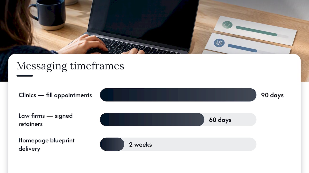
The pattern that works is outcome first, audience second, timeframe third. Instead of “We help businesses grow,” write something closer to “We help clinics fill their appointment books within 90 days.” That single sentence tells a visitor who you serve, what changes for them, and roughly when. Compare the difference:
- Weak: “Innovative solutions for your business needs.”
- Strong: “We help law firms turn website visitors into signed retainers within 60 days.”
- Weak: “Your trusted partner in digital transformation.”
- Strong: “We rebuild homepage messaging for service firms losing enquiries to unclear positioning.”
Your subheadline should do one more job: name the first concrete deliverable, so the visitor knows what happens if they act. Something like “Get a homepage blueprint with messaging, proof placement, and a video walkthrough in two weeks” removes ambiguity about what they’re actually getting.
Then there’s the microcopy around your call-to-action, which most businesses ignore entirely. If your button says “Book a Call,” tell people what that call involves. Is it 15 minutes or 45? Will they talk to a salesperson or the person who’ll actually do the work? Will they hear back within a day? Every unanswered question here is a reason to hesitate.
Pro Tip: Read your hero section out loud to someone unfamiliar with your business, then ask them to repeat back who you help and what happens next. If they can’t, rewrite it.
A quick self-test: cover everything on your homepage except the headline and subheadline. If a stranger can’t tell who you serve and what you do for them, the rest of the page won’t save it.
Service pages that turn visitors into enquiries
Your homepage earns attention. Your service pages close the sale. Too many businesses treat service pages as an afterthought, a list of bullet points under a generic header, when they should be doing the real convincing.
Each service page should focus on one buyer job: what specific outcome does this page’s visitor want, and what’s stopping them from being confident enough to enquire? That means covering who the service is for, what they’ll actually receive, how the process unfolds, and what happens after they reach out.
A service page that converts usually includes:
- A clear statement of who the service is for, ideally naming the type of business or role.
- A plain description of deliverables, avoiding vague terms like “comprehensive support.”
- A short process outline showing what happens from enquiry to delivery.
- A pricing cue, even a range or a starting point, so visitors can self-qualify before contacting you.
- A single, clear call-to-action that matches the buyer’s stage of readiness.
Case studies and testimonials belong near the point of decision, usually right before or after the process section, not buried at the bottom. The strongest ones name a client type, a specific result, and a timeframe: “Helped a 12-person accounting firm increase qualified enquiries in one quarter” carries more weight than “Great service, highly recommend.”
FAQs at the bottom of a service page aren’t filler. They’re where you handle objections you already hear on sales calls: pricing concerns, timeline worries, whether you work with businesses their size. Answering those questions on the page means fewer people bounce and fewer “just checking” enquiries land in your inbox. For a deeper look at how homepage decision friction shows up across service businesses, see this breakdown of common conversion blockers.
Forms and contact UX: lower effort, higher completion
Every field on your enquiry form is a small tax on the visitor’s patience, and most forms charge more tax than they need to. The EAS framework from NN/g gives a useful order of operations: eliminate fields you don’t strictly need, automate what you can prefill or infer, and simplify whatever’s left.
Start by eliminating. Ask each stakeholder who wants a field on the form to name who uses that data and by when. If nobody has a clear answer, cut it. This single governance step is often what stops forms from bloating over time as different teams add “just one more field.”
Once you’ve trimmed the list, apply a few practical rules:
- Mark required fields clearly and label optional ones explicitly, since guessing which fields matter increases cognitive load and abandonment.
- Use conditional logic so a visitor only sees questions relevant to their situation, but keep the branching question itself visible early rather than hidden below the fold.
- Design for mobile thumbs: larger tap targets, input masks for phone numbers, and validation that flags errors inline instead of after submission.
- Decide what you need before the first contact versus what can wait until the discovery call. A name, email, and one qualifying question is often enough to start a conversation.
Well-designed forms that follow basic usability guidelines see far higher first-try submission success: NN/g’s research found 78% one-try submission rates for usable forms compared to 42% for forms that violate basic guidelines. That gap is the difference between a form that converts and one that quietly loses half its visitors to frustration.
The balance to strike is qualification versus friction. Ask enough to route the enquiry to the right person, not so much that you’re running a full intake before anyone’s even spoken to you.
Speed and page experience: practical priorities that improve enquiry rates
A slow homepage doesn’t just annoy visitors, it actively suppresses the enquiries you’re trying to generate. Think with Google’s reporting on mobile speed found that small improvements in mobile load speed correlate with measurable gains in engagement and form completion, which means speed work pays for itself in enquiries, not just bounce rate.
You don’t need to chase a perfect score. You need to fix the things sitting on the critical path between a click and a visible page:
- Compress or lazy-load hero images so the first thing a visitor sees loads fast.
- Audit third-party scripts, chat widgets, analytics tags, ad pixels, and remove or defer anything not essential to the first interaction.
- Load fonts efficiently so text doesn’t flash or shift as the page settles.
- Focus on perceived speed, meaning how quickly the page feels usable, rather than chasing a lab score no visitor will ever see.
Set a realistic target based on your current baseline rather than an arbitrary number, then measure form completion rate before and after the fix. If completion moves, you’ve found a real lever. If it doesn’t, look elsewhere before sinking more time into speed work.
Booking, qualification, and CTA flows that close the loop
Getting someone to click “Contact Us” is only half the job. What happens in the next sixty seconds decides whether that click turns into a real, qualified conversation or a dead end that never gets answered properly.
The general rule: offer direct calendar booking when your service is well-defined and low-risk to schedule, and require a short intake form first when you need context before a conversation is worth having. A firm selling a single, well-understood service can often skip straight to a calendar. A firm handling varied, higher-stakes engagements usually needs a few qualifying questions first.
A progressive pattern works well for most service businesses:
- Capture intent quickly with one or two questions, nothing that feels like an application.
- Route to a calendar once basic fit is confirmed, rather than making every visitor wait for a callback.
- Ask a small set of pre-call questions so whoever takes the meeting walks in prepared, not cold.
Routing by meeting type and qualifying visitors before they reach a calendar reduces wasted time on both sides and increases the share of meetings that actually go somewhere. If you’re still figuring out what happens after someone enquires, this piece on building a post-contact roadmap is worth a look.
Measure, test, and iterate: KPIs and quick experiments
You can’t improve what you’re not tracking, and most service businesses only watch one number: total enquiries. That’s not enough, because a spike in enquiries that are all the wrong fit isn’t a win.
Track these four instead:
- Enquiry volume, your baseline traffic-to-contact number.
- Qualified enquiry rate, the share of enquiries that match your ideal client.
- Form completion rate, which tells you where friction is costing you leads.
- Response time, since a slow reply undoes good messaging fast.
Test in this order: headline and call-to-action first, since they affect every visitor; then form length, since it’s a fast fix with a clear before-and-after; then hero proof placement; then your booking flow. Give each change enough time to gather a meaningful sample before judging it, and only scale a change once you see it move the qualified enquiry rate, not just raw volume. A simple ROI calculator can help translate a completion-rate improvement into an actual revenue estimate worth acting on.
Hockworks’ approach: the homepage blueprint and when to hire help
This is the exact problem Hockworks was built to solve. We work with service businesses that already get traffic but aren’t turning enough of it into the right enquiries, and we start by diagnosing where decision friction is actually happening rather than guessing at a redesign.
The process combines direct customer-language research with a full teardown of the existing homepage, then produces a structured blueprint: messaging, proof placement, and calls-to-action, delivered with a video walkthrough your team can implement without hiring a designer. You can see the full approach on our homepage and how it’s framed for specific industries on our professional services page.
A DIY pass through this article’s checklist is often enough if your business is small, your offer is simple, and you have someone confident writing and testing copy. Where it usually falls short is when:
- Multiple stakeholders disagree on positioning and need an outside diagnosis to settle it.
- The team has tried small tweaks without a clear lift and suspects a deeper structural problem.
- The business sells a premium service and needs the homepage to justify that price, not just describe it.
Leveraging social media channels to increase enquiries
Social media rarely converts on its own, but it’s one of the most reliable ways to keep your name in front of people who aren’t ready to enquire yet. The mistake most service businesses make is posting generic updates instead of content that does the same job as a good homepage: showing who they help and what changes for that client.
LinkedIn tends to work best for B2B service businesses, since decision-makers are already there in a professional mindset. Short posts breaking down a client problem, a before-and-after, or a common mistake in your industry tend to outperform polished announcements. Instagram and Facebook can work for consumer-facing services like clinics or studios, particularly with short video showing real work or real results rather than stock imagery.
The link between social and enquiries is rarely direct. Someone sees your post today, forgets about it, then searches your name three weeks later when the problem gets urgent enough. That’s why your homepage still matters more than any single post: it needs to hold up when that delayed visit finally happens.
A few practical habits help:
- Post consistently rather than in bursts, since irregular presence reads as inactivity.
- Repurpose service page content into shorter, platform-native posts instead of writing everything from scratch.
- Reply to comments and messages quickly, since social platforms often reward and surface accounts that engage back.
Treat social media as a warm-up act for your website, not a replacement for it.
Implementing live chat or chatbots to capture enquiries promptly
A visitor who’s ready to ask a question right now but has to fill out a form and wait a day is a visitor you might lose to a competitor who answers immediately. Live chat and chatbots exist to close that gap, but only when they’re set up to actually help rather than just collect an email address.
The simplest version works well for many service businesses: a chat widget that answers a handful of common questions, pricing ranges, service areas, typical timelines, and then routes anything more specific to a real person or a booking link. This doesn’t need to be sophisticated. It needs to be fast and honest about what it can and can’t answer.
Where chat tends to backfire is when it’s the only path to contact, or when it asks for too much information before offering any value. A visitor expects a chat to feel like a quick conversation, not a form in disguise. If your chatbot’s first move is a five-field intake, you’ve defeated the purpose.
A few setup principles worth following:
- Keep the opening message short and specific to what visitors usually ask, not a generic greeting.
- Set expectations about response time if a real person will follow up rather than the bot handling everything.
- Route complex or high-value enquiries to a human quickly instead of looping them through scripted responses.
Used well, chat is one of the lowest-friction ways to catch a visitor at the exact moment they’re deciding whether to trust you.
Content marketing approaches to attract and engage potential enquirers
Content marketing’s job in this context isn’t to go viral. It’s to answer the questions your best clients are already searching for, so they arrive at your site already trusting that you understand their situation.
Start with the questions you hear on sales calls and discovery meetings. Those are proof that real buyers are asking them, and turning each one into a clear, specific article does two things: it builds organic visibility over time, and it gives you something concrete to link to from your service pages when a visitor has that exact question.
The content that tends to attract the right enquiries is specific rather than broad. An article titled “How Much Should a Homepage Redesign Cost” attracts a wider mix of visitors than one titled “What a Homepage Blueprint Costs for a Service Business Selling Over $2,000 Engagements.” The narrower piece filters for fit before the enquiry ever happens.
A few approaches worth prioritizing:
- Write from real client questions rather than guessing at what might rank well.
- Link content directly into relevant service pages so curious readers have an obvious next step.
- Update older pieces instead of only publishing new ones, since outdated advice quietly damages trust.
If your team is still building foundational SEO skills, COLLINSEO’s free SEO learning resources are a solid starting point for understanding how organic visibility connects to the kind of specific, buyer-focused content that actually drives enquiries.
Email marketing tactics for nurturing leads toward enquiry
Not every visitor is ready to enquire the moment they land on your site, and email is how you stay relevant until they are. The mistake most service businesses make is treating email as a newsletter instead of a nurture sequence built around a visitor’s actual hesitation.
If someone downloads a guide or signs up after reading a service page, that’s a signal of interest, not commitment. The follow-up sequence should acknowledge that gap: share a relevant case study, answer a common objection, and gradually build toward a low-pressure invitation to talk, rather than pushing a hard sell in the first message.
Segmentation matters more than volume here. A visitor who read your pricing page needs a different message than one who downloaded a general guide. Sending the same broad update to both wastes the specificity that makes email effective in the first place.
A few tactics worth building into your sequence:
- Send a short, personal-feeling welcome message first, not a sales pitch.
- Share one proof point per email rather than stacking testimonials into a single crowded message.
- End each email with a single, clear next step, whether that’s reading more or booking a short call.
Done well, email nurtures the enquiries your homepage and content marketing generate but aren’t ready to close yet.
Author perspective: the common mistakes we still see and quick fixes
Three patterns show up again and again: homepages trying to serve every possible client at once, forms built for internal convenience instead of visitor ease, and proof buried where nobody scrolls to find it. Pick one this week, tighten your headline to name a single audience, and watch your qualified enquiry rate, not just your total count. Small, specific changes tend to outperform ambitious ones nobody finishes.
— Fadly
If you want an expert blueprint: free website review and next steps
If you’d rather not run this checklist alone, that’s exactly the gap Hockworks fills. Our Free Website Review gives you a look at where your current homepage is likely losing enquiries, no redesign required to get the feedback.
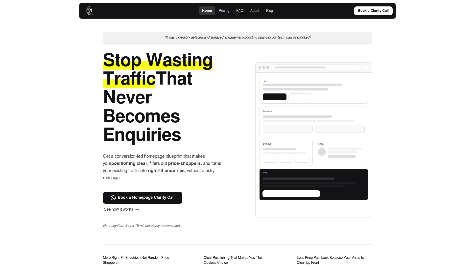
A paid homepage blueprint makes the most sense for established service businesses that already get traffic but keep hearing “just looking” instead of the enquiries they actually want. The Homepage plan starts at 480 SGD one-off, with options to extend into About pages or full-site work if the diagnosis points that way. If that sounds like where you are, the free review is the easiest place to start.
Sources
- Less effort, more completion: The EAS framework - NN/g
- Milliseconds make millions — Think with Google
- Fasrad: booking bot features and routing
FAQ
How do you get more visitors to your website for free?
Organic traffic grows fastest through content that answers real buyer questions, consistent posting on the social platforms your audience actually uses, and basic on-page SEO like clear titles and internal linking. None of these require ad spend, but they do require consistency over weeks and months rather than a single push.
How do I attract people to my website?
Attracting the right people starts with content and messaging that speaks to a specific audience’s problem, rather than generic visibility tactics aimed at anyone. Combining targeted content marketing with clear homepage messaging tends to attract visitors who are more likely to enquire, not just browse.
How can you increase visitors to a website?
A mix of organic content, social media presence, and paid advertising targeted at your specific buyer tends to work better than any single channel alone. NN/g’s guidance on cognitive load also points to a related truth: more visitors only helps if the site itself is clear enough to convert them once they arrive.
How do you boost your website on Google for free?
Improving your Google visibility without paid ads relies mainly on solid on-page SEO, quality backlinks, and content that directly answers what your target audience searches for. Resources like COLLINSEO’s free SEO guides walk through the fundamentals if your team is starting from scratch.
What’s the fastest way to increase website enquiries?
Clarifying your homepage headline so it states who you serve and what outcome you deliver is usually the fastest fix, since it takes hours, not weeks, to test. Pairing that with a shorter enquiry form tends to compound the effect quickly.
Recommended

About the author
Thiam Hock is the founder of Hockworks, a Singapore-based digital advisory focused on clarity-driven websites. He works with service businesses to design websites that guide decisions, filter the right enquiries and reduce hesitation. His perspective centres on positioning, differentiation and how visitors actually make decisions in competitive markets.
Read more about Thiam Hock →