Website as a Decision System
Your website has one job: help visitors decide.
Remove friction for the right customers. Add filters for the wrong ones.
I don't see websites as "just a website".
I see them as a tool that helps your visitors decide.
Especially not for high-ticket businesses. Your website is an extension of your best salesperson. A tool that helps your visitors decide whether to take the next step you want them to take, or to walk away.
That's it. Your website really has only that one job. Everything else is secondary.
By the end of this page, you will see why most websites fail quietly, and what a website needs to achieve for someone to confidently reach out.
When I mention website in this page, I mean your home page, your landing page. Sure, you might have a website that provides documentation or FAQs, but that's not what I am referring to, as far as this page is concerned.
The problem with how websites are usually treated
When I talk to business owners about the purpose of their websites, I get all kinds of answers.
Some tell me this is for their online presence. Some say it's for branding. One even told me that their website is to share their story.
The problem is nobody cares! Not your customers.
They don't care about your online presence. They don't care about your branding. And they definitely don't care about your rags-to-riches story.
What they care about is themselves.
Now, some business owners will say, "My website is meant to get me more customers."
Great. That's a good start. But when I actually look at their websites, they're still doing the same thing:
- Talking about themselves.
- The company history.
- The founder.
- The management team.
- The awards.
- Stock photos everywhere.
If you believe that your business website is not meant to get you more customers, then you can stop reading. The rest of this article is not for you. But if you do believe your website should help you win business, then let me ask you a very simple question:
This is a dumb question.
Of course they care more about themselves! So here's the biggest problem I see in most business websites:
They are not designed and written with the customer in mind.
Most websites are busy explaining who the business is, instead of guiding the visitor to understand whether this is right for them.
In short, the website is a corporate brochure. Even the product or services page, the one page that should matter most, often leaves the customer doing the hardest work - figuring out why it's relevant to them.
That's the disconnect.
That blur does not stay on the page. People increasingly meet a summary from search or chat before they click, and how AI describes your business traces back to the same signals your homepage gives off.
Presenting a different way to look at websites
So what's the right approach then? It's actually very simple.
Design and write your website with your customer in mind.
Simple? Yes.
Easy? No.
Because to do this properly, you need to understand how people actually think.
When someone lands on your website, they don't come prepared. They come with a problem. Or at least a question in their head.
And you want them to take some kind of action. Maybe filling in a form. Maybe sending you a WhatsApp message. Or maybe booking a call.
The job of your website is to guide them there.
This is because most visitors aren't ready. They have questions running through their head. Questions like:
- Are you the right company?
- Can you actually solve my problem?
- What do you charge?
- Are you going to hard sell me?
If you strip all of that down, it usually comes back to one fundamental question:
These three words matter. Right. Trust. Solve.
Each one represents a different group of friction. And your visitor starts with all of them.
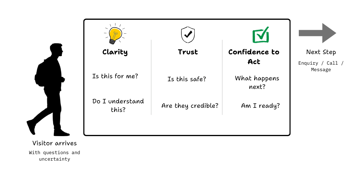
A good website doesn't try to convince. Instead, it removes these frictions. One layer at a time. Until taking the next step becomes the most natural thing to do.
If your website already does this well, you're in the minority.
Seriously. Congratulations.
But if you sell high-ticket services, say, anything above a couple of thousand dollars - there's one more thing your website needs to do.
When friction is low, enquiries go up. Your calendar fills. And sooner or later, you'll notice something else:
Not everyone who reaches out is right for you. Some think you're too expensive. Some misunderstood what you actually do. Some were never a good fit to begin with. These are not the conversations you want to have.
They cost time, money, attention, and your energy.
This is where your website does its second job.
It filters.
People are generally selfish. They won't reach out if they feel they're wasting their time. Think about how you or your sales team qualify leads in a conversation. That's exactly what your website can do upfront, if it's designed properly.
This has nothing to do with persuasion, clever copy or "conversion tricks."
Reducing Frictions
This is the most important job of any business website.
When friction is low enough, there's only one sensible thing left for the visitor to do: reach out. Fill in the form. Send the message. Book the call. Not because they were pushed, but because nothing is stopping them anymore.
So what do I mean by "friction"?
Friction is anything that makes a visitor hesitate. Anything that introduces doubt, effort, or uncertainty at the moment they're deciding what to do next.
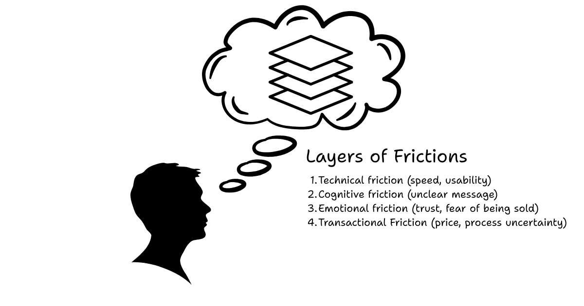
Most websites don't lose visitors because of one big mistake. They lose them because of many small frictions stacked together.
This is why a visitor reads your page, nods along ... and still doesn't call.
Slow loading speed
This is the very first layer of friction.
If your site takes too long to load, most people won't wait.
They won't complain. They won't give feedback. They will just leave, and move on to the next option.
Fast loading speed is like battery life on a phone. Nobody praises a phone for having "good" battery life. But everyone remembers a bad one.
A slow website doesn't just feel unprofessional. It quietly signals "If this is already frustrating, what will it be like to work with them?"
Unclear next steps after CTA
Most visitors understand what the button says. "Contact us". "Get in touch". "Book a call". What they don't know is what happens after.
Will someone call them immediately? Will they get a reply in three days? Is this a sales call? Is there pressure? Is the price going to be wildly out of budget?
This uncertainty is friction.
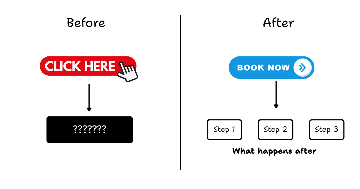
You're asking them to take a step forward, without showing them where they'll land. When the cost of being wrong feels high, people hesitate.
Or they leave.
Overwhelming structure
This is a very common one.
You try to say too many things. You try to appeal to too many audiences. And in the end, the website feels busy, but unclear.
Is this site for: New customers? Existing customers? Partners? Investors? Job seekers?
When everything is important, nothing is.
A focused website feels calm. An unfocused one feels like work.
And when deciding feels like work, people delay. Or they bounce. to appeal to too many audiences.
And in the end, the website feels busy, but unclear. Is this site for: New customers? Existing customers? Partners? Investors? Job seekers?
When everything is important, nothing is.
A focused website feels calm. An unfocused one feels like work. And when deciding feels like work, people delay.
Or they bounce.
The real point
All of these are different forms of the same problem. They introduce friction at the exact moment your visitor is trying to answer one question:
"Should I take the next step here or not?"
A good website doesn't try to hype, persuade or impress. It removes friction, layer by layer until taking action feels obvious and safe.
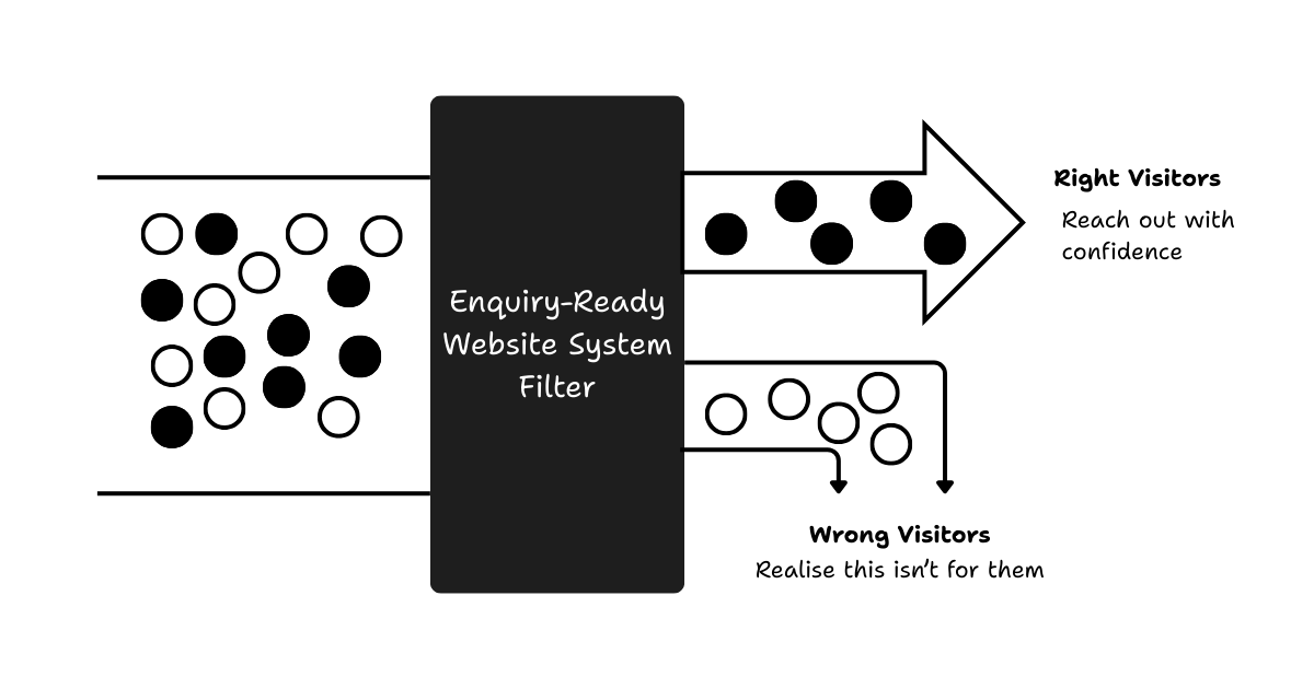
That's the first job of a enquiry-ready website.
Adding Filters
When I first talk to business owners about adding filters to their website, the reaction is almost always the same.
"Siao ah"
"I spent so much money to get traffic. And now you're telling me to chase people away? Are you crazy?!?!?"
I get it. It sounds crazy at first. But let's slow this down for a moment.
Think about filters in real life.
For example, a water filter removes what you don't want, so what remains is clean and safe to consume. Nobody complains that a water filter is "chasing water away". That's literally its job.
So here's the real question: Why should your lead generation process be any different?
You're already filtering. Just that you are doing it later.
If you think about it honestly, you're already filtering your leads.
You do it during: Sales calls, Discovery meetings, Qualification questions, Back-and-forth emails.
You ask questions to figure out: Are they serious? Do they understand what you do? Can they afford it? Are they a good fit?
The difference is where the filtering happens. Right now, it happens after they've already booked your time.
Bad leads are not free
Every call with a bad-fit lead has a cost.
It costs: Your time, Your energy, Your attention, Your momentum.
And for high-ticket businesses, this cost adds up very quickly. One or two bad calls a week doesn't sound like much. But over months, it quietly drains focus from the conversations that actually matter.
This is where website can do more.
Let the website do some of the work
A well-designed website doesn't just encourage the right people to reach out. It also gently discourages the wrong ones. Not by being rude. Not by being arrogant. But by being clear.
Clear about: Who this is for, Who it's not for, What problems you solve, What you don't do, What kind of commitment is required.
Most people are selfish, in a normal, human way. They won't reach out if they feel they're wasting their time, or if they already sense they're not a good fit.
That's a good thing.
Filtering is not rejection. It's respect.
Good filters don't reduce quality enquiries. They improve them. They protect your time. They protect your customers' expectations. And they make every conversation that does happen more productive.
So the second job of a enquiry-ready website is this: To quietly filter out the worst-fit visitors, while making it easier for the right ones to move forward with confidence.
The Principles-Based Approach Towards Websites
We are living in a time where building a website is no longer hard. You can spin one up in minutes.
Templates, website builders, and AI tools have made design and development incredibly accessible. That part is solved.
The real problem is not how to build a website. The real problem is how to build a website that:
reduces friction, adds the right filters,and supports real decisions.
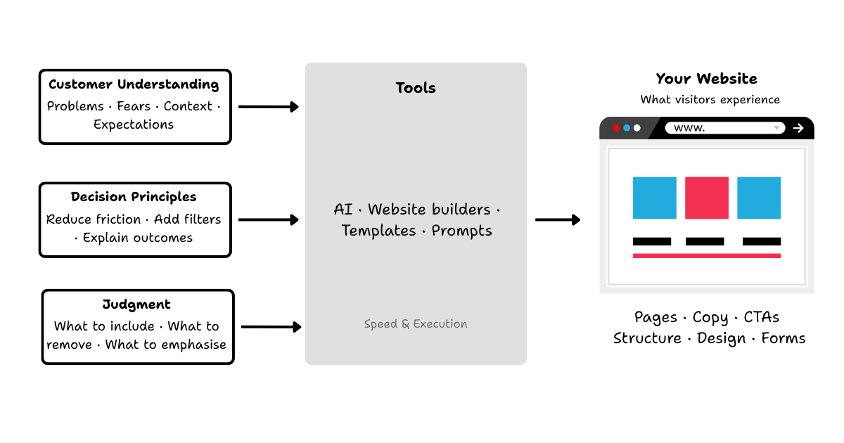
Tools don't think. You do
By default, your website builder doesn't know any of this.
It doesn't know: Who your ideal customer is, What questions they're asking, What makes them hesitate, What would disqualify a bad fit.
All it does is wait for instructions. In that sense, modern tools including AI are like very fast intern with no judgment. They can execute. They can produce. They can work at 10x, sometimes 100x speed. But they still rely entirely on your direction.
Speed amplifies clarity or confusion
This is where many businesses get into trouble.
If your thinking is unclear, AI doesn't fix it. It accelerates it.
Just because you have a microphone, doesn't mean your singing will be good. Similarly, just because you can use AI to create a website, doesn't mean your website will meet your goals.
That's why I am very deliberate about how I talk about AI. I will show you how to use it. I will talk about prompts, workflows, and tools.
But AI is not the solution. It is a leverage.
Principles are what shape outcomes
The quality of the website you end up with depends far more on:
How you think about your customer, How you understand decision-making, How you structure information, How you define friction and filters.
Those are principles. Tools simply execute them.
Without principles, tools are noise. With principles, tools become powerful. That's why everything I share starts from thinking first, and only then we move into implementation. Because tool doesn't decide. You do.
Who is this for?
This way of thinking is for business owners who:
- want their website to work harder and smarter
- want fewer, better enquiries instead of more noise
- care about clarity, professionalism, and trust
- are tired of guessing whether their website is helping or hurting
- want to feel confident sharing their website with customers, partners and even family
If your business relies on trust to close, your website should support that and not undermine it.
Who this is NOT for
- you just want something "nice-looking" online
- you're chasing traffic, hacks, or conversion tricks
- price is the only thing you want to compete on
- you expect a website to magically fix a weak offer or sales process
There's nothing wrong with that. But this way of thinking prioritises better decisions, better control, not just bigger numbers. And that naturally isn't for everyone.
What this looks like in practice
Up to this point, everything might sound conceptual, reasonable, and high-level. Let's bring this back down to earth.
When I say a website should reduce friction and add filters, I am not talking about theory. I am talking about very specific and practical decisions. Things like:
- What your homepage chooses to explain and what it doesn't
- How early you talk about pricing
- Whether your call-to-action feels safe or risky
- How much thinking your visitor has to do on their own
- What assumptions your website makes about who's reading
None of these are "design preferences". They are decision choices.
Reducing friction shows up as clarity
In practice, reducing friction often means:
- saying less, but saying it more clearly
- answering the obvious questions earlier than feels comfortable
- removing vague language that sounds nice but explains nothing
- making the next step feel predictable, not intimidating
A low-friction website doesn't feel clever. It feels calm. Visitors don't feel rushed. They don't feel sold to. They feel oriented. They know where they are, what this business does, and what happens if they take the next step.
Adding filters shows up as honesty
Filtering doesn't mean hiding information. It usually means being more honest earlier.
In practice, this might look like this:
- Being explicit about who this is for, and who it's not
- Setting expectations around budget, process and commitment
- Explaining what kind of problems you don't handle
- Using language that resonates with the right people and quietly repels the wrong ones
Good filters don't push people away. They help people decide not to waste anyone's time.
Every element plays a role
This is why I don't look at websites page by page. I look at them as systems.
Structure. Copy. Images. CTAs. Forms. Reviews. Referrals. None of these work in isolation.
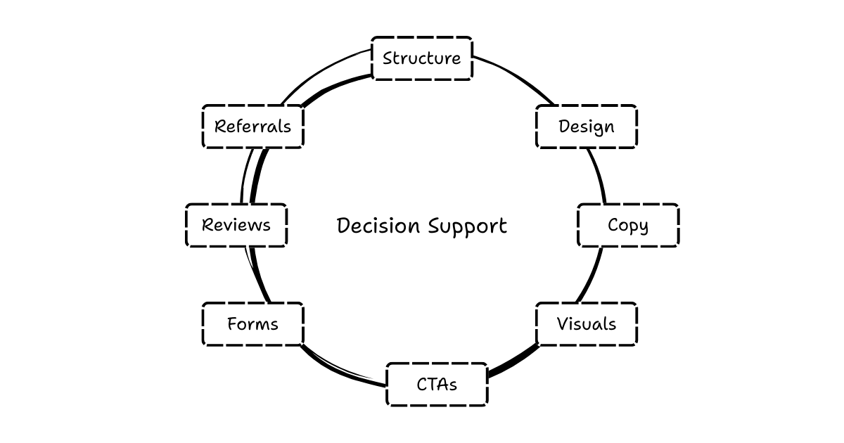
Each element either: removes a bit of uncertainty, or adds a bit of doubt, or filters someone in or out. That's the lens I use. Not "does this look good?" But "what decisions does this support or block?"
This is not about perfection
A enquiry-ready website doesn't need to be perfect. It needs to be intentional.
You don't need: fancy animations, clever wordings, complex funnels. You need clarity. You need honesty. And you need a clear point of view on who you want to talk to.
When those are in place, the website starts doing its job quietly, even when you're not watching.
Where this leads
This page is not meant to teach you how to redesign your website. It's meant to help you see it differently.
Once you start looking at your website as a decision system, you can't unsee: where friction exists, where filters are missing, where uncertainty is being created accidentally.
That's intentional. Because the real work begins after the thinking is clear.
From here, there are many directions you can go:
- auditing an existing site through this lens
- redesigning pages with decision clarity in mind
- using tools (including AI) properly, guided by principles
- building systems around reviews, referrals and trust
Those are all separate conversations. This page exists to set the foundation.
If this way of thinking resonates, you are probably the kind of business owner I work best with. And if it doesn't, that's ok too.
That, in itself, is good filtering.
Frequently asked questions
- What is a website as a decision system?
- A website as a decision system is a way of thinking about your site: its main job is to help visitors decide whether to take the next step you want (e.g. reach out) or to walk away. You remove friction for the right customers and add filters for the wrong ones.
- Why do most business websites fail?
- Most sites are built as corporate brochures—focused on the company, history, and awards instead of guiding the visitor. They don't address the customer's questions or make it easy to decide, so visitors leave or hesitate.
- What is friction vs filter on a website?
- Friction is anything that slows or blocks the right visitors from taking the next step (e.g. unclear value, too many choices). A filter is something that helps unsuitable visitors self-select out early, so you spend time only on serious, well-matched enquiries.
- Who is this article for?
- Business owners who believe their website should help win more customers, especially in high-ticket or service businesses. If you're ready to see your website as a tool that helps visitors decide, this pillar sets the foundation.
- What should my website achieve for visitors?
- It should answer the one question that matters: Is this right for me? By reducing uncertainty for the right fit and making misalignment obvious early, your site does its job even when you're not watching.
See how the Enquiry-Ready Website System works
This is the pillar article of HockWorks. If this way of thinking resonates, see how we put it into practice.