Sticky Header Pros for Service Sites: 22% Faster Navigation
Sticky headers can speed navigation by 22%, but poor execution hurts usability. Check accessibility, performance, and homepage conversion before adding one.

Yes, sticky headers usually improve navigation on content-rich sites, and the data backs that up: one study found 22% faster navigation with persistent menus, and Nielsen Norman Group agrees they boost discoverability, provided you protect accessibility and performance along the way. The catch is execution. Get the implementation wrong and you trade a navigation win for a usability headache. We’ve built a practical checklist below to help you avoid that trade.
TL;DR:
- A 2024 controlled experiment recorded average navigation tasks at 46.88 seconds with persistent headers, versus 49.96 seconds without them, a statistically significant difference.
- Sticky headers suit catalogs, documentation, long landing pages, and apps with working controls, but reading pages and crowded mobile screens often need another pattern.
- Use CSS sticky positioning with a defined top value, reserve header space before rendering, and set scroll offsets to keep anchor links visible.
- Check keyboard focus, skip links, screen readers, and 400% zoom; respect reduced motion settings and disable stickiness when small screens restrict reflow.
- Keep one primary call to action visible, then compare navigation times and bounce rates after launch; test variations or roll back if results worsen.
Table of Contents
- 1. The measurable benefits: what evidence shows
- 2. When sticky headers help (use cases) and when they don’t
- 3. Practical implementation checklist: accessibility, performance, and SEO fixes
- 4. Design patterns and sizing: recommended heights, behaviors, and interactions
- 5. Short verdict and prioritized next steps
- 6. User experience benefits beyond navigation speed
- 7. Common design best practices for sticky headers
- 8. Potential impact on conversion rates and how sticky headers influence user decision-making
- 9. Compatibility considerations across browsers and devices
- 10. Examples of effective sticky header implementations in service business websites
- 11. Performance optimization techniques to mitigate sticky header resource use
- Header chrome and homepage conversion: our take
- How we can help: a homepage blueprint for better navigation and conversions
- FAQ
- Sources
1. The measurable benefits: what evidence shows
The case for sticky headers isn’t just a design preference. It’s backed by task-level data. A 2024 controlled experiment comparing persistent and non-persistent headers found that people completed navigation tasks in an average of 46.88 seconds with a persistent header, versus 49.96 seconds without one, a statistically significant difference (p < .001). That’s roughly three seconds saved per task, which sounds modest until you multiply it across every visitor trying to find a pricing page, a contact form, or a product category.
22% faster navigation. Smashing Magazine reported that sticky menus let users navigate about 22% faster, saving roughly 36 seconds during a five-minute visit. That’s the kind of friction reduction that compounds across a session: fewer scroll-backs to find the menu, fewer dead ends, fewer abandoned paths.
The mechanism is straightforward. When navigation stays visible, people don’t have to scroll back up to reorient themselves or remember where a link lived. That cuts the number of clicks and scroll events needed to complete a task, which is exactly what task-completion studies measure.
Where do these gains show up most?
- Documentation sites, where readers jump between sections constantly.
- Product listing and catalog pages, where filters and category links need to stay within reach.
- Web applications, where persistent controls support ongoing workflows rather than one-time reads.
These are all contexts where the user is actively navigating, not settling in to read one long passage start to finish.
2. When sticky headers help (use cases) and when they don’t
Sticky headers earn their keep on pages built around movement: scrolling through options, comparing items, or jumping between sections. They tend to struggle on pages built around stillness: long-form reading, where the goal is immersion, not navigation.
Good fits include:
- Long-scrolling landing pages where a visitor needs to find a call to action at any scroll depth.
- Ecommerce catalogs with filters, cart icons, or search bars that benefit from constant access.
- Documentation and knowledge bases with deep nested structures.
- Web apps where the header holds functional controls, not just links.
Poor fits include:
- Long-form articles or essays, where NNG’s guidance warns that stickiness can become intrusive when reading is the primary task.
- Small-viewport mobile flows where a sticky bar eats too much of the visible screen.
- Pages that already stack multiple fixed bars (announcement banner plus header plus cookie notice), which compound into a wall of chrome.
For reading-first contexts, consider a partially persistent pattern: a header that hides as the reader scrolls down and reappears only when they scroll back up. It keeps navigation available without permanently taxing the screen.
3. Practical implementation checklist: accessibility, performance, and SEO fixes
Most sticky header complaints aren’t about the concept. They’re about sloppy execution. Here’s the order we’d tackle it in:
- Use CSS
position: stickyover JavaScript-driven fixed positioning. MDN notes that sticky requires at least one inset property, usuallytop, set to a non-auto value, or it behaves like a normal relative element and simply won’t stick. - Reserve header height before the page loads to prevent Cumulative Layout Shift. A header that snaps into place after content has already rendered pushes everything else around, which hurts both user experience and Core Web Vitals.
- Set
scroll-padding-topandscroll-margin-topso that jump links and in-page anchors don’t land underneath the sticky header, a common and easily missed bug. - Protect the skip-to-content link and tab order. Accessibility testing on real sites found that sticky headers frequently obscure skip links and focus targets, especially for keyboard users.
- Test at 400% browser zoom and with a screen reader. Reflow problems at high zoom are one of the most common WCAG failures tied to persistent headers.
- Respect
prefers-reduced-motion. Shrinking or sliding animations should back off for users who’ve set that preference. - Avoid JavaScript that adds fixed positioning after the page has already painted. It’s a frequent cause of both layout shift and flash-of-unstyled-header bugs.
- Use
transformandwill-changesparingly for animated headers, and confirm the result against measured Core Web Vitals rather than assumptions.
For more on scroll-triggered UI patterns and accessibility, our piece on accessibility checks for homepage scroll cues walks through related failure points.
Pro Tip: Start with a CSS-only sticky header and only reach for JavaScript if you need behavior CSS genuinely can’t deliver, like hiding on scroll-down and reappearing on scroll-up.
4. Design patterns and sizing: recommended heights, behaviors, and interactions
Sizing is where a lot of sticky headers quietly go wrong. Too tall, and you’re eating valuable screen space on every scroll. Too many behaviors stacked together, and the header starts to feel unpredictable.
These pinned height ranges come from practitioner guidance on balancing header chrome against visible content.
A few pattern notes worth keeping in mind:
- Always-visible headers are simplest to build but cost the most screen real estate over a long scroll.
- Shrink-on-scroll headers compress after a threshold, trading a bit of complexity for better space efficiency.
- Hide-down, show-up patterns (sometimes called headroom) disappear when scrolling down and return when scrolling up, which suits reading-heavy pages.
- Appear-after-threshold headers stay hidden until the user passes the hero section, which keeps the first screen clean.
Keep transitions between 150 and 250 milliseconds, set a sensible scroll-delta threshold so the header doesn’t flicker on tiny movements, and size tap targets at a minimum of 44 by 44 CSS pixels.
5. Short verdict and prioritized next steps
Sticky headers are worth implementing on most navigation-heavy and catalog-style pages, as long as you guard against layout shift and accessibility regressions. If you’re deciding what to do next: measure your current navigation task times, apply the checklist above in order, and test the result with real users and assistive technology before rolling it out site-wide. If task times or bounce rates worsen after launch, roll back and A/B test variations rather than guessing at a fix.
6. User experience benefits beyond navigation speed
Faster task completion is the easiest benefit to measure, but it’s not the only one. A persistent header changes how people feel while they browse, not just how quickly they move.
When navigation stays visible, visitors explore more freely because they know a way back is always within reach. That lowers the perceived risk of clicking into a deeper page or product category, which tends to translate into more pages viewed per visit on catalog and documentation sites.
Sticky headers also support casual content discovery. A visitor who wasn’t actively searching for anything in particular might notice a menu item, a search icon, or a secondary link simply because it’s still there after they’ve scrolled three screens down. Without that constant presence, those secondary paths only get seen once, at the very top of the page, and then disappear from view.
There’s a trust dimension too. A header that stays consistent and accessible throughout a session reads as more polished and intentional than one that vanishes the moment a visitor starts scrolling. That consistency is part of why NN/g frames sticky navigation as a discoverability tool rather than a purely cosmetic choice: it keeps the path forward visible at every point in the journey, not just the first one.
7. Common design best practices for sticky headers
A sticky header that works tends to follow a few consistent design habits, regardless of industry or layout style.
Visual hierarchy matters more once a header becomes permanent, because it’s now competing with every piece of content underneath it for attention. The strongest implementations keep the header visually quiet: fewer colors, simpler typography, and a clear distinction between primary navigation and secondary links.
Minimalism isn’t just an aesthetic preference here. Every extra element in a sticky header (a second row of links, a promotional banner, an oversized logo) adds to the permanent tax on screen space. Trim the header down to what a visitor actually needs at every scroll depth: a way to navigate, a way to search or contact, and a clear brand mark.
Branding consistency is worth protecting too. Logo placement, color, and type should match the rest of the site so the header doesn’t feel like a separate layer bolted on top of the page. When the sticky version differs noticeably from the header a visitor saw at the top of the page, it can feel like a visual glitch rather than a deliberate pattern.
The through-line across all of this is restraint. A sticky header earns its permanent spot on screen by doing less, not more.
8. Potential impact on conversion rates and how sticky headers influence user decision-making
A sticky header’s biggest conversion lever is usually the call to action it carries, not the navigation links around it. When a “Get a Quote” or “Book a Call” button stays visible at every scroll depth, a visitor doesn’t need to scroll back to the top the moment they’re ready to act. That removes a small but real piece of friction right at the decision point.
This matters because decisions rarely happen at the top of a page. A visitor usually scrolls through proof, pricing hints, or service details first, and only decides to act partway down. If the only call to action lives in the hero section, the header has already scrolled out of view by the time the visitor is ready. A persistent header keeps that path to action available exactly when it’s needed.
The flip side is that a cluttered sticky header can dilute that effect. If the primary call to action competes with five navigation links, a search bar, and a phone number, none of them get the visual priority to actually drive a click. The header has to make a choice about what matters most, the same way the rest of the homepage does.
We’ll come back to this later, since it’s one of the places where header design and homepage conversion work overlap directly.
9. Compatibility considerations across browsers and devices
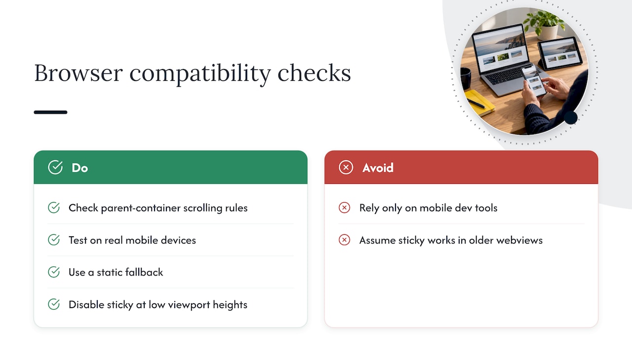
CSS position: sticky enjoys broad support across modern browsers, but a few compatibility details are worth checking before you ship.
MDN notes that sticky positioning depends on the element’s nearest scrolling ancestor, and certain overflow settings on parent elements can change that containing block in ways that quietly break the sticky behavior. If a header refuses to stick on one page but works fine on another, an overflow: hidden or overflow: auto rule on a parent container is a common culprit.
Mobile browsers introduce their own quirks. Address bars that collapse and expand as a user scrolls can shift the effective viewport height, which sometimes causes a sticky header to jump or flicker on first scroll. Testing on real devices, not just browser dev tools set to a mobile viewport, catches most of these issues.
Older browser versions and some in-app webviews (social media apps with embedded browsers, for instance) have historically had partial or buggy sticky support. A simple fallback, where the header behaves as a normal static element if sticky isn’t supported, avoids a broken layout for that smaller slice of traffic.
Reflow at high zoom levels is another cross-device concern. WCAG’s reflow criteria suggest disabling stickiness below certain viewport heights, so the header doesn’t consume most of the visible screen when a visitor zooms in or uses a magnifier.
10. Examples of effective sticky header implementations in service business websites
Service business homepages tend to do best with a narrow, deliberately restrained sticky header: logo, three or four navigation links, and a single clear call to action like “Request a Quote” or “Book a Call.” The pattern works because service buyers are often comparing several firms in open tabs, and a persistent, easy-to-spot CTA shortens the distance between curiosity and contact.
Firms that sell higher-ticket services, consulting, legal, architecture, and similar categories, tend to benefit from a header that shrinks slightly after the hero section, trading a large logo for a more compact one that makes room for content without losing the brand mark entirely. That shrink behavior keeps branding present without permanently taxing the screen the way a full-height header would across a long homepage.
The weaker implementations we see in this space usually share the same problem: too many competing links in the header, a phone number and a contact form and a quote button all fighting for attention, with no single clear next step. For a service business, the header isn’t just wayfinding. It’s one of the main places a hesitant visitor decides whether to act now or keep scrolling, which is precisely the kind of decision-point friction we focus on when we break down a homepage.
11. Performance optimization techniques to mitigate sticky header resource use
A sticky header shouldn’t be a meaningful performance cost if it’s built correctly, but a few habits keep it that way.
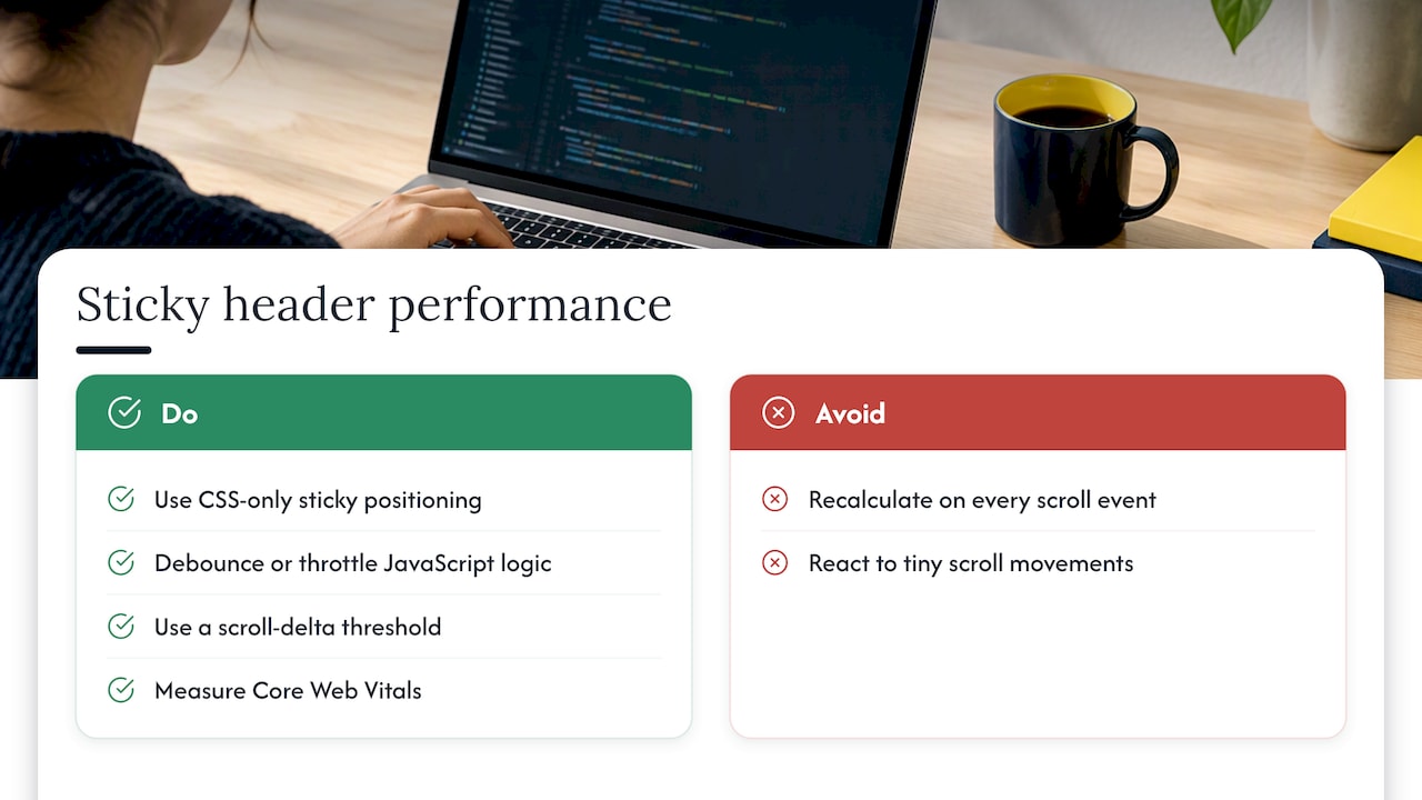
CSS-only sticky positioning, using position: sticky, avoids the scroll-event listeners that JavaScript-driven fixed headers often rely on. Fewer scroll listeners means less work for the browser on every frame, which matters most on lower-powered mobile devices.
When animation is genuinely needed, like a shrink-on-scroll effect, use transform rather than animating height or top directly. Transform-based animations run on the compositor thread and tend to stay smoother under load. Reserve will-change for the specific property being animated, and remove it once the animation is done, since leaving it active indefinitely can increase memory use.
Debounce or throttle any scroll-based logic that does need JavaScript, so the header isn’t recalculating on every single scroll event. A scroll-delta threshold, only reacting once the user has scrolled a meaningful distance, cuts down on unnecessary recalculation and avoids the flicker that comes from reacting to tiny scroll movements.
Finally, measure the result. Core Web Vitals, particularly Cumulative Layout Shift and Interaction to Next Paint, will reveal whether a sticky header implementation is actually adding cost, rather than relying on assumptions about what should be lightweight.
Header chrome and homepage conversion: our take
We spend our time taking apart homepages to find where visitors hesitate, and the header is one of the first places where decision friction shows up. A cluttered or poorly prioritized sticky header competes with the one call to action that actually matters, and most homeowners never notice because it looks fine, it just doesn’t convert.
Our homepage blueprint process treats header chrome as part of the bigger messaging and proof-placement picture, not a separate design task. If you’re weighing whether to audit your own header chrome, read our notes on fixing service CTAs next.
— Fadly
How we can help: a homepage blueprint for better navigation and conversions
If you’ve read this far and you’re thinking about more than just header code, that’s the real opportunity. A sticky header fix is a two-hour task. Turning your whole homepage into something that consistently attracts right-fit enquiries is a different project, and it’s the one we focus on.
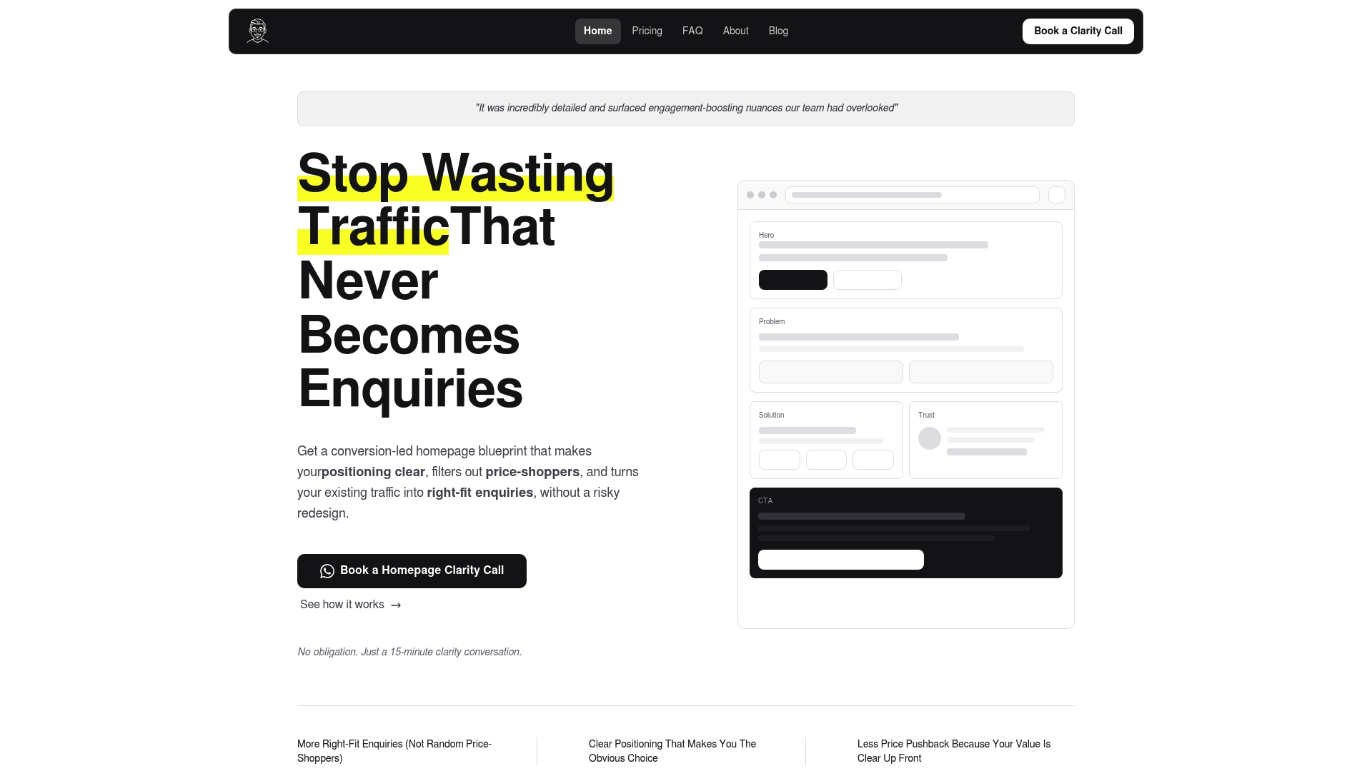
We provide homepage blueprints focused on improving conversion, including a structured plan covering messaging, proof placement, and call-to-action design, delivered with a video walkthrough so your team can implement it without a full redesign. If you want a no-cost starting point first, our free website review is a practical way to see where your own homepage is losing visitors before committing to anything.
If you’d rather compare agencies before committing, Agency Review Guide offers a searchable directory with transparent selection criteria. If you decide a dedicated blueprint is the better fit, you can book an initial call to see whether we’re a good match for your homepage.
FAQ
How do you get a sticky header in WordPress?
Most modern WordPress themes and page builders include a built-in sticky header toggle in their customizer settings, often labeled “sticky” or “fixed” navigation. If your theme doesn’t offer one, a lightweight plugin or a small custom CSS snippet using position: sticky on the header element will achieve the same result without added page weight.
Is a sticky header good or bad?
A sticky header is generally a net positive: research shows sticky menus can speed up navigation by around 22%. It becomes a problem only when it’s poorly built, causing layout shift, blocking skip links, or eating too much screen space on long-form reading pages.
What does “sticky” mean in CSS?
In CSS, position: sticky makes an element behave like a normal part of the page layout until the user scrolls past a defined threshold, usually set with top, at which point it “sticks” in place within its parent container. MDN explains that the element needs a non-auto inset value to trigger this behavior correctly.
What does “sticky navigation” mean?
Sticky navigation refers to a menu or header that stays visible on screen as a visitor scrolls down a page, rather than scrolling away with the rest of the content. It’s designed to keep navigation links, search, or key calls to action within reach at every point in the page.
What is the recommended height for a sticky header?
Pinned header heights typically run 48 to 56 pixels on mobile, 56 to 64 on tablet, and 64 to 80 on desktop, leaving most of the viewport for actual content. Going taller than that range starts to eat noticeably into the visible screen on every scroll.
Sources
- Sticky menus are quicker to navigate (Smashing Magazine)
- The Usability of Persistent and non-Persistent Headers on Web Pages (Scitepress, 2024)
- Sticky headers (Nielsen Norman Group)
- Sticky Header accessibility: the skip link, focus and reflow problems most sites miss (DEV Community)
- position CSS property - MDN
Recommended

About the author
Thiam Hock is the founder of Hockworks, a Singapore-based digital advisory focused on clarity-driven websites. He works with service businesses to design websites that guide decisions, filter the right enquiries and reduce hesitation. His perspective centres on positioning, differentiation and how visitors actually make decisions in competitive markets.
Read more about Thiam Hock →