Fix Service CTAs: Call to Action Examples, Copy, Code, 44 by 44
Example-first CTA playbook for service homepages: ready-to-use button copy, 44 by 44 touch size rules, front end patterns, and simple A/B test steps to...
An effective CTA names the outcome and is visually unmistakable: use an outcome-focused label on a distinct, solid primary button sized for touch. Change your main button to something like “Get my free quote” instead of “Submit,” and make sure it meets minimum touch size. That single swap fixes more conversion problems than most redesigns ever do.
TL;DR:
- Choosing outcome-focused, clear, and specific language for each goal type improves click-through rates and reduces hesitation, especially when paired with high-contrast, sizable buttons.
- Using a solid-filled primary button with 16 to 24 pixels of padding and distinct interaction states ensures visibility and usability across all devices.
- Testing one CTA variable at a time and measuring next-step completion rates helps identify the most effective design and placement strategies.
- Addressing trust and proof before presenting the CTA increases conversions more than merely optimizing button color or copy.
- Proper CTA placement on homepages requires sequencing proof and credibility elements ahead of the button to secure visitor trust before prompting action.
Table of Contents
- 1. CTA examples for every goal: purchase, leads, bookings, and content
- 2. Design rules that make your button impossible to miss
- 3. Accessible sizing and interaction states for every device
- 4. Outcome-focused microcopy and phrase templates
- 5. Front-end patterns for accessible, responsive CTAs
- 6. How to test CTA changes without guessing
- 7. What this means for service business homepages
- Most advice about CTAs misses the actual problem
- Get a second opinion on your homepage’s CTA placement
- FAQ
- Sources
1. CTA examples for every goal: purchase, leads, bookings, and content
Different goals need different language. A shopper ready to buy responds to urgency and clarity, while someone considering a $5,000 service needs reassurance before they click anything.
For ecommerce, short and direct wins: “Add to cart,” “Buy now, pay later,” or “Get free shipping today.” These phrases work because they remove a specific hesitation (cost, delivery time, commitment) rather than just asking for a sale.
Lead generation CTAs need a promise attached to the action, as explained in the consulting CRM buyer’s guide. “Get my free quote” or “See my custom plan” perform better than “Submit” because they tell the visitor what happens next, which matches NN/g’s guidance on outcome-focused button copy.
Booking and appointment CTAs benefit from time framing: “Book my 15-minute call” or “Reserve my spot this week” work because they shrink the commitment down to something concrete.
For content downloads, lower the perceived friction: “Send me the guide” or “Get instant access” both signal speed without asking for much in return.
- Ecommerce: “Add to cart,” “Buy now,” “Get free shipping”
- Lead gen: “Get my free quote,” “See my custom plan”
- Booking: “Book my 15-minute call,” “Reserve my spot”
- Content: “Send me the guide,” “Get instant access”
- Community: “Join the conversation,” “Ask a question” (use sparingly, mainly on forums or membership sites)
2. Design rules that make your button impossible to miss
Visitors scan pages in seconds. If your primary action doesn’t stand out immediately, you’ve lost the click before anyone reads your copy.
A solid-filled button consistently reads as the primary action more clearly than an outline or ghost button, a distinction NN/g has documented in its research on command links and button styling. Reserve outlines and text links for secondary actions so visitors never have to guess which button matters most.
Contrast matters more than color choice. There’s no universal “best” button color. What matters is that your button stands apart from the page background and surrounding elements, typically by exceeding a 4.5:1 contrast ratio for readable text. Chasing a trendy hue while ignoring contrast is a common and costly mistake.
Give your CTA room to breathe. Crowding a button against text or other elements weakens its visual weight. Negative space around a button signals importance the same way a pull quote does in print.
- Use one dominant, filled primary button per screen
- Keep secondary actions visually quieter (outline or text link)
- Add 16 to 24 pixels of padding around the button for clear separation
- Use icons only when they clarify the action (a cart icon, an arrow); skip decorative icons that add visual noise
Pro Tip: If you can’t tell which button is primary from ten feet away, neither can your visitor.
3. Accessible sizing and interaction states for every device
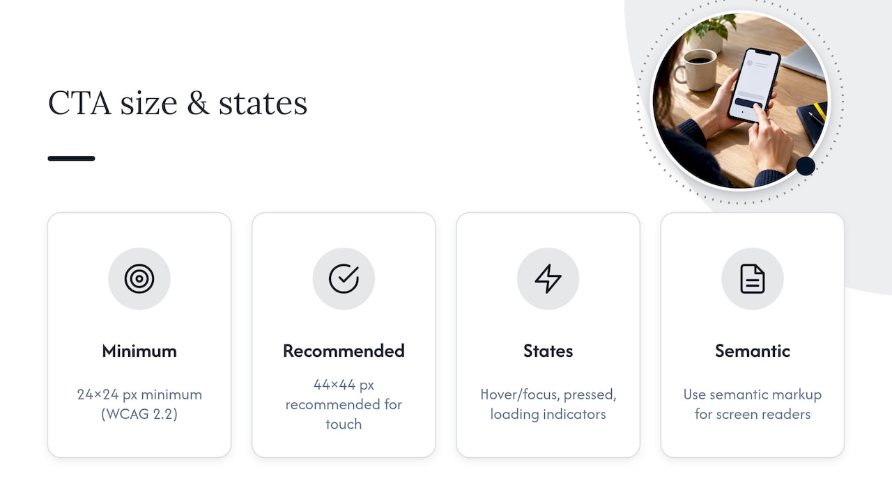
A CTA that looks great on desktop but fails on mobile loses conversions nobody notices until the data shows a drop-off. The W3C’s WCAG 2.2 guidance sets a 24 by 24 pixel minimum for interactive targets, with 44 by 44 pixels recommended for reliable touch usability. That extra 20 pixels on each side is the difference between a button someone taps cleanly and one they miss on a crowded screen.
Beyond size, build in visible states: a hover or focus outline, a distinct pressed state, and a loading indicator when the action takes time. Use semantic <button> markup so screen readers announce the control correctly instead of skipping past it.
4. Outcome-focused microcopy and phrase templates
Swap generic verbs for language that names what the visitor gets. A few reliable templates:
- “Start my [outcome]” (free trial, consultation, project)
- “Get my [deliverable]” (quote, report, download)
- “Book my [timeframe] consult” (15-minute, 30-minute)
Power verbs like “get,” “start,” and “book” create momentum, but urgency phrasing (“only 3 spots left”) should only appear when it’s true. Fabricated scarcity erodes trust faster than it drives clicks.
Supporting microcopy does quiet work beneath the button: “Takes 2 minutes,” “No credit card required,” or “We never share your info” each answer an unspoken objection before it stalls the click.
5. Front-end patterns for accessible, responsive CTAs
A button only works if the code behind it behaves the way it looks. A few patterns to copy directly into your project:
- Use a native
<button>or an anchor styled as one, witharia-labeltext that matches the visible label exactly so screen readers announce the same outcome sighted users see. - Set a minimum touch area of 44 by 44 pixels using padding rather than shrinking the visible button, and keep a visible focus outline for keyboard users.
- For sticky CTAs, reveal the floating button only after the visitor scrolls past the primary inline CTA, so you’re not duplicating the same prompt twice on one screen.
That third point matters more than it sounds. A sticky bar that appears immediately competes with your hero section instead of supporting it.
6. How to test CTA changes without guessing
Change one variable at a time. Testing label, prominence, and placement together tells you something moved, but not which part did the work, a distinction WordStream’s collection of CTA examples and testing notes reinforces across categories.
Track more than clicks. Measure progression to the next step (form started, checkout reached) alongside the raw click-through rate, since a button can get clicks and still leak visitors right after.
- Run one variable change per test: label, then color, then placement
- Measure next-step completion, not just clicks
- Test sticky versus inline CTA placement separately, since GoodUI’s documented experiments on sticky CTAs show gains concentrated in mobile flows specifically
7. What this means for service business homepages
Most service homepages bury their CTA under a mission statement nobody asked for. We built our homepage blueprint process around removing that friction before worrying about button color.
A quick checklist: outcome-first label, proof sitting right next to the button, one primary action per screen, and a clear next step once someone clicks, a pattern we detail in how visitors decide what to trust.
Most advice about CTAs misses the actual problem
Most CTA advice treats the button as the problem to solve. It isn’t. A perfectly designed button on a page that hasn’t earned the click yet still gets ignored, because the visitor hasn’t decided you’re credible before they reach it.
The industry’s obsession with button color and copy formulas is overrated. Swapping “Submit” for “Get my quote” helps, but it’s a marginal gain if the three paragraphs above the button never answered why this business, specifically, deserves the click. Contrast and sizing are table stakes, not differentiators: everyone can hit 4.5:1 contrast now.
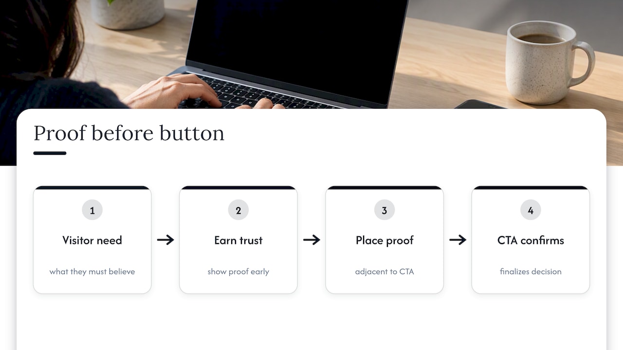
What actually moves the needle is sequencing. Put proof near the button, not above the fold in isolation. Make sure the visitor already trusts you by the time they reach the CTA, so the button just confirms a decision they’d already leaned toward.
Start with what the visitor needs to believe before they’ll click anything. The button comes after that, not before.
— Fadly
Get a second opinion on your homepage’s CTA placement
We provide services that help service businesses improve their homepage conversion and get more right-fit enquiries. If you want a no-cost look at where your current CTA sits and whether it’s actually doing its job, start with our free website review.
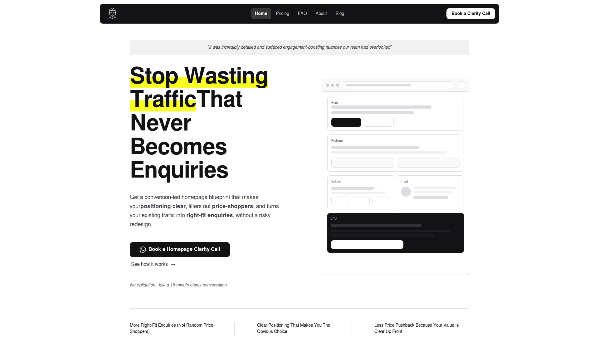
For a full homepage rebuild plan with CTA placement, proof points, and messaging mapped out, our homepage blueprint starts at $480 and includes a video walkthrough you can hand straight to your developer.
FAQ
What is a call to action in writing examples?
A call to action is a short, direct instruction that tells the reader exactly what to do next, such as “Get my free quote” or “Book my consult.” In writing, it works best when it names a concrete outcome rather than a vague action like “click here.”
What are some good call to action phrases?
Strong phrases name the benefit: “Start my free trial,” “Get my custom quote,” or “Reserve my spot this week.” Research from WordStream’s CTA collection shows these outperform generic phrases like “Submit” or “Learn more” because they set a clear expectation.
What are some effective call to action examples?
Effective examples vary by goal: ecommerce favors “Add to cart” or “Buy now,” lead generation favors “Get my free quote,” and bookings favor “Book my 15-minute call.” Each works because it pairs a visible, high-contrast button with language that names the result.
How do I make a call to action?
Pair an outcome-focused label with a solid, high-contrast button sized for easy tapping, following the W3C’s recommended 44 by 44 pixel touch target. Add one line of supporting microcopy, like “Takes 2 minutes,” to remove hesitation right before the click.
Sources
- Understanding Success Criterion 2.5.8: Target size (Minimum)
- Button states: communicate interaction
- Pattern #41: Sticky Call To Action
- 31 Call to Action Examples + How to Write Your Own | WordStream
Recommended

About the author
Thiam Hock is the founder of Hockworks, a Singapore-based digital advisory focused on clarity-driven websites. He works with service businesses to design websites that guide decisions, filter the right enquiries and reduce hesitation. His perspective centres on positioning, differentiation and how visitors actually make decisions in competitive markets.
Read more about Thiam Hock →