Get More Right Fit Enquiries for Service Firms Without a Redesign
Conversion first homepage blueprint for service firms that reduces decision friction and boosts right fit enquiries without a full redesign.

A homepage blueprint must make it obvious who you serve, what you deliver, and the next step, all within the first screen. Before you touch design or copy, audit three things on your current homepage: does the hero pass a 10-second clarity test, is your primary call to action visible without scrolling, and is there at least one credible proof point above the fold. If any of those fail, that’s where you start.
TL;DR:
- Most service businesses should focus on fixing clarity, proof placement, and navigation issues rather than redesigning their entire site.
- The hero should clearly state who you serve and the outcome, with a visible call to action and relevant visual reinforcement.
- Place one credible proof point near the hero to build trust, and ensure navigation directs visitors toward decision-making options without distraction.
- Optimize for speed and mobile performance by avoiding intrusive elements like auto-rotating carousels and compressing large images to meet Core Web Vitals thresholds.
- Measure success through key metrics such as enquiry rate, response time, and bounce rate from the hero, making incremental changes for continuous improvement.
Table of Contents
- The blueprint elements every homepage needs
- Above the fold: one message, one action
- Messaging and proof that make visitors trust you
- Navigation and hierarchy that guide the next step
- Calls to action that convert browsers into enquiries
- Mobile, speed, and the technical checklist that protects conversions
- How to test and improve your homepage blueprint
- Accessibility standards worth building in from day one
- Branding elements that keep the page recognizable
- Personalization and dynamic content worth considering
- Layout patterns and design principles that actually work
- Fitting your homepage into the wider marketing funnel
- How we apply this blueprint with clients
- Get a homepage blueprint built around your business
- Sources
- FAQ
The blueprint elements every homepage needs
A homepage is a sequence of decisions, not a design document. Each block on the page either moves a visitor closer to contact or gives them a reason to leave, so the order and content of those blocks matter more than how polished any single one looks.
Here’s the sequence I use when auditing a service business homepage:
- Hero: state who you serve and what outcome you deliver, paired with one primary call to action. Avoid vague taglines like “excellence in service.”
- Value proposition: one or two sentences that explain the result a client gets, not the process you follow.
- Proof: a client logo, a short outcome quote, or a number that shows this works. Avoid burying it below three scrolls of content.
- Service overview: three to five services named plainly, each linking to more detail. Avoid a wall of unlabeled icons.
- Calls to action: repeated at logical intervals, not just once at the top.
- Supporting content: FAQs, process explanation, or a short “how we work” section for visitors who need more before they act.
- Footer: contact details, navigation, and trust marks like certifications or years in business.
Run this checklist in fifteen minutes: scroll your homepage once, and at each block ask whether a first-time visitor would know what to do next. If the answer is unclear more than once, that block needs work before anything else on the page does.
Above the fold: one message, one action
Your hero has one job: tell a stranger who you help and what they get, fast enough that they don’t have to think about it. That means resisting the urge to say everything at once.
Use this structure to build it:
- Headline: audience plus outcome, kept short. “Homepage blueprints for service firms that want better-fit enquiries” beats “Welcome to our agency.”
- Subhead: one sentence that adds context or removes doubt, such as how you deliver the result.
- Primary CTA: a single button with an action-first label, placed where it’s impossible to miss.
Visually, one image or illustration that reinforces the outcome works better than a rotating carousel. Baymard’s research on homepage UX found that many sites still rely on intrusive overlays and aggressive banners that reduce engagement rather than help it, and a busy hero carries the same risk.
Pro Tip: Show your homepage to someone unfamiliar with your business for ten seconds, then ask them to explain what you do. If they can’t, your hero isn’t doing its job yet.
Messaging and proof that make visitors trust you
A visitor deciding whether to contact you is really asking one question: is this the right fit, at the right level, for what I need? Your copy and proof placement answer that before they ever pick up the phone.
Write your value proposition in three parts: who you serve, what you deliver, and the result they get. Skip the process details for later in the page.
For proof, service businesses have more options than they think:
- A one-line client outcome, such as a result described in the client’s own words.
- Logos of recognizable clients or industries served.
- A specific, quantified result tied to a real engagement.
Place one credible proof point near the hero so skeptical visitors don’t bounce before they scroll, then save deeper case studies for further down the page where visitors who want detail can find them.
Navigation and hierarchy that guide the next step
Your navigation should answer one question: what does this visitor want to do right now? Everything else is a distraction. Baymard’s UX benchmarking found that a majority of sites, 58% on desktop and 67% on mobile, score only “mediocre” or “poor” on navigation and layout efficiency, which usually means too many choices or too little clarity.
- Limit primary navigation to services, outcomes, and contact. Cut anything that doesn’t map to a decision.
- Add persistent inquiry pathways: a sticky CTA, contact details in the header and footer, and short anchor links to key services.
- Send visitors who want detail to service or case study pages, and give visitors ready to act a direct, one-click path to contact.
Calls to action that convert browsers into enquiries
A homepage with three different CTAs competing for attention usually ends up with none of them working. Pick one primary action and repeat it consistently.
- Use a single, visible primary CTA with an action-first label, such as “Get a brief review” instead of “Learn more.”
- Reserve secondary CTAs for lower-commitment actions, like downloading a guide, and keep them visually quieter than the primary button.
- Set expectations immediately after contact. A short line like “We reply within one business day” reduces uncertainty and improves the quality of enquiries you get, since serious prospects are more likely to follow through when they know what happens next.
Mobile, speed, and the technical checklist that protects conversions
None of the messaging work matters if your page loads slowly or breaks on mobile. Google’s Core Web Vitals set the bar: LCP at 2.5 seconds or under, INP under 200 milliseconds, and CLS under 0.1 are the current “good” thresholds, and mobile performance tends to matter more since most first visits happen there.
A majority of ecommerce sites still rely on outdated or friction-heavy homepage patterns, according to Baymard’s research, which recommends turning off auto-rotating carousels and keeping search or contact visibly accessible rather than hidden in a menu.
- Avoid auto-rotating carousels and intrusive overlays on mobile.
- Compress and correctly size hero images so they don’t slow the first paint.
- Preload the asset responsible for your largest contentful paint, and defer scripts that don’t affect the first screen.
How to test and improve your homepage blueprint
Treat your homepage as something you measure, not something you finish. Three numbers matter most: your qualified enquiry rate, first-contact response time, and how many visitors bounce from the hero without scrolling.
- Check your data first. Use Google Search Console and PageSpeed Insights for field performance, and session recordings to see where visitors hesitate.
- Run one controlled change at a time, such as a new headline or a repositioned CTA, rather than changing several things together.
- Give it four to eight weeks before judging results, long enough to see a real pattern rather than a single week’s noise.
Accessibility standards worth building in from day one
Accessibility isn’t a separate project from conversion work. A homepage that’s hard to read or navigate for one visitor is usually a little harder for everyone, and the fixes tend to be quick.
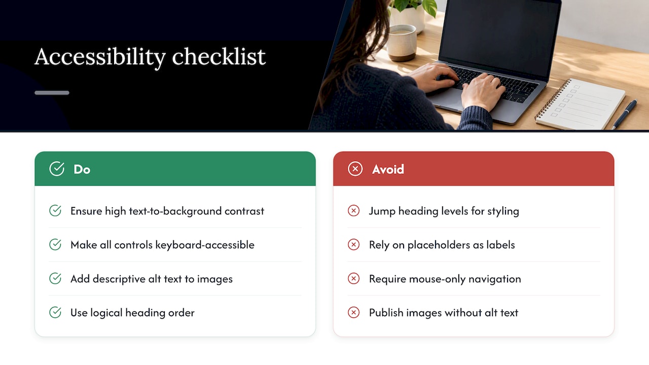
Start with contrast: text should be legible against its background without visitors needing to squint or zoom. Check that every interactive element, buttons, links, form fields, can be reached and operated using a keyboard alone, since not every visitor navigates with a mouse or touchscreen. Add descriptive alt text to images that carry meaning, especially hero visuals, so screen readers can convey what a sighted visitor sees.
Headings should follow a logical order (one H1, then H2s, then H3s) rather than jumping around for visual effect, because assistive technology uses that structure to help visitors scan the page. Form labels need to be explicit and attached to their fields, not just placeholder text that disappears when someone starts typing.
None of this requires a redesign. Most of it is a checklist you can run against your existing homepage in an afternoon, and it tends to overlap with good usability generally: clear structure, readable text, and obvious interactive elements help everyone, not just visitors using assistive tools.
Branding elements that keep the page recognizable
Consistency does more for trust than most business owners expect. A homepage that uses a different tone, color palette, or logo treatment than your invoices, proposals, or email signature creates a small but real moment of doubt for a visitor who’s already unsure.
Keep your color palette, typography, and logo usage identical across every page and every touchpoint a client sees. If your brand voice is direct and plainspoken in person, your homepage copy should read the same way rather than switching to generic marketing language. Photography and imagery style should match too: if you use real photos of your team elsewhere, stock imagery on the homepage will feel slightly off, even to a visitor who can’t articulate why.
A short, written brand guideline, covering colors, fonts, tone, and imagery rules, makes this easier to maintain as you add pages or hand work to a designer. Tools built for managing consistent brand guidelines and assets, such as NEXTmsp’s brand guideline resources, can help formalize this so it doesn’t rely on memory. The goal isn’t visual polish for its own sake. It’s making sure a visitor who lands on your homepage and later opens a proposal recognizes the same business in both.
Personalization and dynamic content worth considering
Personalization on a homepage doesn’t have to mean complex software. For most service businesses, it means showing the right message to the right visitor based on something you already know.
If paid traffic comes from a specific campaign, a landing page variant that matches the ad’s language converts better than sending everyone to the same generic homepage. If you serve multiple industries, a simple visitor-type selector near the top, “clinics” versus “professional services,” for instance, can route people to messaging that speaks directly to their situation rather than making them self-translate generic copy.
Dynamic content, such as showing recently viewed services or location-specific proof points, adds value when you have enough traffic and data to make it meaningful. For a business still building its enquiry volume, a clear, well-segmented homepage usually delivers more return than a personalization engine that needs constant tuning. Start simple: one or two visitor paths, clearly labeled, before investing in anything more automated.
Layout patterns and design principles that actually work
Most effective service-business homepages follow a small set of layout patterns, not because designers lack imagination, but because these patterns match how visitors actually scan a page.
The F-pattern and Z-pattern both describe how eyes move across a page: across the top, down the left side, and across key horizontal bands. Your hero, value proposition, and primary CTA should sit along those natural eye paths rather than in corners a visitor’s gaze skips past. Whitespace matters as much as content: a page dense with text and imagery forces visitors to work harder to find what they need, while generous spacing around key elements draws attention to them.
Visual hierarchy, using size, weight, and color to show what matters most, should guide a visitor from headline to proof to CTA without them having to hunt. If every element on the page is the same size and weight, nothing stands out, and the visitor has to do the prioritizing themselves, which is exactly the friction a blueprint is meant to remove.
Fitting your homepage into the wider marketing funnel
Your homepage doesn’t operate alone. It’s one stop in a journey that might start with a search result, a referral, or a paid ad, and end somewhere past the contact form.
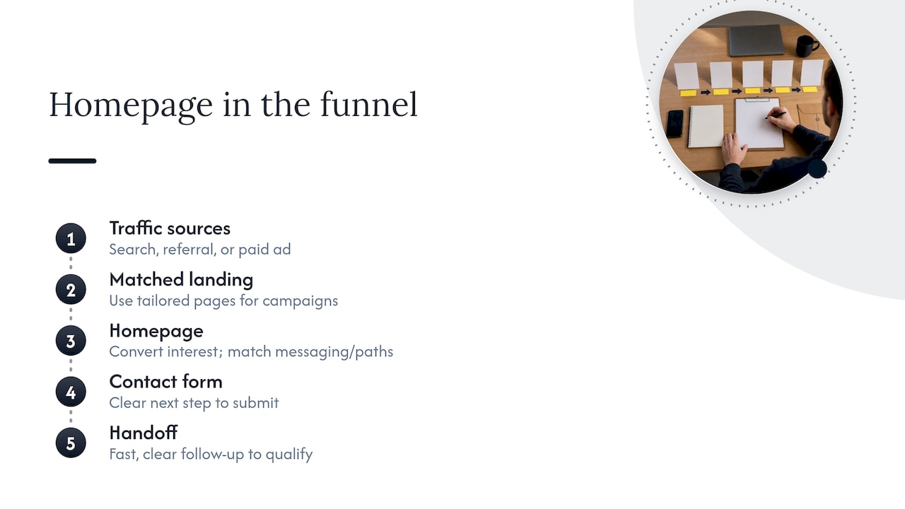
Map where your traffic actually comes from before assuming every visitor needs the same homepage experience. A visitor arriving from a Google search for a specific service has different context than one clicking a retargeting ad after reading a case study, and your homepage should account for that difference where possible, through matched messaging or clear paths to the content that got them there. If you run separate campaigns for different services or audiences, consider whether a tailored landing page would serve that traffic better than routing everyone through the same general homepage.
The homepage’s job in this funnel is to convert interest into a qualified enquiry, not to close the sale on its own. That means the handoff after contact matters as much as the page itself: a clear next step, a fast response, and a process that matches what the homepage promised. A blueprint that gets someone to fill out a form but leads to a confusing or slow follow-up wastes the work done getting them there.
How we apply this blueprint with clients
When I review a homepage, I’m looking for the exact point where a visitor would hesitate, not because the design is wrong, but because the messaging asks them to guess. Most clients are surprised how often the first fix is subtraction: a clearer headline, one CTA instead of four, one strong proof point instead of five vague ones. Small, low-risk changes usually move enquiry quality faster than a full redesign.
— Fadly
Get a homepage blueprint built around your business
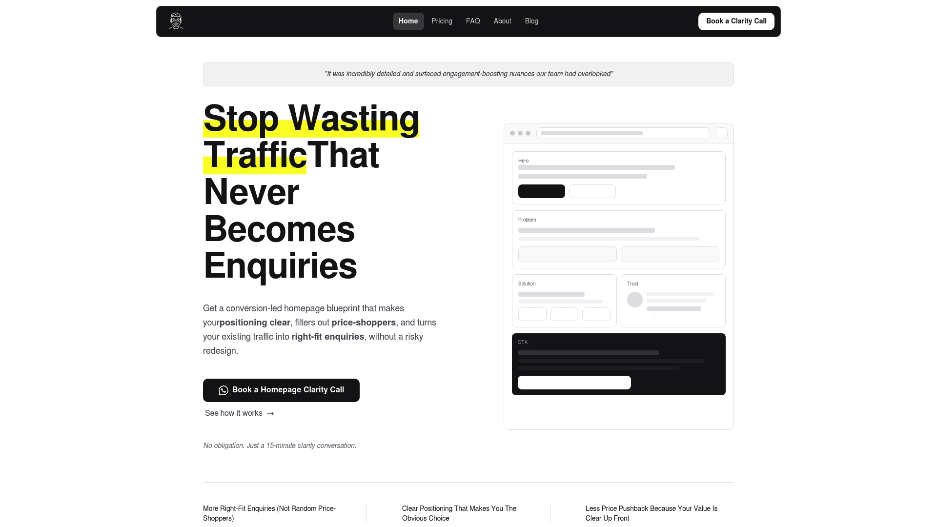
Most service businesses don’t need a new website. They need a clear plan for the one they have, which is exactly what a Hockworks homepage blueprint delivers. Rather than rebuilding your site from scratch, we diagnose the specific points where visitors hesitate and hand you a structured plan to fix them.
Here’s what the engagement includes:
- A decision-friction diagnosis based on how real visitors read and respond to your current homepage.
- A messaging blueprint covering positioning, proof placement, and calls to action.
- A video walkthrough so your team can implement changes without guessing at intent.
This fits service firms selling higher-value work, generally over $2,000 per engagement, that already get traffic but want more right-fit enquiries rather than more volume. A Homepage blueprint starts at 480 SGD, with a Homepage + About option at 680 SGD if your About page needs the same treatment. If you’d rather see where your current site stands first, start with a Free Website Review.
FAQ
What is the blueprint of a website?
A website blueprint is a structured plan that maps out the key sections, messaging, and calls to action a page needs before any design work starts. For a homepage specifically, it typically covers the hero, value proposition, proof, service overview, and CTA placement in the order visitors need them.
What is the best example of a homepage design?
There’s no single universal best example since effective homepage design depends on your audience and offer. The consistent pattern among strong service-business homepages is a clear hero message, one primary CTA, and visible proof placed close to the top of the page.
How do I build a homepage?
Start with a blueprint that defines your hero message, value proposition, proof points, and calls to action before writing copy or choosing visuals. Then build each section to match that plan, checking mobile performance and Core Web Vitals thresholds like LCP at 2.5 seconds or under before launch.
How can I create my own blueprint?
Audit your current homepage against a checklist covering hero clarity, proof placement, navigation, and CTA visibility, noting where a first-time visitor would hesitate. From there, outline each section’s purpose and content before making design changes, testing one change at a time so you can measure what actually improves enquiries.
What homepage mistakes hurt conversions most?
Vague headlines that don’t name who you serve, competing calls to action, and proof buried too far down the page are common issues. Research on homepage usability also points to intrusive overlays and pop-ups as a frequent source of lost engagement.
Recommended

About the author
Thiam Hock is the founder of Hockworks, a Singapore-based digital advisory focused on clarity-driven websites. He works with service businesses to design websites that guide decisions, filter the right enquiries and reduce hesitation. His perspective centres on positioning, differentiation and how visitors actually make decisions in competitive markets.
Read more about Thiam Hock →