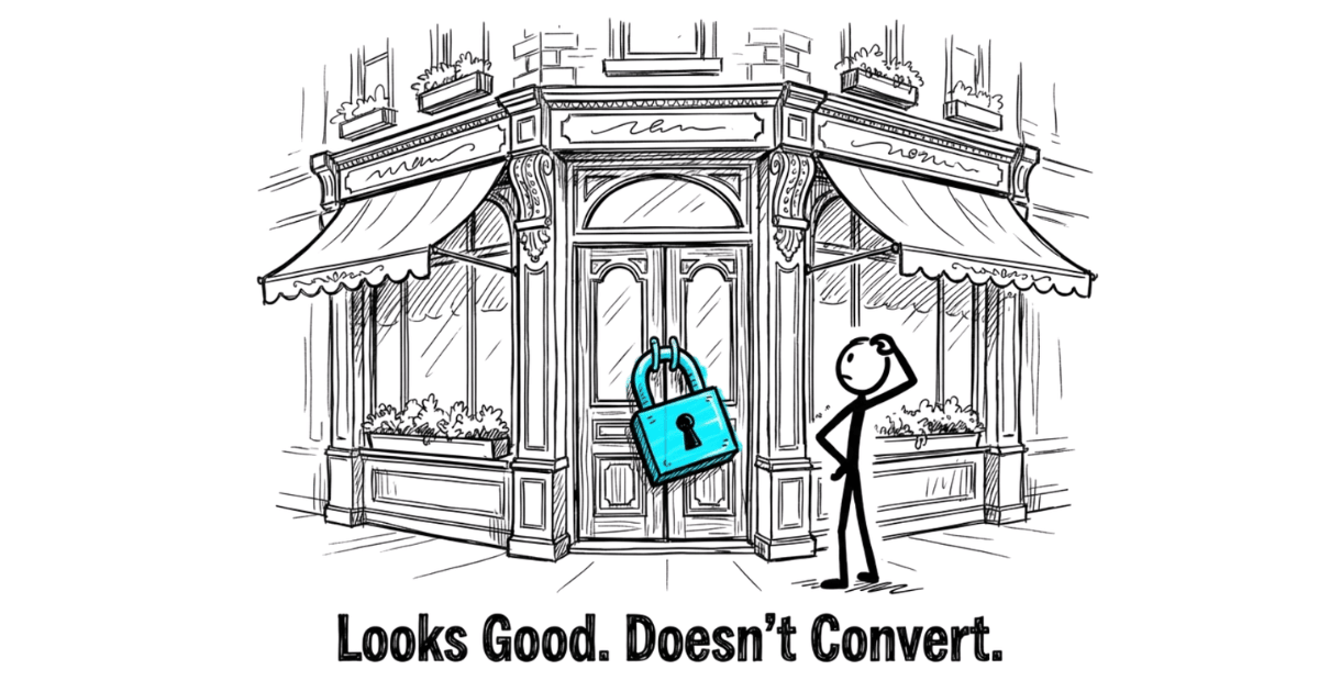
Your Service Business Homepage Looks Good. So Why Isn't It Converting?
Most service business homepages look professional but still fail to convert. Here's what's actually missing and how to fix it without a redesign.
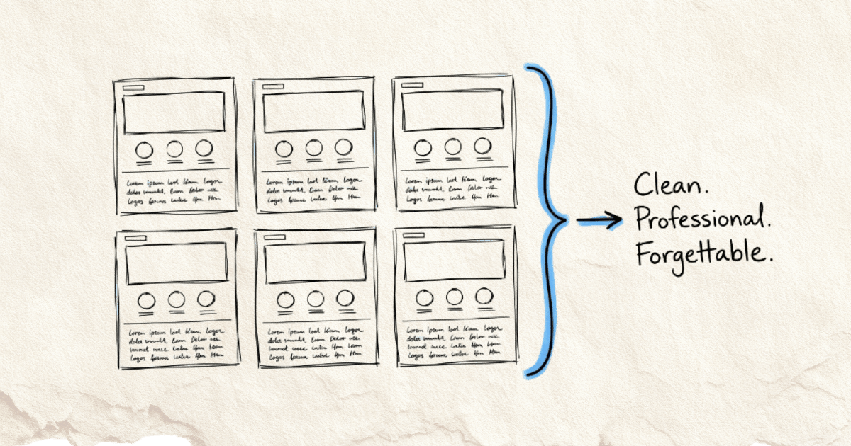
I recently reviewed 21 service business homepages in Singapore.
Different industries. Different budgets. Different designs.
Same problem.
Almost every single one was built like a corporate brochure.
When the page does not differentiate, how AI describes your business usually cannot either — models are working off the same thin signals your visitors see.
Hero banner with a vague tagline.
A row of services.
A badge claiming “trusted” or “leading” or “award-winning.”
A wall of logos.
A contact form at the bottom.
Clean. Professional. Forgettable.
If you are thinking about fixing that through a redesign, choosing the right web design company matters because the wrong partner can simply give you a better-looking version of the same generic problem.
And here’s the thing: these weren’t bad businesses. Most of them were doing solid work, with real clients and real results.
But their homepage didn’t show that. It described the business. It didn’t help anyone decide.
That distinction is small. The difference in results is not.
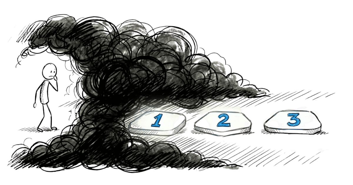
If your homepage looks like everyone else in your industry, visitors can’t tell you apart. So they do what people do when things look the same:
They compare on price.
Or they leave.
This article is about what separates a homepage that converts from one that just sits there.
Not design trends. Not clever copywriting tricks.
But the underlying structure that within a first few seconds makes a visitor think:
“This is exactly who I need.”
A homepage has one job: guide a decision
When someone lands on your homepage, they aren’t reading. They’re scanning for answers to three questions: what does this business offer, how will that help me, and what do I need to do to get it.

That’s it. Everything else exists to support those three questions. If it doesn’t help answer them, it’s noise.
Most homepages get this backwards. They’re organised around what the business wants to say, not what the visitor needs to know. They describe the company instead of guiding a decision.
A decision-focused homepage does two things. It removes friction for the right visitors, making it easy for serious prospects to understand your value and take the next step. And it filters, quietly signalling who this is for and who it isn’t, so you spend less time on bad-fit conversations.
If you want to go deeper on this way of thinking, this piece on the website as a decision system covers the full philosophy. Here’s what it looks like in practice.
What a decision-focused homepage actually contains
Here’s where most “homepage guide” articles hand you a checklist. That’s not what this is.
A checklist tells you what to include. It doesn’t tell you why each element is there, or what it’s supposed to do for the visitor standing in front of it.
So instead of a list, think of your homepage as a story with a specific job. Each section moves the visitor one step closer to a decision. Remove any section and you create a gap. Fill a section with the wrong content and you create friction.
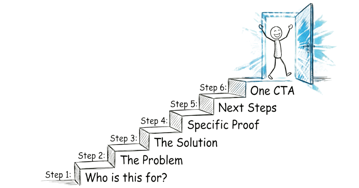
Here’s how a decision-focused homepage is structured, and what each part is actually doing.
Above the fold: Answer “is this for me?” in seconds
The first thing a visitor sees before they scroll is the most valuable real estate on your entire website. Most businesses waste it on a vague tagline and a stock photo.
What belongs above the fold is a clear, specific answer to the visitor’s first question: am I in the right place?
That means your positioning needs to be immediately obvious. Who you help. What you help them with. Why it matters to them. Not your company name in large letters. Not “welcome to our website.” Not “your trusted partner in [industry].”
If a visitor has to scroll or think hard to figure out what you do, you’ve already lost most of them.
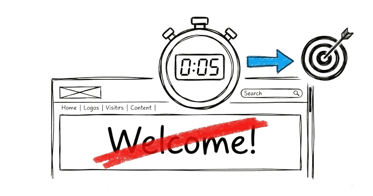
The test is simple. Show your homepage to someone unfamiliar with your business. Within five seconds, can they tell you who it’s for and what it does? If they hesitate, the positioning isn’t clear enough.
The problem: Make the visitor feel understood
After the visitor decides they’re in the right place, the next thing they need to feel is understood.
This is the section most homepages skip entirely. They jump straight from their tagline to their services. But there’s a gap in between that needs to be bridged.
Naming the problem your visitor is experiencing, in their language, does something that no amount of feature-listing can do. It signals that you get it. That you’ve seen this before. That you’re not just another provider describing what they sell.
When a visitor reads a description of their own situation on your homepage, they lean in. The page stops feeling like a brochure and starts feeling like a conversation.
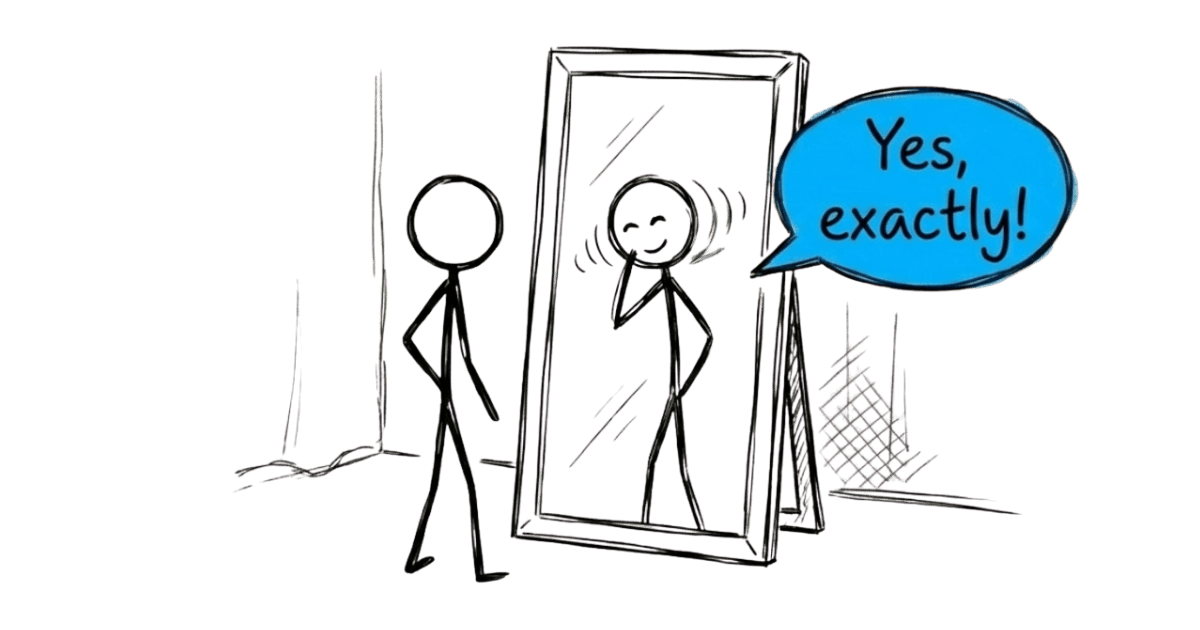
This doesn’t need to be a long section. A few sentences that accurately describe the frustration, the situation, or the gap your visitor is trying to close. The goal is recognition. “Yes, that’s exactly what I’m dealing with.”
The solution: Explain what you do and why it works
Now that the visitor feels understood, they’re ready to hear about you.
This is not a services list. A services list tells visitors what you offer. This section should explain what you do, how it works at a high level, and why that approach gets results.
The distinction matters. A services list makes the visitor do the work of connecting your offer to their problem. A well-written solution section does that work for them.
Here’s what that looks like in practice.
Services list (what most homepages do)
- Corporate Tax Filing
- GST Submission
- Bookkeeping
- Financial Statements
Solution-focused (what a decision homepage does)
“Most small business owners spend more time chasing receipts and stressing over deadlines than actually running their business. We handle the books, the filings, and the compliance, so you always know where your numbers stand and never miss a deadline again.”
Same business. Same services underneath.
But one makes the visitor do the work of figuring out whether this is relevant to them. The other speaks directly to the situation they’re already in.
That’s the difference between describing what you sell and explaining why it matters.

Think about the specific shift your service creates. What does a client’s situation look like before they work with you, and what does it look like after? That before-and-after is the core of what belongs here.
Keep it clear. Keep it specific. Avoid the trap of sounding like every other provider in your space. Generic language like “tailored solutions” and “end-to-end service” adds words without adding meaning.
Proof: Show it, don’t claim it
Every business claims to be good. Proof is what separates the claim from the reality.
But not all proof is equal, and this is where most homepages get it wrong.
The typical approach: collect a handful of testimonials, pick the most glowing ones, and display them. The problem is that generic praise, “great service, highly recommend,” doesn’t move anyone. It’s forgettable because it could apply to any business in any industry.

Effective proof is specific and deliberate. It reinforces your positioning. It addresses the hesitations your ideal client carries. It shows results, not just satisfaction.
A testimonial that says “we used to get price-sensitive enquiries constantly, now the clients who reach out already understand our value” does more work than ten five-star reviews.
The question to ask about every piece of proof on your homepage: does this make my ideal visitor more confident, or is it just there to fill space?
Proof should also be placed where it does the most work, near the claims it supports, not all grouped at the bottom as an afterthought.
How it works: Remove uncertainty about what happens next
Even when a visitor is convinced you’re the right fit, there’s one more thing that stops them from reaching out.
They don’t know what happens after they click.
Will someone call them immediately? Is this a long sales process? Will they be pressured? Will they feel awkward if they decide it’s not right?
This uncertainty is friction. And it kills more enquiries than most business owners realise.
A simple “how it works” section addresses this directly. Not a detailed internal process document. Just a clear, plain-language description of what the first few steps look like after someone reaches out.
What happens first. How long it takes. When any real commitment begins.
When the next step feels predictable and low-risk, more of the right people take it. If you want a detailed breakdown of how to build this section properly, this piece on the post-contact roadmap covers it in full.
The call to action: One clear next step
Every section of your homepage has been building to this moment. The visitor understands your offer, feels you get their situation, trusts your credibility, and knows what comes next.
Now you need to ask for one thing. Just one.
The most common CTA mistake is being vague. “Get in touch.” “Contact us.” “Let’s talk.” These tell the visitor nothing about what they’re committing to or what they’ll get.
A stronger CTA names the action and reduces the perceived risk. “Book a 15-minute clarity call” is more specific and less intimidating than “contact us.” “Get your homepage diagnosed” is more compelling than “get in touch.”
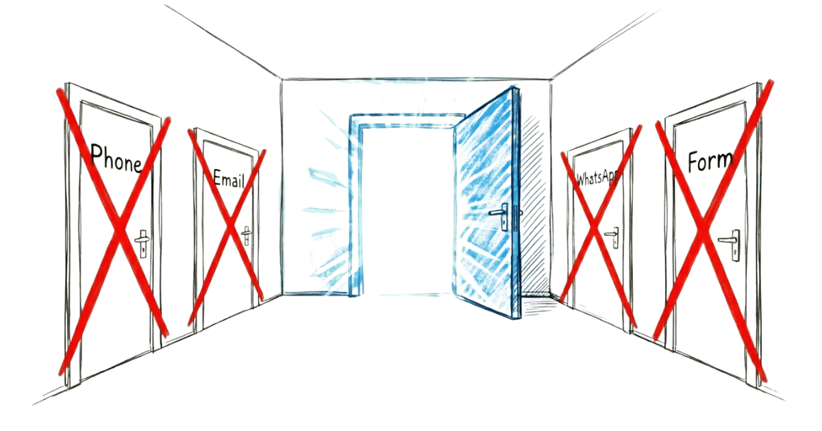
One CTA per page. Not three different options. Not a form, a phone number, an email address, and a WhatsApp button all competing for attention. When you give visitors too many options, many of them choose none.
Make the next step obvious. Make it feel safe. Then ask clearly.
A homepage that converts isn’t about design
Most businesses jump into a redesign when they decide their homepage isn’t working. New layout. New colours. New photos.
And they end up with a homepage that looks different but behaves the same. Because the problem was never the design.
The problem is clarity.

Every month with a homepage that doesn’t convert is a month of leaking enquiries from traffic you’re already paying for. Visitors land, can’t tell you apart from the next option, and do the only thing that makes sense to them: they ask who’s cheaper.
You shouldn’t need to discount to get chosen. But that’s what happens when your homepage doesn’t make your value obvious fast enough.
A clearer homepage fixes both problems. The right visitors recognise themselves in it and reach out. The wrong ones self-select out. And price stops being the default conversation.
That’s exactly what the Homepage Conversion Blueprint is built to do. A structured process that gives you a clear, section-by-section plan your team can implement, without a risky redesign.
Book a Homepage Clarity Call if you’d like a quick read on where your homepage stands.

Frequently Asked Questions
What makes a great homepage for a service business?
A great homepage for a service business helps visitors decide, not just browse. It answers three questions clearly: what you offer, how it helps them, and what to do next. When the right visitor lands and immediately understands your value, that’s a homepage doing its job.
What should be on a service business homepage?
A service business homepage should include clear positioning above the fold, a description of the problem you solve, an explanation of your solution, specific proof that supports your claims, a simple explanation of how to get started, and one clear call to action. Each element should move the visitor one step closer to a decision, not just add information to the page.
What do visitors look for on a homepage?
Visitors come to a homepage looking for answers to three things: what the business offers, how that helps them specifically, and what they need to do to get it. They’re not reading carefully. They’re scanning for signals that tell them whether they’re in the right place.
What sections should a homepage include?
A decision-focused homepage typically includes a positioning statement, a problem section that names the visitor’s frustration, a solution section that explains your approach, proof that reinforces your positioning, a how-it-works section that clarifies next steps, and a single call to action. The order matters as much as the sections themselves.
What is the most important element on a homepage?
Clear positioning above the fold. If a visitor can’t tell within a few seconds who you help and what you do for them, most of them will leave before seeing anything else on the page. Everything else on the homepage only gets read if the first impression earns it.
How should a homepage be structured?
A homepage should be structured around the visitor’s decision journey, not the business’s preferred talking points. Start by answering whether they’re in the right place, then make them feel understood, then explain your solution, then show proof, then make the next step feel safe and obvious. Think of it as a sequence, not a collection of sections.
How can a homepage convert visitors into enquiries?
A homepage converts when it reduces the friction standing between a visitor and taking the next step. That means clear positioning, specific proof, and a next step that feels predictable and low-risk. Visitors don’t hesitate because your offer is weak. They hesitate because something on the page creates doubt or uncertainty.
Why do some homepages fail to generate leads?
Most homepages fail because they’re built to describe the business rather than guide a decision. They lead with vague claims, list services without explaining value, and use proof that doesn’t connect to the visitor’s real hesitations. The result is a page that looks professional but gives the visitor no strong reason to act.
What makes visitors trust a service business website?
Trust on a homepage comes from specificity, not claims. Vague statements like “trusted” or “leading” register as noise. What builds trust is specific proof: testimonials that reflect real outcomes, clear explanations of how you work, and honest signals about who you’re a good fit for and who you’re not. When a homepage is honest about its positioning, the right visitors trust it faster.

About the author
Thiam Hock is the founder of Hockworks. He helps service businesses turn their websites into decision systems: clearer positioning, stronger proof, and a next step that feels predictable and low-risk. His work focuses on clarity and differentiation, not design trends.
Read more about Thiam Hock →