Make Service Homepages Convert: Visual Hierarchy with WCAG 7:1
Make your service homepage convert. Practical rules on scale, color, type, WCAG 7:1 contrast, measurable testing, and a Hockworks blueprint for service sites.
An effective homepage visual hierarchy makes your primary value proposition and your main call to action the two clearest, most visible things on the first screen. Everything else, your scale, your color, your type, your spacing, exists to support that priority. Get this wrong and even a beautiful homepage leaves visitors confused about what you do and what to click. Get it right, and you still need accessible contrast and real testing to confirm it actually works.
TL;DR:
- Limit visual hierarchy to one or two dominant elements per screen to avoid clutter and ensure clear focus on the value proposition and call to action.
- Use a maximum of three font size tiers, emphasizing contrast and weight to highlight important content, and group related elements with ample white space for clarity.
- Design the layout to follow either an F-pattern or Z-pattern, placing key elements like headline, CTA, and supporting imagery in their natural eye-scan regions.
- Ensure the hero section communicates a specific outcome with a clear benefit, supported by a single, high-contrast CTA and relevant visuals to maximize instant understanding.
- Test hierarchy elements with analytics tools, focusing on CTA click-throughs, scroll depth, and attention heatmaps to confirm effective visitor engagement.
Table of Contents
- Core principles for homepage visual hierarchy
- How eye-scanning patterns should shape your layout
- Hero and CTA rules for a one-glance value proposition
- Accessibility and legibility during implementation
- Navigation choices that support quick scanning
- Content and microcopy that reinforce hierarchy
- Testing and metrics that confirm hierarchy works
- How Hockworks applies hierarchy to reduce decision friction
- A simple rule for homepage clarity
- Get a homepage blueprint built around this hierarchy
- FAQ
- Sources
Core principles for homepage visual hierarchy
Visual hierarchy comes down to five levers, and homepages tend to fail when designers reach for all five at once instead of picking which element truly deserves attention.
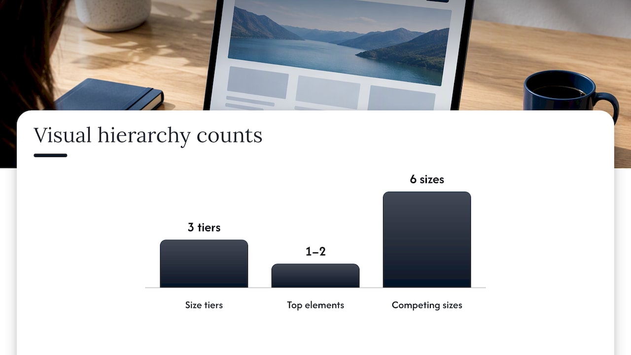
Start with scale. Limit yourself to one or two visually dominant elements per screen, and cap your overall size range at three distinct tiers: large (headline), medium (subhead and CTA), small (body copy and labels). A homepage with six different font sizes competing for attention reads as noise, not structure.
Color and contrast work together, not separately. A saturated accent color on your primary CTA button helps it stand out, but contrast and weight do the heavier lifting. A pale orange button on a white background can lose to a bold gray one if the gray has better contrast and more visual weight.
Typography should follow a clear descent: headline, then subhead, then body, each stepping down on a modular scale rather than an arbitrary one. Grouping and white space finish the job. Related elements, a headline and its supporting bullets, a testimonial and its CTA, should sit close together, with generous space separating unrelated sections so the eye knows where one idea ends and the next begins.
Quick rules worth keeping on hand:
- Never let more than two elements compete for “most important” status on one screen.
- Use white space to separate ideas, not just to look clean.
- Reserve your most saturated color for the one action you most want taken.
- Match font size to actual importance, not to what looks nice in isolation.
How eye-scanning patterns should shape your layout
Homepages tend to follow one of two scanning patterns, and picking the right one depends on how much text competes for attention. Homepage design research shows that text-heavy pages get read in an F-pattern, where attention drops sharply after the first few lines, while simpler, visual-first pages like landing-style homepages get scanned in a Z-pattern that moves from top-left to top-right, down to bottom-left, then across to bottom-right.
A practical sequence for applying this:
- Place your headline and logo in the top-left, where both patterns start.
- Put your primary CTA where the eye naturally lands next, typically top-right or centered in the hero.
- Use supporting imagery or a short video to anchor the middle of the Z, reinforcing the claim in your headline.
- Add a visual cue, a partial content block or a faint arrow, right at the fold to invite scrolling rather than leaving the page looking finished.
Matching your layout to the pattern your content naturally produces saves visitors from having to hunt for information you already know they want.
Hero and CTA rules for a one-glance value proposition
Your hero section carries more weight than any other part of the homepage. Eye-tracking research indicates that a large share of visitor attention concentrates there, and that people form a judgment about a page within two to three seconds, which means the hero has to do its job almost instantly.
A dependable formula, drawn from conversion-focused value proposition guidance, looks like this:
- Write a headline that names a specific, outcome-focused result, not a vague mission statement.
- Follow it with one clarifying sentence and three short supporting perks or benefits.
- Give the page a single dominant CTA in a high-contrast color, and if you need a second action, make it visually quieter, a text link rather than a second button.
- Use an authentic photo or a brief demo clip that backs up the claim in your headline rather than generic stock imagery.
Pro Tip: If you can’t summarize your hero’s message in one breath, your visitor won’t be able to either.
Accessibility and legibility during implementation
Hierarchy that isn’t readable isn’t hierarchy at all. WCAG contrast guidance recommends a 7:1 contrast ratio for normal text to meet the enhanced level, with lower thresholds allowed for larger text, such as 18-point type or 14-point bold.
A 7:1 contrast ratio is the enhanced WCAG benchmark for normal-sized text, and meeting it means your hierarchy still works for visitors with low vision, not just for people with perfect screens in perfect lighting, according to W3C’s contrast guidance.
A short checklist to carry into implementation:
- Check every text and background pairing against the 7:1 threshold, with allowances for large or bold type.
- Use a modular type scale so headline, subhead, and body sizes stay proportional across breakpoints.
- Never rely on color alone to signal importance; pair it with weight, size, or shape.
- Lock your scale and spacing into design tokens so hierarchy survives handoff to development.
Navigation choices that support quick scanning
Navigation should help visitors complete a task, not compete with your hero for attention. Group related links together rather than scattering them, and start link labels with the verb or task a visitor is trying to accomplish, “Book a consultation” rather than “Consultation.”
Keep the navigation bar visually simpler than your hero. Older but still relevant homepage usability guidelines warn that over-styled navigation or banner-like sections can get dismissed as advertising, causing visitors to skip right past them.
A few habits worth adopting:
- Group navigation items by task or audience, not by internal department names.
- Start each link label with an action word.
- Make your homepage visually distinct from interior pages so returning visitors reorient instantly.
- Offer a short features list or jump-link anchors for visitors who want to scan rather than scroll.
Content and microcopy that reinforce hierarchy
Your words carry as much hierarchy weight as your layout. A headline and subhead should answer “what do you do for me?” in plain language, with no jargon standing between the visitor and the answer.
Write CTAs that state the benefit, “Get your free estimate,” not “Submit.” Start every clickable link with a verb. Skip decorative stock imagery that visitors have learned to tune out as advertising, and use real, relevant visuals instead. Place testimonials and proof points near your CTA, but keep them visually smaller than the action itself.
- Lead headlines with the outcome, not the process.
- Make CTA copy describe the benefit, not the mechanics.
- Choose images that document real work, not generic stock scenes.
Testing and metrics that confirm hierarchy works
Hierarchy decisions are only as good as the evidence behind them, which may include using sophisticated analytics and automation that supports testing and personalization from providers like AdaptAI. Track CTA click-through rate, conversion rate, bounce rate, scroll depth, and smaller micro-conversions like newsletter signups to see whether your changes actually move behavior.
A simple roadmap:
- Test one variable at a time, headline, CTA color, or hero image, against a clear KPI.
- Plan your sample size before launch so you’re not reading results too early.
- Layer in heatmaps and session recordings to see where attention actually lands versus where you intended it to land.
- Run small, sequential experiments and pair the numbers with direct user feedback before rolling out a bigger change.
Pro Tip: A heatmap showing nobody notices your CTA tells you more than a dozen internal opinions ever will.
How Hockworks applies hierarchy to reduce decision friction
When we build a homepage blueprint, we treat visual hierarchy as inseparable from messaging. Our process starts by diagnosing where visitors hesitate, then maps a clear path: dominant value proposition, supporting proof, and a single obvious next step, into a structured plan with a video walkthrough.
- We review existing homepage traffic and enquiry quality to find where clarity breaks down.
- We capture language straight from customer conversations so the headline matches how buyers actually think.
- We place proof points where they reduce hesitation without competing with the primary CTA.
We recommend this process most for service businesses that already get traffic but keep attracting the wrong kind of enquiry, a sign that the homepage’s decision friction sits in messaging and layout rather than in volume.
A simple rule for homepage clarity
If I had to boil down years of reviewing homepages into one rule, it’s this: clarity beats decoration every time. A visitor forgives plain design far faster than they forgive confusion about what you do.
— Fadly
Get a homepage blueprint built around this hierarchy
Reading about visual hierarchy is useful, but applying it to your own homepage while running a business is a different task entirely. Our Homepage Blueprint gives service businesses a structured, conversion-focused plan: messaging clarity, proof placement, and a CTA strategy, delivered with a video walkthrough your team can implement without a full redesign.
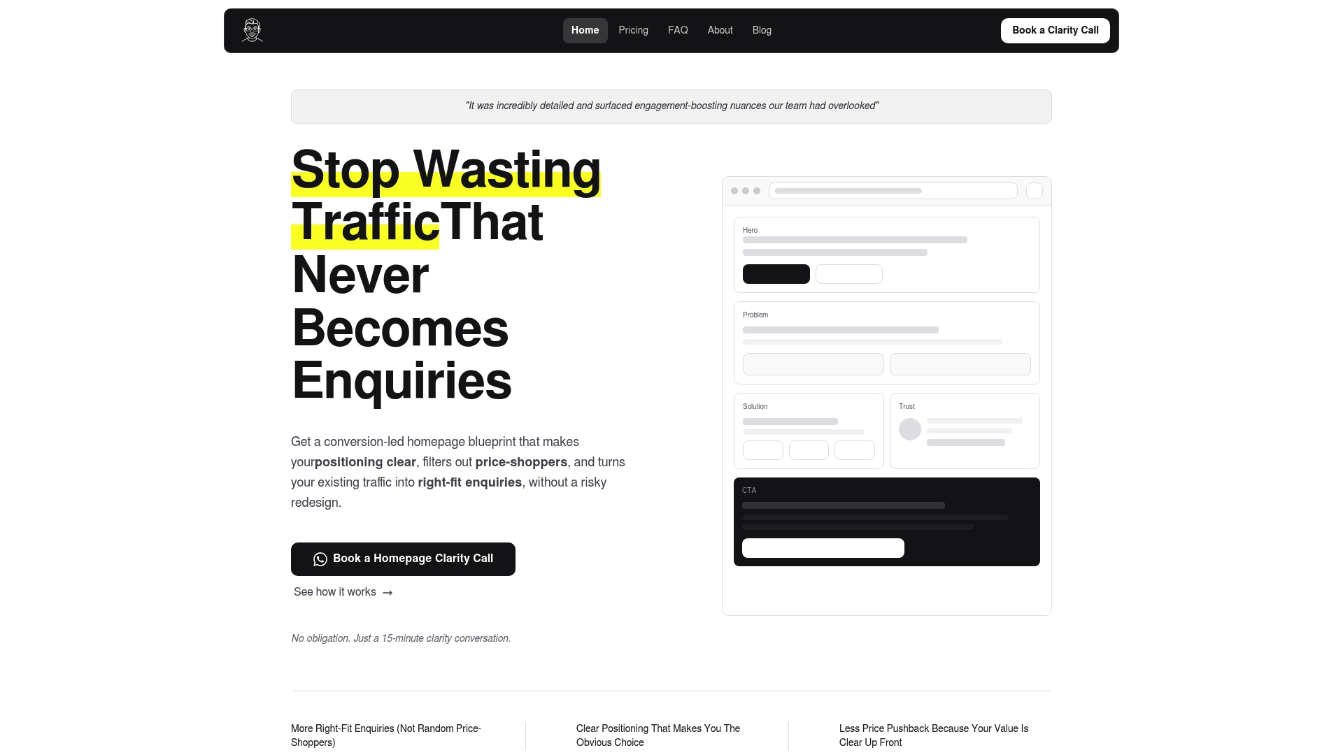
This fits best if your site already gets visitors but the enquiries that come through aren’t the right fit, a pattern we see often in established service firms selling considered, higher-value work.
- Homepage blueprint: 480 SGD one-off, see full pricing.
- Homepage plus About page blueprint: see the full pricing on our pricing page.
- Full site blueprint: see the full pricing on our pricing page.
- Not ready to commit: request a Free Website Review first.
If you’re weighing a full rebuild against a sharper homepage first, our free review gives you a clear read on where your current page loses people before you spend on either.
FAQ
What is visual hierarchy on a website?
Visual hierarchy is the deliberate arrangement of size, color, contrast, and spacing so visitors notice the most important content first. On a homepage, that means your value proposition and primary call to action should be the clearest elements on the first screen.
What are some examples of visual hierarchy?
Common examples include a large bold headline above smaller supporting text, a brightly colored CTA button against a neutral background, and white space separating one section of content from another. Grouping related items, like a testimonial next to the offer it supports, is also a form of visual hierarchy.
What is the hierarchy of a website structure?
Website structure hierarchy refers to how pages and navigation are organized, typically starting with the homepage, then category or service pages, then individual detail pages. On the homepage itself, visual hierarchy guides attention from headline to subhead to call to action in that order.
What are the 7 principles of web design?
Definitions vary across sources, but commonly cited principles include balance, contrast, emphasis, consistency, unity, hierarchy, and white space. For homepage work specifically, hierarchy and contrast tend to matter most because they determine whether visitors understand your offer within the first few seconds.
How much does a homepage redesign cost?
Pricing depends on scope: our Homepage Blueprint runs 480 SGD one-off, while a Homepage plus About page combination runs 680 SGD one-off, and a full site blueprint price is available on our pricing page. A Free Website Review is also available for businesses unsure where to start.
Sources
- Homepage design: 5 fundamental principles - NN/g
- Understanding Success Criterion 1.4.6: Contrast (Enhanced) | WAI | W3C
- Value proposition: Shopify blog
Recommended

About the author
Thiam Hock is the founder of Hockworks, a Singapore-based digital advisory focused on clarity-driven websites. He works with service businesses to design websites that guide decisions, filter the right enquiries and reduce hesitation. His perspective centres on positioning, differentiation and how visitors actually make decisions in competitive markets.
Read more about Thiam Hock →