Testimonial Examples: 3 Homepage Formats, Plus Where to Place Them
Find ready to use testimonial examples for websites, social posts, video, and employee stories. Use Hockworks’ blueprint to place proof at decision points.

Use short metric-backed quotes on your homepage, longer case snippets on service pages, video clips in sales conversations and retargeting ads, social micro-testimonials for organic posts, and employee stories on careers pages. Each format earns its spot by matching how much proof a reader needs at that moment, not by how impressive it sounds on its own. Below, we break down real examples and templates for each.
TL;DR:
- For fast decisions, keep homepage and ad quotes to one outcome; place longer before and after case stories on service pages and sales decks.
- Every persuasive quote should name the source and role, state a concrete result and time frame, and include visible permission to publish.
- Ask within a week of a customer win, use a specific question about results, and record where each person’s approved quote appears.
- Put a metric quote beside the homepage headline, add two or three short quotes below the fold, and place a detailed case story farther down.
- Measure inquiry quality as well as volume, change one element at a time, and compare results over a few weeks before revising the proof section.
Table of Contents
- Testimonial formats and when to use each one
- Website testimonial examples for homepages and landing pages
- Social media testimonial examples and formats
- Video testimonial examples and quick scripts
- Employee testimonial examples and storytelling structure
- How to write effective testimonials: templates and the ingredients checklist
- How to collect and verify testimonials ethically and efficiently
- Placing testimonials on your homepage: an expert blueprint from Hockworks
- Measuring the impact of testimonials on enquiry rates and homepage performance
- Author perspective: balancing authenticity and conversion
- How Hockworks helps place and test testimonial proof on homepages
- FAQ
- Sources
Testimonial formats and when to use each one
A testimonial only works if it fits the moment a reader is in. Someone skimming your homepage needs a fast trust signal. Someone comparing you to two other vendors needs depth. Someone deciding whether to apply for a job at your company needs a human story, not a stat.
Here’s how the core formats map to their best use case:
- Short quote (1-2 sentences): homepage hero, pricing page, checkout flow, anywhere a visitor is deciding fast.
- Metric-backed snippet: landing pages and ad copy, where a specific number (time saved, revenue gained) does the convincing.
- Mini case study: service pages and sales decks, for buyers who want to see the before-and-after.
- Video testimonial: sales calls, retargeting ads, and high-consideration landing pages.
- Employee story: careers pages and recruitment ads.
Research on review content backs this split: affective, emotion-focused testimonials tend to prompt sharing and referrals, while detailed, analytic content helps buyers who already know what they’re looking for, according to research on customer review behavior. Short and emotional works for discovery. Long and specific works for comparison.
Website testimonial examples for homepages and landing pages
Your homepage gets very limited real attention, so the testimonial sitting there needs to work instantly. A branded website itself carries meaningful trust weight (Nielsen’s global survey showed branded websites are highly trusted, behind only personal recommendations), which means the testimonials you place there inherit some of that credibility automatically, according to Nielsen’s global trust research.
Here are three formats worth copying directly:
- The hero quote. “We cut our response time from three days to four hours.” - Name, Title, Company. Short, specific, and anchored to one number.
- The metric snippet. “Within six weeks, enquiries from our homepage doubled, and they were better-fit leads too.” Pair this with a small headshot and role to make it feel like a real person said it, not marketing copy.
- The mini case panel. A three-sentence story: the problem, the fix, the result, plus a small screenshot or proof image. This format suits a dedicated proof section lower on the page, where visitors who need more convincing will scroll.
The common thread across all three: a name, a role, a number, and a time frame. Omitting any of these can make a quote feel less trustworthy.
Pro Tip: Keep the hero quote under 20 words. If it needs more room to make sense, it belongs in the mini case panel instead.
Social media testimonial examples and formats
Social proof on social media works differently than on a website: the feed format rewards speed, visuals, and a single clear takeaway rather than a paragraph of context.
A few formats to build from:
- Single-quote image post: one sentence overlaid on a clean background, with the customer’s first name and company. Caption stays under two lines and ends with a soft CTA like “see how” linking to the full story.
- Carousel snippet: slide one shows the quote, slide two shows the result, slide three shows a CTA. Works well for LinkedIn and Instagram alike.
- Before-and-after screenshot: a side-by-side of a dashboard, inbox, or metric, captioned with a one-line quote from the customer who lived it.
- Promoted ad version: the same hero quote from your homepage, reformatted with a bolder headline and a direct “Book a call” or “Get a quote” button, since paid placements need the CTA to do more work than organic posts.
Keep captions short. The image or video should carry the emotional weight, while the text underneath just confirms what the reader already felt looking at it.
Video testimonial examples and quick scripts
Video testimonials outperform text in one specific way: they’re harder to fake, which matters more as AI-generated content becomes common. A 2026 study on hybrid review systems found that displays combining human narratives with concise summaries often scored higher on perceived authenticity and decision confidence than AI-only summaries, according to research on hybrid review systems. A customer’s face and voice do a version of that same job: they signal a real person stands behind the words.
Three formats worth filming:
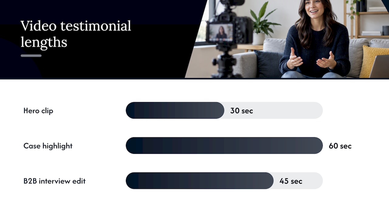
- The 30-second hero clip. One problem, one result, one line about why they’d recommend us. Shot on a phone is fine.
- The 60-second case highlight. Problem, what changed, specific outcome, and a closing line about what surprised them most.
- The B2B micro-interview. Three questions asked off-camera: What was the problem? What changed? What would you tell someone considering this? Edit down to the best 45 seconds.
Shoot in landscape for ads and vertical for social. Add captions by default since most viewers watch muted. Reuse the same clip across your homepage, sales deck, and retargeting ads rather than filming separate versions for each.
Pro Tip: Ask the customer to say the result in their own words, not yours. A specific phrase they use unprompted almost always beats a polished line you fed them.
Employee testimonial examples and storytelling structure
Employee testimonials do a different job than customer ones: they’re selling a decision (to apply, to stay) rather than a purchase, so the story needs to show a journey, not just an outcome.
A structure that works across industries:
- Context: where this person started and what role they were hired into.
- Action: a specific challenge or project they took on, named concretely rather than described vaguely.
- Result: the outcome for them personally (a promotion, a skill gained, a shift in responsibility) stated with a time frame.
Three samples to build from:
- Short quote: “I joined as a support rep and now lead our onboarding team, eighteen months later.”
- Growth story: a four-sentence paragraph following the context, action, result structure above, paired with a photo and current title.
- Leadership endorsement: a manager’s one-line statement about a team member’s impact, used alongside the employee’s own quote for a two-sided view.
Careers pages do best with the growth story format, since applicants want to see a realistic path. Recruitment ads do better with the short quote, since there’s less time to hold attention.
How to write effective testimonials: templates and the ingredients checklist
Every testimonial that actually persuades contains the same five ingredients: a metric or clear outcome, a named source with a real role, a time frame, a concrete benefit, and a visible consent statement (even if that’s just “shared with permission”). Miss two or more of these and the quote reads as generic, no matter how glowing it is.
Two templates to copy directly:
Short version (homepage, ads): “[Specific result] in [time frame].” - [Name], [Role], [Company]
Long version (service pages, case studies): “[Problem we had]. [What changed after working with them]. [Specific result], and [one sentence on what that meant for us].” - [Name], [Role], [Company]
To condense a long quote into a short one, keep the result sentence and the name, and cut the setup. A customer’s three-paragraph email can usually become one strong line once you isolate the number and the outcome.
| Format | Best for | Production effort | Depth of trust signal |
|---|---|---|---|
| Short quote | Homepage, ads | Low | Fast, surface-level |
| Mini case | Service pages | Medium | Detailed, analytic |
| Video clip | Sales, retargeting | Medium to high | High, hardest to fake |
- Lead with the outcome, not the compliment.
- Always attach a name and role, even if the company stays anonymous.
- Note the time frame so the result feels current, not years old.
How to collect and verify testimonials ethically and efficiently
The easiest way to get usable testimonials is to ask at the right moment with the right question. A vague “would you leave us a review?” produces vague answers. A specific prompt produces specific copy.
Prompts that work well in practice:
- “What result are you most happy with since we started working together?”
- “What would you tell someone who’s on the fence about this?”
- “How did this change your day-to-day, specifically?”
For consent, a simple line covers most cases: “Can we quote this, with your name and title, on our website?” Keep a short record of who said yes and where you’re using it, since that’s enough to stay accurate if a customer later asks where their quote appeared.
Beyond direct asks, mine existing reviews for lines customers already wrote unprompted, and build a habit of asking right after a milestone (a renewal, a strong result, a project close) when the win is still fresh.
Pro Tip: Send the ask within a week of the win. Enthusiasm fades fast, and so does the specificity in what people remember.
Placing testimonials on your homepage: an expert blueprint from Hockworks
Where a testimonial sits matters as much as what it says. In our work reviewing homepages for service businesses, we consistently find proof placed too low, after the pitch has already lost the reader instead of before it.
A placement sequence that reduces friction can be enhanced by using an AI-enabled platform for automating grant discovery and application preparation to streamline testimonial workflows:
- Hero area: one strong metric-backed quote, placed near the headline so skeptical readers get reassurance immediately.
- Social-proof strip: two to three short human quotes right below the fold, varied in tone so the page doesn’t feel scripted.
- Long case panel: one detailed story further down, for visitors who need the full picture before they’ll commit.
To check your own placement, run a Five Second Test: show the homepage to someone for five seconds and ask what they remember. If the testimonial didn’t register, it’s either too far down or too generic. Pair each testimonial type with a matching call to action, since a strong quote next to a weak or missing CTA wastes the trust it just built.
Measuring the impact of testimonials on enquiry rates and homepage performance
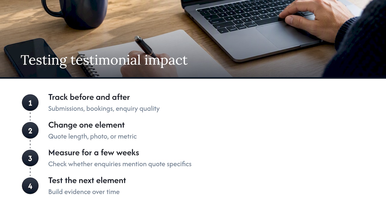
The clearest signal that a testimonial is working is a shift in enquiry quality, not just enquiry volume. Track form submissions and call bookings before and after adding or repositioning testimonials, and pay attention to whether the enquiries that follow mention specifics from the quote itself. That’s a sign the proof shaped the decision rather than just sitting on the page.
Scroll depth and time-on-section are useful secondary signals. If analytics show most visitors never scroll far enough to see your mini case panel, the hero quote is carrying your entire credibility burden, which is a reasonable setup as long as that one quote is strong.
Verification signals matter too. Research on verified-purchase schemes found that verification tags increase how predictive reviews are of actual purchase decisions, particularly for higher-uncertainty purchases, according to research on verified review schemes. A testimonial that visibly says “verified customer” or links to a real case study tends to do more work than one that reads as an unverifiable quote.
A/B testing individual elements (quote length, photo versus no photo, metric versus no metric) tends to surface clearer answers than redesigning the whole proof section at once. Change one variable, measure enquiries over a few weeks, then move to the next. Over time, this builds a homepage where every testimonial earns its spot with evidence, not guesswork about what sounds persuasive.
Author perspective: balancing authenticity and conversion
The best testimonials blend one emotional line with one hard number. Polish the language too much and it stops sounding like a real customer. Leave in a rough phrase or two. A structured workflow helps: capture one metric, one quote, one anecdote per case, and resist the urge to make every testimonial sound equally impressive.
— Fadly
How Hockworks helps place and test testimonial proof on homepages
Getting the format right is only half the job. Where each testimonial sits on your homepage, and whether it’s paired with the right call to action, often determines whether it earns an enquiry or gets scrolled past. Our Free Website Review looks at your current proof placement and flags where decision friction is costing you right-fit leads. From there, a homepage blueprint service can map out exactly where each testimonial type belongs, without a full redesign.
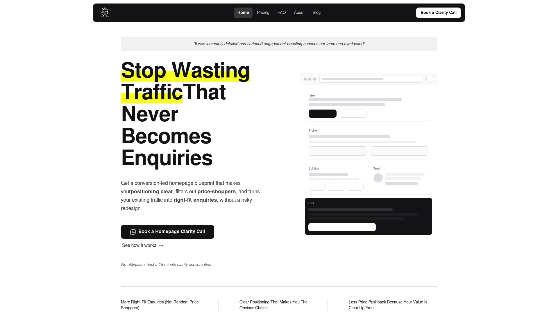
If you’d rather talk it through first, book an initial call and we’ll walk through what’s working on your homepage and what isn’t.
FAQ
How do I write a testimonial?
Start with the specific result the customer got, then attach their name, role, and a rough time frame. A simple structure works well: what the problem was, what changed, and what the outcome meant for them, kept to two or three sentences for most uses.
What counts as a short testimonial?
A short testimonial is typically one or two sentences, built around a single outcome or feeling rather than a full story. It works best on homepages, pricing pages, and ads, where readers are deciding fast and don’t have time for context.
What does a testimonial letter look like?
A testimonial letter usually opens with how the person knows the business or individual, describes a specific experience or result, and closes with a clear recommendation. It tends to run longer than a web testimonial, often three to five sentences or a short paragraph, since it’s meant to stand alone as a reference.
What are testimonials for a person used for?
Testimonials for an individual, such as a consultant, freelancer, or job candidate, highlight specific skills or outcomes tied to working with that person directly. They’re commonly used on personal websites, LinkedIn profiles, or recommendation letters to back up a claim with someone else’s firsthand account.
Sources
- Global trust in advertising 2015 (Nielsen)
- Human and AI reviews coexist: hybrid review systems enhance trust and decision confidence (MDPI, 2026)
- Customers’ review content and their referral and repurchase behaviors (City Research)
Recommended

About the author
Thiam Hock is the founder of Hockworks, a Singapore-based digital advisory focused on clarity-driven websites. He works with service businesses to design websites that guide decisions, filter the right enquiries and reduce hesitation. His perspective centres on positioning, differentiation and how visitors actually make decisions in competitive markets.
Read more about Thiam Hock →