Designers: 5 Accessibility Checks for Homepage Scroll Cues
Five point accessibility checks and CSS first code patterns for designers. Know when to add homepage scroll cues and how to QA them.
Add scroll cues only when your layout genuinely fails to hint that more content follows, and even then, keep it minimal. A staggered chevron pair, a slim progress bar, or a CSS ScrollTimeline animation cover almost every real case, and all three must bow to prefers-reduced-motion. Hockworks treats this as a design decision with a test, not a default add-on.
TL;DR:
- Most scroll cues should be hidden on mobile devices and when the user has enabled reduced motion settings to avoid accessibility issues.
- Implementing CSS-only indicators like chevrons or gradients is preferred, with scroll-driven animations as a progressive enhancement where supported.
- Layout fixes, such as revealing content peeks or repositioning headings, are more effective than scroll cues for guiding user attention below the fold.
- Use feature detection and accessibility checks to ensure scroll cues do not cause motion sickness, conflict with keyboard navigation, or generate unnecessary performance load.
- Measure engagement through analytics and consider disabling or replacing cues if user interactions with them are minimal after testing and data collection.
Table of Contents
- Choosing The Right Scroll Cue For Your Homepage
- How To Implement Scroll Cues Step By Step
- Accessibility And Performance Checklist Before Launch
- Skip The Cue And Fix The Layout Instead
- Code Patterns And A Pre-Launch Deploy List
- What Hockworks Sees In Homepage Blueprints
- An Honest Take On Scroll Cues And What To Test Instead
- Sources
- FAQ
Choosing The Right Scroll Cue For Your Homepage
Not every homepage needs the same nudge. A full-bleed hero with no visible content peek needs a different signal than a long-form story page, and picking the wrong pattern either annoys users or does nothing.
Chevrons and bouncing arrows work best under full-screen heroes where the next section is completely hidden below the fold. They’re cheap to build in CSS, instantly recognizable, and should hide once the user scrolls past a small threshold. The tradeoff: overused, they can feel like decorative clutter, and on mobile they consume valuable vertical space.
Progress bars and reading indicators suit long-form landing pages, editorial homepages, or anything selling a narrative arc. They provide a sense of reading progress, which may help reduce bounce on dense pages. Build the visual bar in CSS, but drive its position with ScrollTimeline where supported, or an optimized scroll listener as a fallback.
Edge shadows, gradients, and card peeks are the quietest option. A one-percent-opacity gradient at a container’s bottom edge, or a card that’s deliberately cut off at the viewport boundary, tells the eye “there’s more” without a single frame of animation. This is the best fit when you’re worried about looking gimmicky. Implementation is pure CSS: no JavaScript, no motion, no accessibility exceptions needed because nothing moves.
- Chevron/bounce: best for heroes, hide-on-scroll after a small scroll amount, CSS-first.
- Progress bar: best for long-form pages, needs scroll position tracking.
- Shadow/gradient peek: best universal fallback, zero motion, zero accessibility risk.
How To Implement Scroll Cues Step By Step
Build from the ground up: markup first, CSS-only animation second, scroll-driven enhancement third, JavaScript last.
- Markup the indicator inside the hero. If it’s purely decorative, mark it
aria-hidden="true"so screen readers skip it entirely. If it’s clickable (jumps to the next section), it needs a real<button>or a link with a visible focus state, not a<div>with anonclick. - Write the CSS-first animation. Use
animation-fill-mode: backwardsrather thanbothorforwards. A subtle bug shows up otherwise: when you later add a class to hide the indicator on scroll, the original animation’s forward fill-mode locks the final keyframe state and blocks your transition from taking effect, a fix documented in Héctor Galíndez’s breakdown of a desktop-only hero indicator. Setpointer-events: noneon decorative versions so they never intercept clicks meant for content behind them. - Wrap the whole thing in a reduced-motion guard. Inside
@media (prefers-reduced-motion: reduce), kill the animation outright or drop it to a simple opacity fade. This isn’t optional polish. MDN’s accessibility guidance is explicit that non-essential animation must respect this preference to avoid triggering vestibular symptoms. - Layer in scroll-driven animation where supported. Feature-detect with
@supports (animation-timeline: scroll()), then bind your chevron or progress bar to a nativeScrollTimelineorview()timeline. Chrome’s engineering team notes that these run off the main thread, which matters once you’re also running hero video, lazy-loaded images, and analytics scripts on the same page. Leaveanimation-duration: autowhen the timeline should span the full scroll range. - Fall back to JavaScript only where CSS can’t reach. An
IntersectionObserverwatching a sentinel element at the bottom of the hero can toggle a “hide” class cleanly. For progress bars specifically, a throttled scroll listener updating a CSS custom property beats recalculating the bar’s width on every raw scroll event.
Pro Tip: Test your hide-on-scroll threshold on a real device, not just a resized browser window. What feels instant on a 27 inch monitor can trigger before the user has even registered the chevron on a 6 inch phone screen.
Restrict desktop-only indicators using both min-width and min-height media queries together, not width alone. That combination excludes landscape phones that are wide but short, a detail Galíndez’s implementation notes call out specifically after testing common breakpoint mistakes.
Accessibility And Performance Checklist Before Launch
Ship nothing until it clears these five checks.
- Reduced motion respected everywhere. Both your CSS media query and any JS-driven animation must check
prefers-reduced-motionand disable non-essential movement, per WCAG’s Success Criterion 2.3.3 on Animation from Interactions. - ScrollTimeline preferred, JS as backup only. Native scroll-driven animation runs off the main thread; Chrome’s own case studies show production sites saving main-thread work by switching from custom JS to CSS scroll-driven animation.
pointer-events: noneandaria-hiddenon decorative cues. Interactive variants need real keyboard focus and a descriptive label, never a bare icon with no accessible name.- Five-point device and interaction test. Run it on a small phone, a tablet, and a wide desktop; test with OS-level reduced motion turned on; navigate with keyboard only; run a screen reader pass; profile for jank under DevTools’ performance tab.
None of this is exotic tooling. It’s a checklist you run once per homepage before it goes live, and it catches the two failure modes that actually show up in the wild: a chevron that keeps animating for users who’ve asked their OS to stop it, and a scroll listener heavy enough to stutter on a mid-range Android phone.
Skip The Cue And Fix The Layout Instead
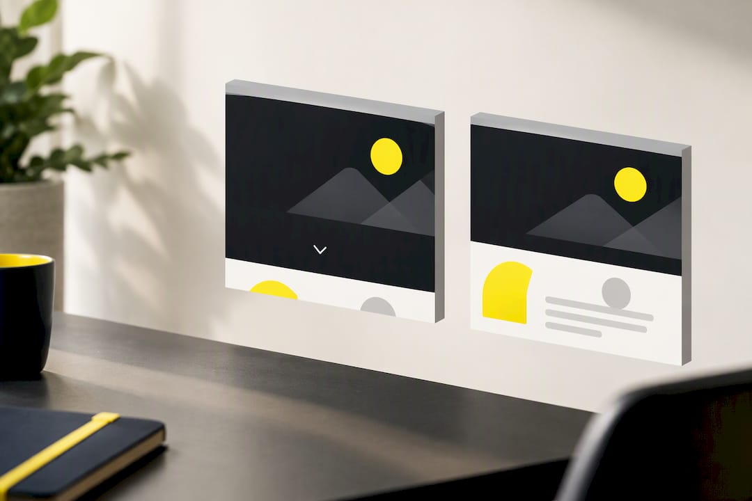
A scroll cue is sometimes a patch over a layout that doesn’t communicate on its own, and that’s worth catching before you ship it. If usability testing shows people stalling at the fold only because nothing below it is visible, the fix is architectural, not decorative.
The tell is simple: if the cue is the only signal telling users to keep scrolling, in either usability sessions or your analytics, that’s a layout problem wearing a chevron as a costume. Try these first:
- Let a sliver of the next section’s heading or image peek above the fold.
- Stagger content so the hero visually bleeds into what follows instead of ending in a hard line.
- Add plain microcopy, something as direct as “story continues below,” where a visual cue alone reads as too subtle.
Layout fixes solve the problem permanently. A cue just treats the symptom every time a new visitor lands.
Code Patterns And A Pre-Launch Deploy List
A minimal chevron needs three pieces: a positioned wrapper, a bounce keyframe, and the reduced-motion override. Position the wrapper absolutely at the bottom of the hero, animate transform: translateY() in a short keyframe loop, and set animation-fill-mode: backwards so a later .hidden class can override the animation cleanly once the user scrolls.
For scroll-driven progress bars, sketch the skeleton like this: check @supports (animation-timeline: scroll()), and inside that block, bind the bar’s transform: scaleX() to a scroll() timeline tied to the document root. Outside that support block, drop back to an IntersectionObserver watching content sections, updating a width percentage as each section’s sentinel crosses the viewport.
Before you push to production, run this list:
- Feature-detect
ScrollTimelinesupport and confirm the fallback path actually fires in older browsers. - Run the full accessibility QA pass: reduced motion, keyboard access, screen reader labels.
- Verify responsive breakpoints using combined
min-widthandmin-heightconditions, not width alone. - Confirm hide-on-scroll fires at a sensible pixel threshold on both desktop and mobile.
- Wire up an analytics event on cue clicks so you can see whether anyone’s actually using it.
Pro Tip: If your analytics show near-zero clicks on an interactive scroll cue after two weeks, that’s your answer: replace it with a static, non-interactive version or drop it entirely, guided by insights from customer intelligence to measure engagement effectively.
What Hockworks Sees In Homepage Blueprints
Across the homepage audits Hockworks runs for service businesses, scroll cues come up as a symptom, not a fix. The diagnostic question is never “should we add a chevron,” it’s “why isn’t the hero itself signaling there’s more below.”
The rule of thumb: fix the layout first. A cue only earns a place when the next section peeks less than roughly 20 pixels into the viewport in testing, and even then it hides on scroll by default. Hockworks’ homepage blueprint work treats this as one small piece of a bigger clarity problem, decision friction that keeps otherwise-qualified visitors from reaching a call-to-action at all.
An Honest Take On Scroll Cues And What To Test Instead
Scroll cues are cheap visual polish, and that’s exactly the risk: they’re easy to add and easy to mistake for a real fix. The layout problem underneath doesn’t go away just because a chevron is bouncing over it, and in the worst cases the animation itself becomes a new distraction competing with your actual call-to-action.
Before committing to any cue, run a simple A/B test: one variant gets a layout fix (a content peek or repositioned heading), the other gets a scroll cue on an otherwise unchanged layout. Measure scroll depth, time on the hero, and whichever conversion event matters most, an enquiry form submit, a phone click, a booking start. Let the data settle the argument instead of your own aesthetic preference.
— Fadly
Sources
- Scroll-triggered animations — Chrome Developers
- Hero Scroll Indicator — Desktop-Only, Hides on Scroll — Héctor Galíndez
FAQ
How Do You Add Scrolling Animation To A Website?
Start with CSS keyframes for the visual cue itself, then feature-detect @supports (animation-timeline: scroll()) to bind it to native scroll position where browsers support it. Fall back to an IntersectionObserver or a lightweight scroll listener for browsers that don’t, and always wrap the animation in a prefers-reduced-motion check.
How Do I Disable Scroll Anchoring?
Scroll anchoring is a browser behavior, not a scroll cue setting, and you disable it with the CSS property overflow-anchor: none on the element causing unwanted jumps. It’s unrelated to hero indicators or progress bars but often gets confused with scroll-cue troubleshooting because both involve unexpected scroll position shifts.
How Do I Get A Visible Scroll Bar On My Screen?
That’s a browser or OS display setting, not something a website controls directly, though CSS can style a scrollbar’s appearance with properties like scrollbar-width and ::-webkit-scrollbar. If a user’s scrollbar has disappeared entirely, check their OS accessibility settings for “always show scrollbars,” since some systems hide it by default until the user actually scrolls.
What Is Sticky Scrolling?
Sticky scrolling refers to elements that stay fixed in the viewport as the user scrolls past them, typically built with position: sticky in CSS. It’s a different technique from a scroll cue: a sticky header or sticky progress bar remains visible throughout the scroll, while a scroll cue like a chevron is usually meant to disappear once scrolling begins.
Do Scroll Cues Actually Improve Homepage Engagement?
Scroll cues can help when a layout genuinely hides the fact that more content follows, but a small chevron or gradient can’t fix a homepage that fails to establish a clear next step. If you want a full diagnosis of where visitors actually hesitate on your homepage, Hockworks’ free website review walks through those friction points directly, and the homepage blueprint service turns those findings into a structured plan starting at $480 SGD one-off.
Recommended

About the author
Thiam Hock is the founder of Hockworks, a Singapore-based digital advisory focused on clarity-driven websites. He works with service businesses to design websites that guide decisions, filter the right enquiries and reduce hesitation. His perspective centres on positioning, differentiation and how visitors actually make decisions in competitive markets.
Read more about Thiam Hock →