Navigation Labels: 4 Rules for Accessible, Scannable Homepages
Learn how to write navigation labels that name destinations, scan quickly, and work with screen readers, with practical homepage swaps and quick tests.
Navigation labels work when they’re specific, task-focused, and frontloaded, meaning the most meaningful word comes first so scanning users catch it instantly. Vague verbs like “Explore” or “Discover” waste that first glance. Get the wording right, then confirm it with accessibility checks and quick usability tests before you call the job done.
TL;DR:
- Use nouns for destinations and verbs for immediate actions; keep primary navigation plain, make menu sublabels specific, and reserve literal labels for breadcrumbs.
- When a page has multiple navigation regions, use semantic nav elements and give each a short, unique accessible name without repeating the role.
- For formal page titles, write link text around the task visitors need to complete, then test that revised wording still leads to the intended destination.
- Validate labels with first click tests, tree tests, unmatched internal search queries, and timed page finding tasks before expanding changes across the site.
- Check every label at the narrowest mobile width, where truncation can obscure meaning, and start fixes in the primary menu before secondary navigation.
Table of Contents
- Core Principles For Effective Navigation Labels
- How Label Wording Changes Across Navigation Types
- Accessible Labeling: Landmarks, ARIA, and Screen Reader Etiquette
- When Link Text Should Differ From The Page Title
- Lightweight Tests And Metrics To Validate Label Choices
- A Practical Checklist And Do/Don’t Label Swaps
- Applying These Rules To Real Homepages
- What To Fix First When Your Navigation Feels Off
- Get Expert Help Fixing Your Homepage Navigation
- FAQ
- Sources
Core Principles For Effective Navigation Labels
Good navigation copy follows a pattern Nielsen Norman Group calls the 4Ss: specific, sincere, substantial, and succinct. A label should tell users exactly what they’ll get, set honest expectations, carry enough words to be clear, and avoid padding. “Pricing” beats “Learn More” every time because it names the destination instead of describing an action.
Frontloading matters because people don’t read navigation menus, they scan them. Eye-tracking research behind the 4Ss framework shows that the opening word of a label does most of the work in telling users whether to click, so the distinguishing noun needs to lead, not trail. “Project Templates” scans faster than “Templates for Your Projects,” even though both say the same thing.
Part of speech matters too. Categories, the kind of destination a user lands on and stays at, usually read better as nouns: “Services,” “Pricing,” “Case Studies.” Actions, the kind of thing a user does and then leaves, often work as verbs: “Book a Call,” “Download the Guide.” Mixing the two inside one navigation bar is fine as long as the pattern stays consistent within each section.
A label also has to survive outside its menu. If you copy a navigation item and paste it into a blank document, does it still make sense? “Our Work” barely does. “Case Studies” does.
- Lead with the noun or keyword that distinguishes the page from its neighbors.
- Match the part of speech to the job: nouns for destinations, verbs for actions.
- Test every label by reading it alone, with no surrounding menu for context.
- Cut filler words that don’t carry meaning, like “our,” “the,” or “simply.”
Pro Tip: Read your whole navigation bar out loud in order. If two labels sound interchangeable, one of them is too vague.
How Label Wording Changes Across Navigation Types
The same word choice rules apply everywhere, but what counts as “specific” shifts depending on where the label lives and what the user is trying to do at that moment.
Primary navigation carries the heaviest cognitive load, so it needs the plainest category nouns you can write. “Services” beats “What We Do.” “Pricing” beats “Explore Plans.” Every word in the top bar should name a destination, not describe a feeling.
Secondary and mega menus get more room, which is both an opportunity and a trap. Sublabels should add distinguishing detail, not restate the parent category. A mega menu under “Services” that lists “Service One,” “Service Two,” and “Service Three” has told the user nothing; naming the actual service solves it.
Footer navigation serves a different job: utility and trust. Labels like “Careers,” “Privacy & Terms,” and “Contact” work because they’re blunt and expected. Footer is the wrong place for cleverness.
Breadcrumbs exist to orient, not persuade, so they should mirror the page hierarchy in short, literal terms: “Home > Services > Web Design,” never a reworded version of the page title.
Buttons and calls-to-action are the one place verb-first labels earn their keep, because the action is immediate and the outcome is obvious: “Book a Call,” “Start Free Review.” Save verbs for buttons and keep navigation proper mostly noun-led.
- Primary nav: short category nouns, no filler verbs.
- Mega menu sublabels: specific service or product names, never repeated parent terms.
- Footer: plain utility labels users already expect.
- Breadcrumbs: literal hierarchy names, not rewritten titles.
- Buttons: verb-first only when the action happens on click.
Accessible Labeling: Landmarks, ARIA, and Screen Reader Etiquette
Screen reader users rely on semantic structure to skip straight to what they need, which means the markup behind your labels matters as much as the wording itself. W3C’s ARIA landmark guidance recommends using native HTML elements like nav and main so assistive technology recognizes regions automatically, without extra scripting.
When a page has more than one navigation region, each one needs a unique accessible name so a screen reader user can tell them apart without replaying the whole menu. WCAG technique H101 shows how semantic markup gives assistive technology that programmatic access in the first place.
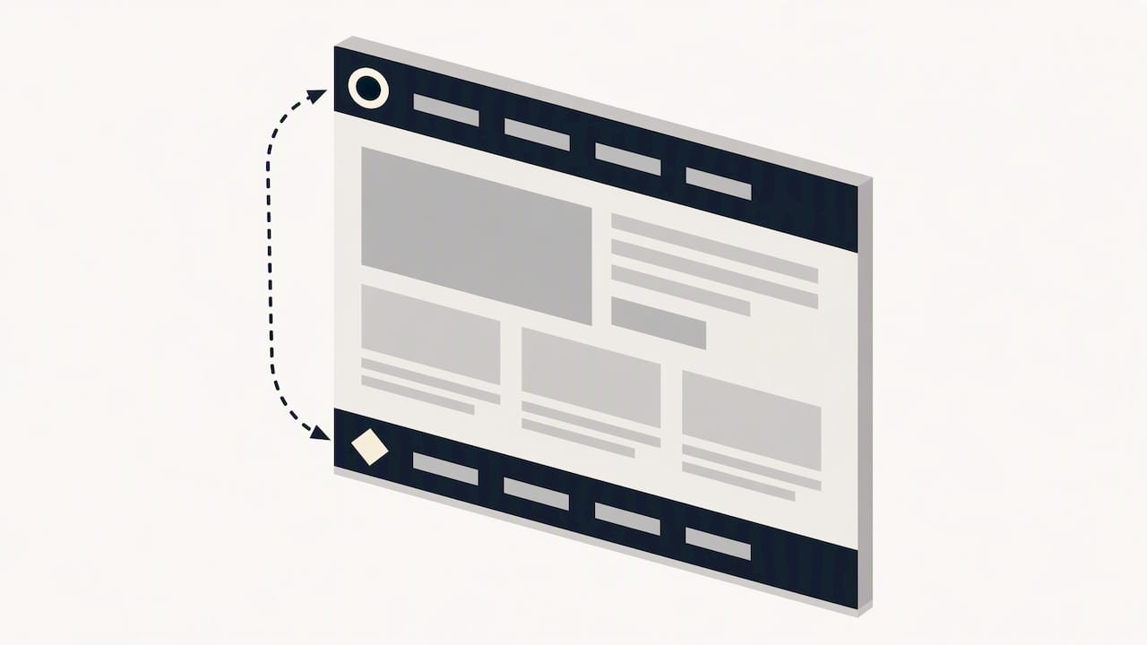
Redundant labeling is a common misstep. Screen readers already announce the role, so an aria-label of “Site navigation” on a nav element just repeats information the user already heard. Something short and unique, like “Primary” or “Footer,” does the job without the noise.
A short aria-label tied to a visible heading, rather than a restated role name, keeps multiple navigation regions distinguishable without adding announcement clutter for screen reader users.
- Use semantic
navandmainelements instead of genericdivcontainers. - Give each navigation landmark a short, unique accessible name when more than one exists.
- Skip restating the role in the label text; “Main” works better than “Main navigation.”
- Tie
aria-labeloraria-labelledbyto existing visible headings where possible.
When Link Text Should Differ From The Page Title
A page’s title and its link text don’t always need to match, and forcing them to match can actually hurt findability. GOV.UK’s service mapping work found that swapping a literal title like “Theory test: cars” for a task-focused link such as “Theory test revision and practice” made the destination clearer before the click happened. The page title can stay formal; the link text should describe the task the user is trying to complete.
A simple audit process works for most sites: list every page title, write the task each page actually helps someone finish, then check whether the current link text matches that task or just repeats the title verbatim.
Testing on the GOV.UK service mapping work showed that task-focused link text improved clarity without confusing users who expected a literal title match.
- List current page titles and the task each page supports.
- Rewrite any link text that merely repeats a formal title with no task context.
- Confirm through quick testing that the new wording still points to the right destination.
Lightweight Tests And Metrics To Validate Label Choices
Label decisions don’t have to rest on guesswork. A handful of low-cost methods will tell you whether your wording actually works before it ships to everyone.
- Run a first-click test: give users a task and watch which navigation item they click first; a high first-click success rate on the correct item is a strong signal the label scored on information scent.
- Use tree testing or card sorting to check category names against how real users naturally group content, which NN/g’s information scent research ties directly to click-through confidence.
- Mine internal search queries for terms that don’t match any navigation label, and flag pages with high zero-results rates as candidates for relabeling.
- Time a handful of remote testers on a simple find-this-page task and compare time-to-target before and after a wording change.
These four checks cost little and catch most labeling problems before they reach a live audience.
A Practical Checklist And Do/Don’t Label Swaps
Before publishing any navigation update, run it against a short checklist: frontload the distinguishing word, avoid internal jargon customers won’t recognize, confirm every label makes sense without surrounding context, keep the top-level list short enough to scan in one glance, and check how each label truncates on a small screen.
Mobile truncation deserves its own pass. A label that reads fine at desktop width can clip to nonsense in a hamburger menu, so test every item at the narrowest breakpoint you support, not just the widest.
| Vague label | Clearer swap |
|---|---|
| Explore | Services |
| Learn More | Pricing |
| Our Work | Case Studies |
| Get Started | Book a Call |
| Resources | Help Center |
- Frontload the keyword that distinguishes the destination from its neighbors.
- Drop internal jargon that only makes sense to people inside the business.
- Confirm each label stands alone without the surrounding menu for context.
- Keep the top-level navigation list short enough to read in a single glance.
- Check every label at mobile width, where icon-only buttons need a short adjacent label for clarity.
Applying These Rules To Real Homepages
We treat navigation wording as part of the same conversion audit we run on everything else above the fold. One recurring pattern from that work: sticky headers improve navigation speed by 22% on service business homepages, largely because visible, well-worded navigation stays reachable instead of scrolling out of view.
On every homepage audit, we run quick accessibility checks including landmark markup, unique labels across multiple nav regions, color contrast on link text, keyboard-only tab order, and whether skip-to-content links work. A homepage blueprint engagement typically rewrites the primary navigation first to improve clarity and make a better impression on users.
- Sticky headers paired with clear labels keep navigation visible and reachable during scroll.
- Five accessibility checks: landmarks, unique nav labels, contrast, tab order, skip links.
Pro Tip: If your top navigation hasn’t changed in over a year, run the first-click test again. Content grows, and what made sense at launch often stops matching what’s actually on the site now.
What To Fix First When Your Navigation Feels Off
Start with the top navigation bar, not the footer or a mega menu buried three clicks deep. That’s where the most visitors form their first impression of whether your site understands what they’re looking for. Once the primary labels are specific and frontloaded, pull your internal search logs and look for queries that don’t map to any existing label, those are your low-scent blind spots. Make small wording changes, measure first-click success again, then widen the scope to secondary navigation. Chasing every menu at once usually means fixing none of them well.
— Fadly
Get Expert Help Fixing Your Homepage Navigation
Rewriting a few labels gets you partway there, but navigation wording is only one piece of a homepage that’s losing good-fit enquiries to friction elsewhere on the page. Our homepage blueprint engagement includes a full label audit, a prioritized list of changes, and a video walkthrough your team can implement without a redesign.
We start by mapping where visitors hesitate, including unclear navigation, then hand over a structured plan covering messaging, proof placement, and calls-to-action alongside the label fixes. If you’re not ready for a full engagement, our free website review is a low-friction way to see where your current homepage, navigation included, is losing people before you commit to anything.
- Full label audit mapped against actual service pages.
- Prioritized change list to guide fixes.
- Video walkthrough to aid implementation.
- Free website review offered as an initial option.
Ready to see what’s costing you enquiries? Book an assess-fit conversation and we’ll walk through your homepage together.
FAQ
What is navbar in UI?
A navbar, short for navigation bar, is the UI element, usually a horizontal or vertical strip, that holds a site’s primary links to its main sections. It typically sits at the top of the page and stays visible or reappears on scroll so users can move between major areas without returning to the homepage.
Can you give me some examples of navigation apps?
Common navigation patterns appear in mobile apps through bottom tab bars, hamburger menus, and swipeable drawers that hold core sections like Home, Search, and Profile. The labeling principles are the same as on the web: specific, frontloaded words paired with icons perform better than vague verbs or icon-only buttons.
How many types of navigation are there?
Most sites use five recognizable navigation types: primary (top-level menu), secondary or mega menus (subcategories), footer (utility links), breadcrumbs (hierarchy trail), and buttons or calls-to-action (task-specific links). Each type calls for slightly different label wording based on what the user is trying to accomplish in that spot.
Which element is used for navigation links?
In HTML, the nav element is the semantic container intended for navigation links, and W3C’s landmark guidance recommends it specifically so assistive technology can identify navigation regions automatically. Individual links inside it use the standard anchor element, with clear, frontloaded text describing each destination.
Why does link text sometimes need to differ from the page title?
Link text should describe the task a user is trying to complete, while a page title can stay more formal or descriptive. GOV.UK’s service mapping research found that task-focused link text improved clarity without confusing users who expected a literal match.
Sources
- Landmark Regions | APG | WAI | W3C
- Better link labels: 4Ss for encouraging clicks - NN/g
- How we approached service mapping — Inside GOV.UK
Recommended

About the author
Thiam Hock is the founder of Hockworks, a Singapore-based digital advisory focused on clarity-driven websites. He works with service businesses to design websites that guide decisions, filter the right enquiries and reduce hesitation. His perspective centres on positioning, differentiation and how visitors actually make decisions in competitive markets.
Read more about Thiam Hock →