Mobile Homepage Design That Converts for Service Firms in Two Sprints
Conversion first mobile homepage design for established service firms: outcome led headlines, one clear CTA, trust strip, and fixes you can ship in two...
Your mobile homepage has one job in the first three seconds: prove you’re the premium option worth waiting for, not the cheapest tab still open. That means an outcome-led headline, one visible call-to-action, and an immediate trust signal, all rendered before the visitor’s thumb finishes its first scroll. Baymard Institute found that 70% of mobile users scroll up and down quickly just to figure out what a business does, and if your homepage makes them guess, they’ve already started comparing you to someone else. This is exactly the friction Hockworks was built to find and fix.
TL;DR:
- A mobile homepage must clearly communicate the outcome, target audience, and premium differentiator within the first three seconds to avoid losing visitors.
- The essential above-the-fold elements are a compelling headline, a clarifying subhead, a single thumb-sized call-to-action button, and a trust signal such as a credibility marker.
- Post-headline messaging should focus on outcome-oriented service bullets, a simple “how it works” section, and a secondary CTA to guide visitors further without overwhelming them.
- Layout and technical optimization—such as single-column design, fast load speeds, and accessible typography—are crucial for keeping visitors engaged and reducing bounce rates on mobile.
- Proven trust signals like concise testimonials, curated result bullets, and immediate proof are more effective than full logo walls or lengthy case studies in mobile-friendly designs.
Table of Contents
- What Should Appear Above the Fold on a Mobile Homepage?
- How Should Messaging Flow After the Headline?
- Layout Rules for Thumb Reach and Fast Scanning
- What Kind of Proof Actually Works on a Small Screen?
- Why Mobile Load Speed Is a Persuasion Issue, Not Just a Technical One
- A Two-Sprint Checklist for Shipping Mobile Homepage Fixes
- How Should Navigation Work on a Mobile Homepage?
- What Typography Choices Improve Mobile Readability?
- Should You Use Touch Gestures and Mobile-Specific Interactions?
- What Image Optimization Actually Matters for Mobile?
- What Accessibility Standards Should a Mobile Homepage Meet?
- What I’ve Learned Reviewing Service-Business Homepages
- How Hockworks Turns This Into a Blueprint You Can Ship
- Sources
- FAQ
What Should Appear Above the Fold on a Mobile Homepage?
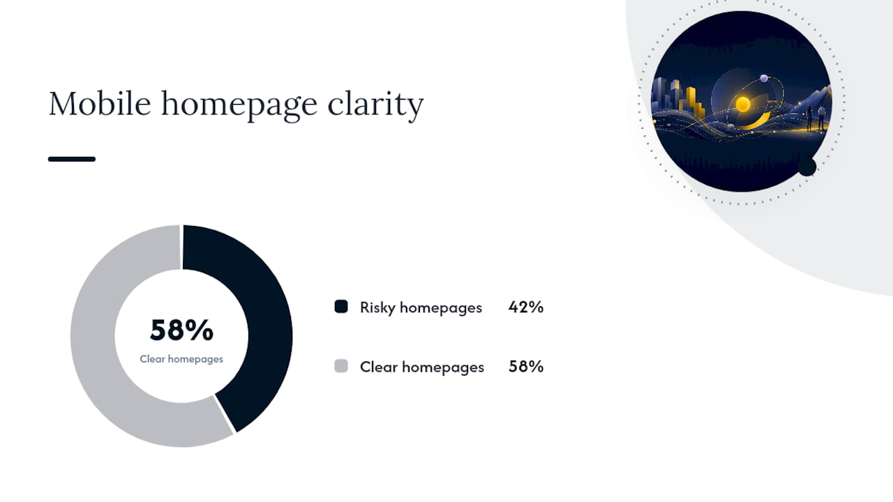
Above the fold on mobile is not a design decision. It’s a five-second test of whether a stranger understands what you do, who you help, and what happens if they tap one button. Baymard’s research is blunt about the stakes: 42% of mobile homepages risk setting the wrong expectations because they oversimplify or bury what the business actually offers, and that gap is where premium-priced service businesses lose serious prospects to lower-tier competitors who simply explained themselves faster.
Three elements need to survive first paint.
The headline should combine what you do, who you help, and the specific premium outcome, in that order. “Wealth Management for Tech Founders Who Want Their Portfolio Working as Hard as They Do” beats “Financial Planning Services” every time, because it filters correctly.
The subhead removes ambiguity. If your headline states the outcome, your subhead states the mechanism. One sentence, no more.
The primary CTA is singular. One button, sized for a thumb, worded as an action (“Book Your Free Review,” not “Submit”), placed within the first screen height.
A workable above-the-fold template for a service business looks like this:
- Headline: outcome + audience + premium differentiator
- Subhead: one sentence explaining the “how”
- Primary CTA: single button, high contrast, thumb reachable
- Micro-trust line: one credibility marker (years in business, client count, or a single result)
Anything beyond these four elements belongs further down the page, not competing for attention at the top.
How Should Messaging Flow After the Headline?
Once a visitor has the headline, they’re deciding whether to keep scrolling or bounce. The next few screens either build confidence or dilute it. A tight hierarchy keeps that momentum moving toward the CTA instead of toward a competitor’s tab.
The order that tends to work for established service businesses is:
- Trust strip. A short line of proof directly under the hero, before anything else competes for attention.
- Three outcome-focused service bullets. Not features. Outcomes. “Reduce audit risk” reads stronger than “Tax compliance services.”
- A three-step “how it works” block. Short enough to scan in five seconds, framed to reduce perceived risk of reaching out.
- A secondary CTA. Softer language than the primary (“See How It Works” or “Check Pricing”), for visitors not ready to commit yet.
Microcopy discipline matters more on mobile than desktop. Keep sentences under 14 words wherever possible, force line breaks at natural clause boundaries instead of letting the browser wrap mid-thought, and never truncate a value statement with an ellipsis. Translating service features into outcomes the client actually experiences is what separates a premium homepage from a brochure. As Hockworks’ research on service-business homepages points out, prospects respond to language like “book better clients” or “stop competing on price,” not a list of what your firm technically does.
Pro Tip: Drop one specific number into your outcome bullets instead of an adjective. “Cut onboarding time by half” earns more trust than “faster onboarding,” even without a footnote.
Layout Rules for Thumb Reach and Fast Scanning
Mobile layout succeeds or fails on physical ergonomics, not just visual taste. A single-column stack is non-negotiable. Every element should read top to bottom without the visitor needing to zoom, rotate, or pinch to understand what’s in front of them.
CTA placement follows a simple pattern for service businesses: one primary CTA above the fold, and a sticky footer CTA that appears once the visitor scrolls past the hero. Use the sticky CTA sparingly. One instance, consistent wording, and it should never cover content the visitor is actively trying to read.
Hero images need restraint. A large photo of a smiling team or a stock handshake pushes your headline and CTA further down the screen, which directly undermines the above-the-fold priorities you just built. If you use imagery, show a specific client outcome or workspace, sized so it never delays the headline’s arrival.
Accessibility rules double as conversion rules on mobile:
- Tap targets at least 44 by 44 pixels, with enough surrounding space to avoid mis-taps.
- Text contrast ratio meeting WCAG AA standards, particularly for CTA buttons on colored backgrounds.
- Base font size no smaller than 16 pixels, so visitors aren’t forced to pinch-zoom to read your value proposition.
A homepage that’s technically responsive but ignores these details still frustrates the exact high-value prospects it’s trying to attract.
What Kind of Proof Actually Works on a Small Screen?
Long case studies and full logo walls don’t survive mobile’s limited real estate. What works is proof compressed into a single glance: a short testimonial, a specific result, or a tightly curated client-type list positioned where the visitor is already reading, not buried in a separate section they’ll never scroll to.
A testimonial formula that holds up on mobile: one outcome-focused sentence, followed by a compact attribution (name, role, company type). No paragraph-length quotes. If the full story matters, link out to a detailed case study page rather than cramming it into the homepage.
- Use a logo strip when brand recognition itself builds credibility (known clients, familiar industries).
- Use curated result bullets when your buyers care more about outcomes than names, which is common for premium consulting, legal, and advisory services.
- Place the trust strip immediately under the headline, or fold it directly into the primary content block. Don’t wait until the third scroll.
- Truncate long quotes to one sentence and link the rest offsite.
Pro Tip: If you only have one strong testimonial, don’t dilute it by pairing it with two mediocre ones. One sharp result beats three vague ones on a screen this small.
Hockworks’ own diagnostic work on where visitors hesitate consistently finds that a compact trust strip near the headline outperforms a logo wall for audiences evaluating premium positioning, because it answers the credibility question before the visitor has to go looking for it.
Why Mobile Load Speed Is a Persuasion Issue, Not Just a Technical One
A homepage that takes four seconds to render its headline has already lost the scanning window Baymard describes, where 70% of visitors are moving through a page quickly to size up the business. Speed isn’t a backend metric anymore. It’s part of the pitch.
Two numbers matter most: first contentful paint (how fast anything appears) and time-to-interactive (how fast the CTA becomes tappable). Both should prioritize the headline, CTA, and trust strip before anything else on the page even attempts to load.
Practical fixes that move the needle fastest:
- Compress and resize hero images before upload, not after.
- Defer non-critical scripts (chat widgets, tracking pixels, carousel libraries) until after the primary content renders.
- Run a real-device test, not just a desktop browser resize, since actual mobile networks throttle differently than office WiFi.
- Use Lighthouse or a similar audit tool to catch render-blocking assets before they cost you visitors.
A slow-loading premium brand reads as a contradiction to the visitor. If the experience is sluggish, the “premium” claim in your headline stops feeling credible before they’ve even reached it.
A Two-Sprint Checklist for Shipping Mobile Homepage Fixes
You don’t need a full redesign to move the needle. Most of the highest-impact changes fit into one or two development sprints if you prioritize correctly.
- Rewrite the headline using the outcome plus audience plus differentiator formula.
- Add or tighten the trust strip directly under the hero.
- Cut down to a single, unmistakable primary CTA above the fold.
- Compress the hero image payload and defer non-critical scripts.
- Add a sticky footer CTA for pages with meaningful scroll depth.
- Launch an A/B test comparing the new headline and CTA against the current version.
| Task | Owner | Target Outcome |
|---|---|---|
| Headline rewrite | Marketing lead | Higher enquiry relevance, lower bounce |
| Trust strip placement | Design/dev | Faster credibility signal |
| Single CTA enforcement | Dev | Reduced decision friction |
| Image and script optimization | Dev | Faster first paint |
| Sticky CTA implementation | Dev | More conversions on long scroll |
| A/B test rollout | Marketing lead | Measurable lift in qualified leads |
For the A/B test, run it until you’ve collected enough enquiry volume to compare quality, not just click count. A rough guide: don’t call the test before a few hundred sessions per variant, and weigh lead quality (right-fit enquiries, not just form fills) as heavily as the raw conversion rate.
How Should Navigation Work on a Mobile Homepage?
Mobile navigation should answer one question: can a visitor find what they need without ever opening a menu? For most service businesses, the honest answer is that the homepage itself should do most of that work, with navigation serving as a backup, not a requirement.
A hamburger menu is fine as a secondary tool, but it shouldn’t be where your key message lives. Visitors rarely tap into navigation before they’ve decided whether to trust the page they landed on. Keep the menu to five items or fewer, label them in plain language (“Services,” “About,” “Contact”) instead of internal jargon, and avoid nested dropdowns that require multiple taps to reach a destination.
If your business serves multiple audiences (say, both individual clients and enterprise accounts), consider a lightweight audience switcher near the top rather than forcing everyone through one generic path. This is one of the few places where a slightly more complex interaction pattern earns its place, because it prevents mismatched expectations further down the page.
Sticky navigation bars are useful only if they don’t compete with your sticky CTA. Running both at once often clutters the screen and confuses which action actually matters. If you already have a sticky CTA in the footer, keep the header navigation minimal or let it scroll away entirely.
What Typography Choices Improve Mobile Readability?
Type on mobile has to work harder than on desktop because the reading distance, lighting conditions, and screen size are all less forgiving. A body font size below 16 pixels forces visitors to zoom, and any homepage that requires zooming has already broken the scanning flow Baymard’s research describes.
Line length matters as much as font size. On a phone screen, somewhere between 30 and 40 characters per line tends to read most comfortably, longer lines force the eye to work harder to track back to the start. Line height (leading) should sit around 1.4 to 1.6 times the font size, giving text enough breathing room without feeling disconnected.
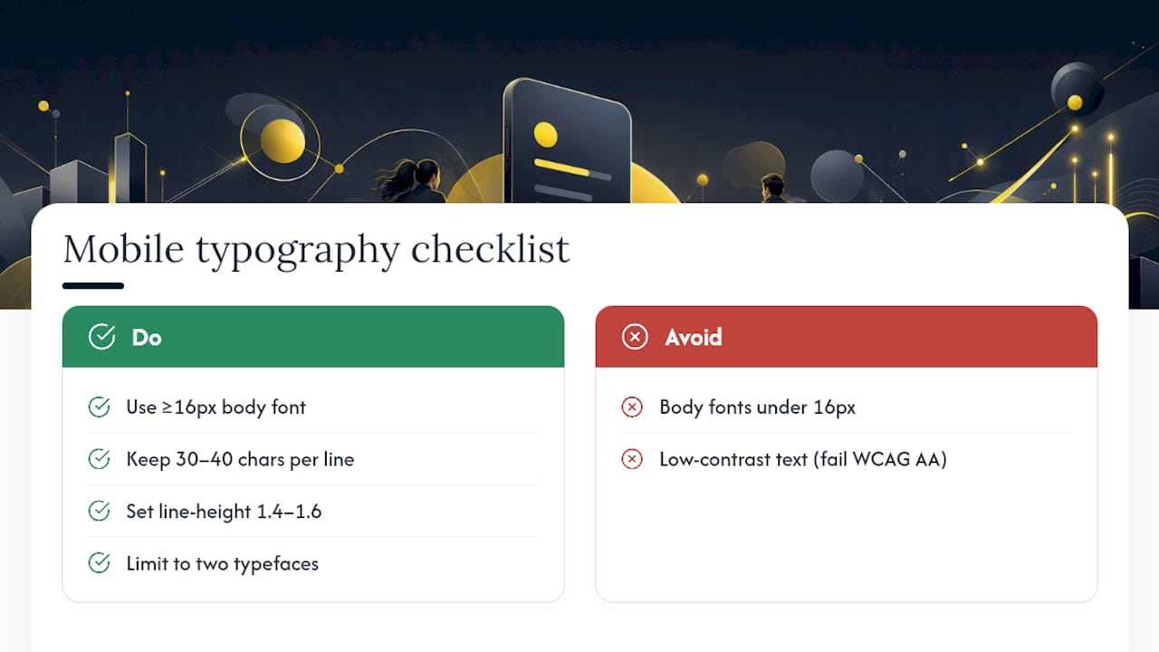
Limit yourself to two typefaces: one for headlines, one for body copy. A third typeface almost always adds visual noise without adding clarity, especially on a screen already fighting for attention. Bold and color should be reserved for genuine emphasis, your CTA button and maybe one key phrase in the headline, not scattered across every paragraph.
Contrast is non-negotiable. Light gray text on a white background might look elegant on a design mockup, but it’s nearly unreadable in bright daylight on a phone screen. Stick to contrast ratios that meet WCAG AA standards, and test your actual color combinations outdoors, not just in a dim office.
Should You Use Touch Gestures and Mobile-Specific Interactions?
Touch gestures can genuinely improve the mobile experience, but only when they replace friction rather than add a layer of novelty the visitor has to learn. Swipeable testimonial carousels, expandable service accordions, and tap-to-reveal FAQ sections all work well because they let visitors control how much detail they see without forcing a full page reload.
The rule that keeps these interactions useful: every gesture-based element needs a visible, obvious affordance. If a visitor can’t tell at a glance that a card is swipeable or a section is tappable, the interaction fails silently, and they simply skip past content you wanted them to see. Small visual cues, like a partial second card peeking from the edge of a carousel, do most of that signaling work without needing instructional text.
Avoid gestures that require precision most phones can’t reliably support, tiny drag handles, multi-finger pinches, or hover-dependent interactions borrowed from desktop design. These frustrate more visitors than they delight, and frustration on a premium-positioned homepage reads as a quality problem, not just a UX quirk.
Used well, touch interactions let you pack more proof and detail into a homepage without lengthening the scroll. Used poorly, they just add another way for an impatient visitor to bounce.
What Image Optimization Actually Matters for Mobile?
Every image on your homepage is competing with your headline and CTA for the same limited loading budget, and on a service business homepage, the images almost never carry the persuasive weight the copy does. That means the optimization goal isn’t “make images look sharp.” It’s “make images cost as little loading time as possible while still supporting the message.”
Start with format. WebP files are typically 25 to 35 percent smaller than JPEG at comparable visual quality, and most modern browsers support them without a fallback needed. Compress every image before upload rather than relying on a plugin to fix it after the fact, since automated compression tools often leave unnecessary bloat behind.
Size images to their actual display dimensions on mobile, not the dimensions they’ll show on a desktop monitor. A hero image built for a 1920 pixel wide desktop screen but displayed at 400 pixels wide on a phone is wasted bandwidth, every extra pixel the browser downloads and discards is time your visitor spent waiting instead of reading your headline.
Lazy loading matters for anything below the first screen. Images in your trust strip, service sections, or footer don’t need to load until the visitor scrolls near them, which frees up bandwidth for the elements that actually need to render first. Combined with proper compression, this is usually the single fastest technical win available to a marketing lead without needing a developer to rebuild the page.
What Accessibility Standards Should a Mobile Homepage Meet?
Accessibility on mobile isn’t a separate checklist from conversion optimization, it’s largely the same checklist. A homepage that’s hard to read for someone with low vision is also harder to scan for someone in bright sunlight glancing at their phone between meetings, which describes a meaningful share of your actual prospects.
Tap targets need real space. Buttons and links should measure at least 44 by 44 pixels with enough surrounding padding that a visitor with larger fingers, or one using their phone one handed on a train, doesn’t accidentally tap the wrong element. Cramped navigation menus are one of the most common accessibility failures on service-business homepages.
Screen reader compatibility matters more than most business owners assume. Every image needs descriptive alt text, every button needs a label that makes sense out of context (not just “click here”), and heading structure should follow a logical order rather than skipping levels for visual effect. These same practices also help search engines understand your page structure, so accessibility work quietly supports your SEO as a byproduct.
Color should never be the only signal for something important. If a form field shows an error in red text alone, a colorblind visitor may miss it entirely. Pair color with an icon, a label, or a border change. None of this requires a specialist accessibility audit to get right. Most of it is a matter of testing your own homepage with a screen reader once and fixing what you find.
What I’ve Learned Reviewing Service-Business Homepages
The same three mistakes show up again and again: a homepage headline that promises one thing while the service pages describe something else, three or four CTAs fighting for the same tap, and a hero image so heavy it delays the message the whole page exists to deliver. None of these are complicated to fix once you see them, but almost nobody sees them in their own site, because they wrote the copy while thinking about their business, not about a stranger scanning quickly on a phone.
One anonymized pattern worth remembering: a firm that simply rewrote its headline from a description of its service into a description of the client’s outcome saw its enquiry quality shift almost immediately, not because more people visited, but because the visitors who reached out already understood what they were buying. That’s the real payoff of getting this right. A structured blueprint is usually the fastest route to that kind of consistent, measurable improvement, because it forces the messaging and proof decisions before a single line of code changes.
— Fadly
How Hockworks Turns This Into a Blueprint You Can Ship
Hockworks builds the alternative to guessing your way through a redesign: a structured homepage blueprint that tells your team exactly what to say, where to place proof, and which CTA to prioritize, without touching your existing design system or gambling on a full rebuild. The process combines a positioning workshop, voice-of-customer messaging capture, and a blueprint planning session into one deliverable, complete with a video walkthrough your web team or contractor can follow directly.
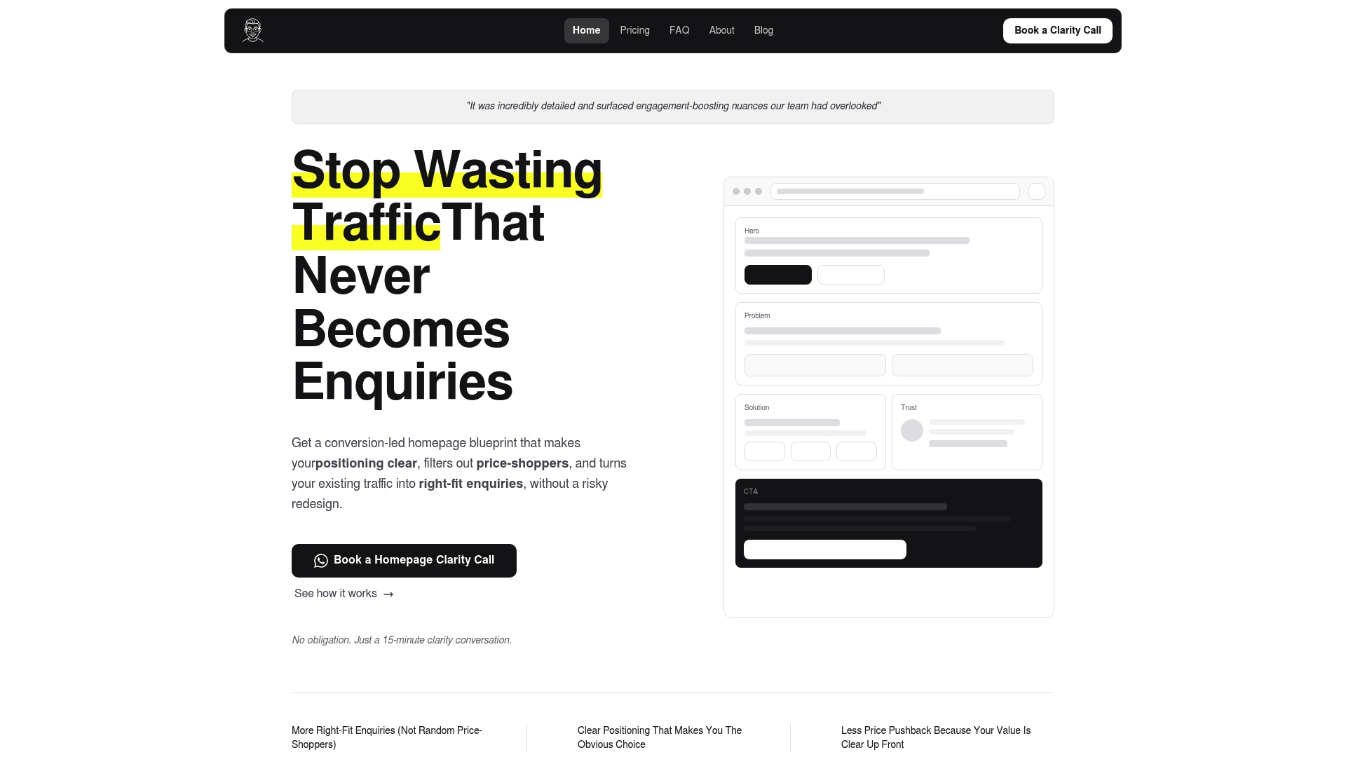
This fits established service businesses selling higher-value work, the ones already getting mobile traffic but watching too many enquiries turn into price comparisons instead of qualified conversations. If that sounds like your homepage, start with a free website review to see exactly where visitors hesitate before you commit to anything. From there, the Homepage and Homepage + About packages give you a clear, fixed-fee path to a mobile homepage that actually earns the enquiries you want.
Sources
For the behavioral research behind this piece, Baymard Institute’s mobile homepage usability study is the most cited source on how visitors actually scan. For practical, service-business-specific examples, Hockworks’ blog and homepage conversion breakdown offer more detail worth a slower read. On content prioritization traps more broadly, Plexo’s analysis is a useful outside perspective.
- Mobile homepage usability — Baymard Institute
FAQ
What Makes a Mobile Homepage “Premium” Instead of Generic?
A premium mobile homepage leads with an outcome-focused headline, shows one clear CTA, and backs both with immediate proof, rather than opening with a generic description of services. Clarity and restraint read as confidence, while cluttered CTAs and vague headlines read as uncertainty, even when the underlying service is excellent.
How Fast Should a Mobile Homepage Load?
Fast enough that the headline, CTA, and trust strip render before the visitor finishes their first scroll. Baymard Institute notes that 70% of mobile visitors scroll quickly just to understand a business, so any delay in showing your core message risks losing them before they’ve read a word.
Does Hockworks Redesign the Whole Website or Just the Homepage?
Hockworks primarily delivers a homepage blueprint, priced at 480 SGD for the homepage alone or 680 SGD with an About page included, without requiring a full redesign. A Full site option is also available for businesses wanting the same process applied more broadly.
How Many Calls-to-Action Should a Mobile Homepage Have Above the Fold?
One. A single, clearly worded CTA above the fold avoids the decision friction that competing buttons create, and a secondary, softer CTA can appear further down the page for visitors not ready to commit yet.
What’s the Fastest Way to Test If My Mobile Homepage Has a Problem?
Book a free website review to see exactly where visitors hesitate on your current homepage. It’s a lower-friction starting point than committing to a full blueprint engagement and gives you a concrete list of what to fix first.
Recommended

About the author
Thiam Hock is the founder of Hockworks, a Singapore-based digital advisory focused on clarity-driven websites. He works with service businesses to design websites that guide decisions, filter the right enquiries and reduce hesitation. His perspective centres on positioning, differentiation and how visitors actually make decisions in competitive markets.
Read more about Thiam Hock →