20 Homepage Tagline Examples for Service Businesses
See 20 real homepage tagline examples for service businesses, plus seven fill-in formulas, testing tips, and a short audit workflow to craft a tested hero...
A homepage tagline is the one line under your logo that tells a visitor what they get by staying. The single rule that decides whether it works: it must let a stranger reasonably understand the outcome they get in just a few seconds. Skip the clever wordplay. Scan the categorized examples below, pick a formula that fits your business, and adapt it.
TL;DR:
- Clear, outcome-led taglines that state the specific benefit in under 12 words build trust faster than vague or generic claims.
- Including a targeted audience detail or a proven number enhances credibility and helps filter the right visitors.
- Testing taglines with the five-second clarity test or small-scale A/B experiments ensures the message is instantly understandable and effective.
- Avoid common mistakes like company-first language, vague superlatives, or mismatched visuals that dilute the message’s clarity.
- A structured homepage audit focused on outcome, proof, Call-to-Action, and supporting elements can significantly improve homepage messaging.
Table of Contents
- Homepage Tagline Examples by Category
- Tagline Formulas You Can Fill In Right Now
- How to Test Whether Your Tagline Actually Works
- Tagline Checklist and the Mistakes That Sink Conversion
- A Quick Expert Audit: Before and After
- Keep It, Tweak It, or Replace It Entirely?
- Get a Tested Tagline Without the Guesswork
- Sources
- FAQ
Homepage Tagline Examples by Category
Not every business should copy the same tagline shape. A law firm and a SaaS tool are solving different trust problems, so the best homepage tagline examples split into distinct families based on what they’re trying to prove. Here’s the bank, organized by the job each style performs.
Outcome-led. These state the result the visitor gets, not the feature they’re buying.
- “Get your invoices paid two weeks faster.”
- “Stop losing leads to a slow follow-up.”
- “Your books, closed by the 5th of every month.”
- “Fewer no-shows. More paid appointments.”
- “Turn website traffic into signed contracts.”
Outcome-led lines win because they answer the only question a new visitor actually has, which is “what changes for me.” HubSpot’s roundup of famous brand slogans shows the same pattern at the top of the market. Nike’s “Just Do It” and Target’s “Expect More, Pay Less” both illustrate how effective taglines often skip cleverness in favor of clear, plain promises that shoppers easily understand.
Audience-led. These name the specific visitor so the wrong-fit prospect self-selects out before wasting a click.
- “Built for boutique law firms with 5 to 40 staff.”
- “For clinic owners who are tired of managing three different booking systems.”
- “The bookkeeping partner for e-commerce brands doing $1M to $10M.”
- “Website reviews for professional service firms that already get traffic.”
Naming the audience directly in the hero does more than filter traffic. It tells the right visitor “this was written for me,” which cuts the mental work of deciding whether to keep reading.
Quantified or credibility-led. A specific number does more trust-building in five words than three paragraphs of “about us” copy.
- “Trusted by 200+ Singapore SMEs since 2016.”
- “We’ve reviewed over 800 homepages for decision friction.”
- “Average client sees a 30% jump in qualified enquiries.”
- “Rated 4.9 out of 5 across 120+ reviews.”
Baymard’s research, drawn from over 200,000 hours of usability testing, consistently finds that homepages leading with a specific, evidence-backed number build faster trust than vague claims like “industry-leading” or “best in class.” A number is concrete. Vague superiority claims are not.
Mechanism-led. These hint at how the result happens, which works well when your process itself is the differentiator.
- “We diagnose friction before we redesign anything.”
- “One structured workshop. One clear messaging plan.”
- “No guesswork. Just voice-of-customer data and a blueprint.”
- “A quote-to-cash system that closes the gap between billed and paid” (a phrase borrowed from MyBizApps’ work on operational bottlenecks, showing how a process-first tagline reads for an operations-heavy audience).
Micro-CTA taglines. These fold the next step directly into the promise, collapsing two decisions into one.
- “Book a free homepage review. Takes 10 minutes.”
- “See your ROI before you spend a dollar on redesign.”
- “Talk to us before your next ad campaign, not after.”
Now, six consulting and service-specific rewrites that show the transformation from vague to plain:
| Vague original | Outcome-led rewrite |
|---|---|
| ”Strategic solutions for modern business" | "Clear financial reporting your board will actually understand" |
| "Your trusted partner in growth" | "We find the three reasons your quotes aren’t closing" |
| "Comprehensive consulting services" | "One workshop. One positioning statement your whole team can repeat" |
| "Excellence in every engagement" | "We rewrite the one page that’s losing you enquiries" |
| "Empowering businesses to succeed" | "Built for firms selling services over $2,000 that already get traffic" |
| "Innovative approaches to client needs" | "Finance. Compliance. Confidence” (a real, plain example from TLC Consulting) |
Notice what the right-hand column has in common: a person, a number, or a concrete result. Nothing on that side needs a marketing dictionary to decode.
Tagline Formulas You Can Fill In Right Now
Staring at a blank hero section is the fastest way to default back to “innovative solutions for modern businesses.” Use one of these seven formulas instead, each built around a different psychological trigger.
- The Outcome Formula: [Verb] + [specific result] + [timeframe or condition]. Template: “Get [result] without [common pain point].” Example: “Get paid invoices in 14 days, without chasing clients yourself.”
- The Audience Formula: For [specific audience] who [specific situation]. Template: “For [role] at [type of business] who [problem].” Example: “For clinic managers who lose hours to double-booked calendars.”
- The Problem/Solution Formula: [Common problem], solved. Template: “Tired of [pain point]? [Company] does [specific fix].” Example: “Tired of quotes that vanish into inboxes? We follow up so you don’t have to.”
- The Quantified Proof Formula: [Number] + [specific credibility marker]. Template: “[Number] [businesses/clients] use [product] to [outcome].” Example: “Over 200 Singapore service firms use this blueprint to fix their homepage in weeks, not months.”
- The Mechanism Formula: [How it works] so [outcome happens]. Template: “We [process] so you [result].” Example: “We diagnose the friction first, so your redesign fixes the right problem.”
- The Contrast Formula: Not [expected approach]. Just [actual approach]. Template: “No [common frustration]. Just [plain benefit].” Example: “No agency retainer. Just a clear plan you can implement yourself.”
- The Direct Question Formula: [Question that names the reader’s exact frustration]. Template: “Is your [asset] costing you [specific loss]?” Example: “Is your homepage costing you the clients you actually want?”
A few word choices matter more than the formula itself. Keep the whole tagline under 12 words wherever possible. Cut adjectives that don’t describe a measurable thing, “seamless,” “robust,” and “cutting-edge” are the usual suspects. For a service business specifically, lean toward a calmer, more confident tone than a consumer brand would use. A law firm or consulting shop selling five-figure engagements should sound certain, not excited.
How to Test Whether Your Tagline Actually Works
Writing a tagline is guessing. Testing one is knowing. Three methods work well for a business without a big research budget.
The five-second clarity test is the fastest gut check. Show your homepage to five to eight people who’ve never seen it, for exactly five seconds, then hide it and ask two questions: “What does this company do?” and “Who is it for?” If three or more people can’t answer both, the tagline fails. This matters because Nielsen Norman Group’s research on page attention found that visitors typically abandon a page within 10 to 20 seconds unless it states a clear value proposition almost immediately. A tagline that needs re-reading has already lost the visitor.
A/B testing works once you have enough traffic to reach statistical confidence, generally a few hundred visitors per variant at minimum. Randomize the tagline only, keep the layout and image identical, and track click-through rate on your primary call-to-action, time on page, and any micro-conversion like a form start. Large-scale hero-section testing across 25,000 A/B tests found that headline clarity and CTA strategy moved the needle far more consistently than visual polish or button color.
Qualitative checks fill the gap when traffic is too low for a clean A/B split:
- Ask your sales team which phrase prospects repeat back on discovery calls.
- Scan chat transcripts or contact-form messages for the language visitors actually use to describe their problem.
- Run a two-question poll on the thank-you page asking whether the homepage matched what they expected.
Pro Tip: Run the five-second test before you touch analytics. It costs nothing, takes an afternoon, and catches the obvious failures that no amount of A/B testing will fix if the core message is confusing.
Tagline Checklist and the Mistakes That Sink Conversion
Run your current tagline through this before you publish anything new:
- Does it state a result, not just a category of service?
- Could a stranger repeat the value back after five seconds?
- Is the audience named or clearly implied?
- Is it under 12 words?
- Does it avoid at least three of the following: “innovative,” “solutions,” “seamless,” “excellence,” “empower”?
- Does the visual next to it show the product or service in context, not a generic stock photo?
- Is there exactly one primary call-to-action visible above the fold?
- Does a subhead or eyebrow line add a number, credential, or specific detail the headline doesn’t?
- Would this line make sense on a competitor’s site, or is it specific to you?
- Have you tested it on at least five people who don’t work at your company?
The six mistakes that show up most often on service-business homepages:
- Company-first language. “We are a full-service consultancy” tells the visitor nothing about them. Fix: lead with their outcome, mention the company second.
- Cleverness over clarity. A pun that requires explanation costs you the five seconds you had. Fix: if you have to explain the joke, cut it.
- Vague superlatives. “Best-in-class service” is unverifiable and forgettable. Fix: replace with a specific number or named outcome.
- Two competing calls-to-action with no clear divergence. Research on hero testing shows that two CTAs can work when they map to distinct buyer paths, like “See Pricing” versus “Talk to Sales,” but two similar buttons just split momentum.
- No audience signal. Without an eyebrow line naming who this is for, the wrong visitor lingers and the right one isn’t sure they’re in the correct place.
- Mismatched visual. A generic handshake photo next to a specific tagline undercuts the credibility the copy just built.
Pro Tip: Use the small eyebrow line above your main headline to name the exact visitor and situation, something like “For clinic owners managing 3+ locations.” That single line pre-qualifies traffic before they even read the headline, which is one of the cheapest conversion levers on the page.
A Quick Expert Audit: Before and After
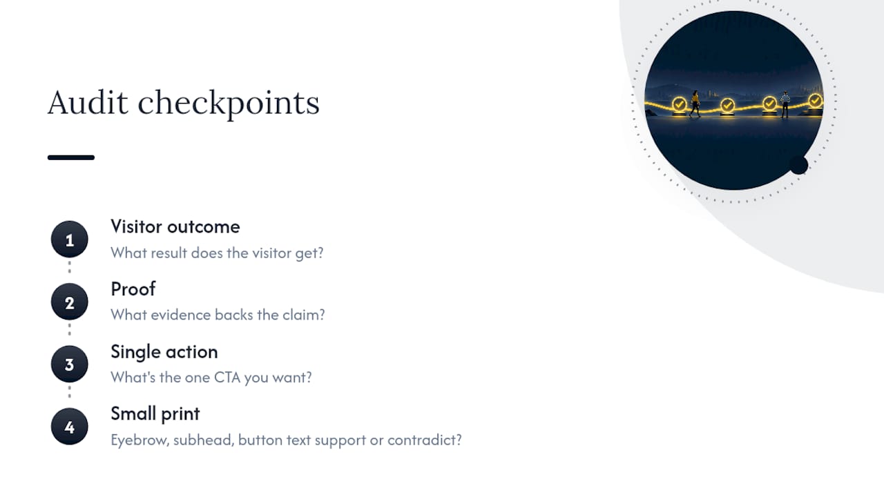
A structured audit runs through four checkpoints in order: what outcome does the visitor get, what proof backs it up, what’s the one action you want them to take, and does the small print (eyebrow, subhead, button text) support or contradict the headline.
Take a fictional consulting homepage. Before: “Strategic Advisory Services for Growing Organizations.” After running it through the checkpoints: “We find the three reasons your proposals aren’t closing.” The eyebrow above it now reads “For consulting firms billing $2,000+ per engagement,” and the single CTA changes from “Learn More” to “Get Your Free Homepage Review.”
The gap between those two headlines isn’t cleverness. It’s specificity. One describes a category of business. The other describes a Monday-morning problem the reader already has.
This is the shape of the diagnosis Hockworks runs during a Homepage Blueprint engagement, paired with a video walkthrough so a team can see exactly why each line changed.
Keep It, Tweak It, or Replace It Entirely?
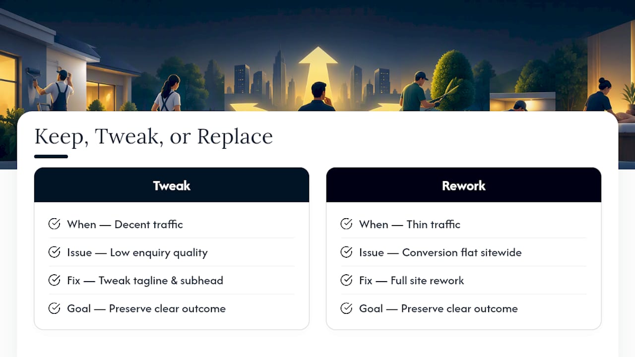
If your homepage gets decent traffic but low enquiry quality, tweak the tagline and subhead first, that’s a messaging problem, not a design problem. If traffic is thin and conversion is flat everywhere, a full rework is worth the cost. Either way, don’t sacrifice a real story about your business for cleverness, but never let storytelling bury the plain outcome a visitor needs in the first few seconds.
Get a Tested Tagline Without the Guesswork
Hockworks is the alternative to hiring a full agency for a redesign you don’t need yet: a fixed-fee Homepage Blueprint that diagnoses exactly where your current messaging loses right-fit visitors, then hands you a structured plan and video walkthrough instead of a vague strategy deck.
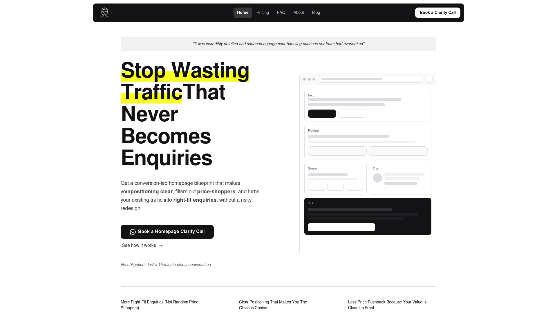
The engagement includes a positioning and differentiation workshop, voice-of-customer messaging capture, and a blueprint session that maps your new headline, proof placement, and calls-to-action, so you’re not guessing which formula from this article fits your business. A Homepage Blueprint runs $480 one-off, or $680 with an About page rewrite included. If you’d rather test the water first, the Free Website Review gives you an expert read on your current tagline and hero section before you spend anything. Either way, you’ll walk away knowing exactly what to fix and why.
Sources
- How Long Do Users Stay on Web Pages? | Nielsen Norman Group
- Research methodology | Baymard Institute
- Your hero section is lying to you — here’s what 25,000 A/B tests actually show
FAQ
What Is a Good Tagline for My Website?
A good homepage tagline states the specific result a visitor gets, in plain language, in under 12 words. The strongest version names the outcome first and the company second, following the “after using this, I will be able to…” test from Nielsen Norman Group’s research.
What Are Some Catchy Homepage Tagline Examples?
Effective examples include outcome-led lines like “Get your invoices paid two weeks faster” and audience-led lines like “For clinic owners tired of managing three booking systems.” Catchy doesn’t mean clever, it means memorable because it’s specific and true to your business.
What Are Some Famous Taglines and What Makes Them Work?
Nike’s “Just Do It” and Target’s “Expect More, Pay Less” rank among the most recognized taglines because they promise a clear benefit rather than relying on wordplay, according to HubSpot’s collection of top brand slogans. The lesson for a smaller service business is the same: promise something the reader instantly understands.
How Do I Know If My Current Tagline Is Working?
Run the five-second clarity test on five to eight people outside your company and ask what the business does and who it’s for. If most can’t answer clearly, the tagline needs a rewrite, and a structured audit like the one Hockworks runs during a Homepage Blueprint engagement can pinpoint exactly where the message breaks down.
Recommended

About the author
Thiam Hock is the founder of Hockworks, a Singapore-based digital advisory focused on clarity-driven websites. He works with service businesses to design websites that guide decisions, filter the right enquiries and reduce hesitation. His perspective centres on positioning, differentiation and how visitors actually make decisions in competitive markets.
Read more about Thiam Hock →