Research Backed Five Second Test for UX Teams: Templates, Sample Rules
Research-backed runbook for designers and UX researchers. Learn exact question templates, sample-size rules (6–10 for a quick read) and clear decision...
A five second test shows a static screen for a short, enforced exposure and measures whether the audience grasps the main message and CTA. It is a fast way to check message clarity before you invest in a redesign or a bigger usability study. Designers, UX researchers, and marketers use it to catch confusing headlines, weak visual hierarchy, and calls to action that never register.
TL;DR:
- A five second test can reliably evaluate message clarity and CTA recognition, but complex or dense screens may require longer exposures or multiple runs.
- The test works best for hero sections, landing pages, and ads, but is unsuitable for navigation, multi-step flows, or features needing exploration.
- Recruiting six to ten participants offers a quick gauge, while twenty to thirty participants improve pattern recognition and confidence in results.
- Enforcing strict timing with dedicated tools prevents participants from studying the layout, ensuring the test measures first impressions accurately.
- Analyzing comprehension rate, open recall themes, and confidence scores helps identify messaging or visual hierarchy issues to inform targeted redesigns.
Table of Contents
- How a five second test works: the standard flow and question types
- Why first impressions matter more than most teams assume
- When a five second test is the right tool (and when it isn’t)
- Building the test: screen, timing, and a question template
- How many people you need and how to recruit them
- Running the test without wrecking your own data
- Turning responses into design decisions
- Common mistakes that quietly invalidate your test
- What the research says about exposure time and who you’re testing
- Why I treat five-second tests as a clarity gate, not a verdict
- Get a second opinion on your homepage’s first impression
- Sources
- FAQ
How a five second test works: the standard flow and question types
The method is simple on the surface. You show a participant one screen (a homepage, an ad, a hero section) for five seconds, hide it, then ask a short sequence of questions while the impression is still fresh. That order matters: the moment you let people study the screen at leisure, you are no longer testing a first impression, you are testing reading comprehension.
Practitioners typically run four to six questions, each targeting a different angle of the same impression:
- Open recall: “What do you remember from that screen?”
- Comprehension: “What does this company help you do?”
- Tone: “How would you describe the feeling of this page?”
- Confidence: “How sure are you about your answer?”
- Memory check: “What color or image stood out most?”
A static image and a strict timer keep the test honest. Any scrolling, hovering, or extra time lets people compensate for a confusing layout, which hides exactly the problem you are trying to find.
Why first impressions matter more than most teams assume
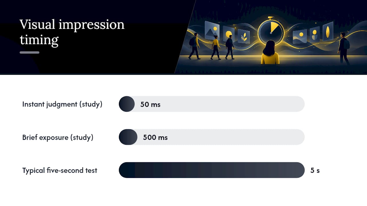
The strongest evidence for this method comes from research on how fast visual judgments form. Lindgaard et al. found that people’s visual appeal ratings from a 50 millisecond exposure closely matched their ratings after a full 500 milliseconds, suggesting a reliable first impression can form almost instantly.
A visual opinion can form in about 50 milliseconds and still predict later judgment, according to Lindgaard et al.’s research, which means the five second window in a typical test is generous compared to how fast real visitors actually judge a page.
That speed cuts both ways. If your page never finishes rendering, no first impression can form at all. Practical commentary on the 50 millisecond finding ties it directly to page load performance: a slow Largest Contentful Paint or a layout that shifts while loading means visitors leave before the design even gets a chance to make an impression. Treat load speed as a precondition for a meaningful test, not a separate concern. What you can test reliably is message clarity, tone, and CTA recognition. What you cannot test reliably from a five second exposure is deep feature understanding or navigation logic, because those require time the method deliberately withholds.
When a five second test is the right tool (and when it isn’t)
This method earns its place early in a research pipeline, before you invest in moderated interviews or multivariate testing.
- Use it for hero sections, landing pages, ads, and anything where the job is to communicate identity or a single next step fast.
- Skip it for navigation testing, multi-step checkout flows, or any feature that requires exploration to understand.
- Sequence it before usability testing, not instead of it: a five second test tells you if the message lands, a task-based session tells you if people can act on it.
Think of it as a filter. It catches a confusing headline or a buried CTA cheaply, before you spend budget on a fuller study that would only rediscover the same problem more slowly.
Building the test: screen, timing, and a question template
Start with one representative screen and write a single sentence describing what you want that screen to communicate. That sentence becomes your yardstick for every answer you collect.
- Pick the screen. Choose the page or section doing the heaviest lifting, usually a homepage hero or an ad creative.
- Set the exposure. Five seconds is standard. Test shorter exposures (two to three seconds) for very simple screens, and longer ones (eight to ten seconds) only for content-dense pages where five seconds would be unfairly punishing.
- Write the questions. Use four to six prompts covering recall, comprehension, tone, and confidence, as practitioner guidance from Talkful recommends.
- Avoid leading phrasing. “What does this company help you do?” is neutral. “Did you notice how fast this service is?” plants the answer you are hoping to hear.
Pro Tip: Ask one open-ended “why” follow-up after your confidence question. It costs almost nothing and turns a recall score into a reason you can actually design against.
How many people you need and how to recruit them
Sample size depends on what you are trying to learn, not on a fixed rule. NN/g’s guidance on the five second test frames it as a quick, directional method rather than a statistically definitive one, which should shape how many responses you chase.
- Six to ten participants is enough for a directional read, catching an obviously broken headline or CTA.
- Twenty to thirty starts revealing patterns you can act on with reasonable confidence.
- Thirty to fifty or more is worth the effort only when you need a defensible recall rate, such as before a major launch.
- Match the audience to your actual buyers, not a convenience sample, and mix device types since mobile and desktop layouts often produce different first impressions.
Speed and confidence trade off directly here: a same-day test with eight people is useful for a gut check, but treat it as a hypothesis, not a verdict.
Running the test without wrecking your own data
Tooling choices affect validity more than most teams expect. A dedicated five second test tool enforces the hide-and-reveal timing automatically, while generic survey platforms often let participants linger on the image, quietly turning your first-impression test into a comprehension test.
- Enforce the timer with purpose-built software rather than a slide deck or a shared screen on a call.
- Choose moderated sessions when you want to probe reasoning live, and unmoderated panels when you need faster turnaround at scale.
- Capture the “why” alongside the recall answer, whether through a voice prompt or a short follow-up text field.
- Check instructions, device mix, and timing of day before launch so a badly worded prompt or an unrepresentative sample doesn’t quietly bias every response that follows.
Turning responses into design decisions
The value of a five second test lives entirely in how you read the results. Four measures do most of the work: comprehension rate, CTA recall rate, the frequency of recurring themes in open recall, and the spread of confidence scores. Talkful’s four-measure synthesis weights comprehension highest, since a screen that people cannot explain in their own words is rarely ready to ship regardless of how memorable it is.
- Code open recall into themes (message, product, feeling, visual element) and calculate what share of participants land in each.
- Treat low comprehension with high confidence as a red flag: people think they understood but got it wrong.
- Treat scattered themes as a sign the hierarchy is unclear rather than the copy itself.
| Pattern observed | Likely cause | Typical fix |
|---|---|---|
| Low comprehension, high confidence | Message is misleading, not just unclear | Rewrite the headline claim |
| Low CTA recall | Call to action lacks visual weight | Reposition or restyle the CTA |
| Scattered open-recall themes | Competing visual focal points | Simplify the hierarchy |
| Low confidence across the board | Screen felt vague or generic | Add a specific, concrete claim |
Common mistakes that quietly invalidate your test
A few recurring errors undermine otherwise well-run tests.
- Leading questions plant the answer instead of measuring it, so keep wording neutral and verb-focused.
- Too many questions, or questions that require re-reading the screen, push the test past what a five second impression can actually measure.
- Unenforced timing lets participants study the layout, which quietly turns your first-impression test into something else entirely.
- Acting on a tiny, unscreened sample as if it were conclusive is the fastest way to redesign around noise.
What the research says about exposure time and who you’re testing
The 50 millisecond finding is remarkable, but it comes with a caveat worth taking seriously: shorter exposures increase variability between participants, especially when the screen is visually complex. Open datasets from five-second test research comparing two, five, and ten second exposures show that complexity and individual cognitive differences interact with recall in ways a single exposure length can miss.
Visually complex stimuli tend to produce less detailed recall from participants with lower working memory or perceptual speed, which means results from a single exposure length can understate how a design performs for part of your audience. Research on cognitive abilities and visual complexity
When your screen is dense, run two exposure variants (say, three and eight seconds) instead of trusting one number, and treat divergent outcomes between them as a signal to simplify rather than a testing error.
Why I treat five-second tests as a clarity gate, not a verdict
I use rapid visual tests early in homepage diagnosis work, before touching layout or copy in earnest. They are cheap enough to run twice and honest enough to expose whether a headline actually lands. In one review, a test showed visitors could describe the visuals in detail but not name what the business actually did, which pointed to a messaging fix rather than a redesign. That is the pattern I see most often: the design usually isn’t broken, the message clarity is.
— Fadly
Get a second opinion on your homepage’s first impression
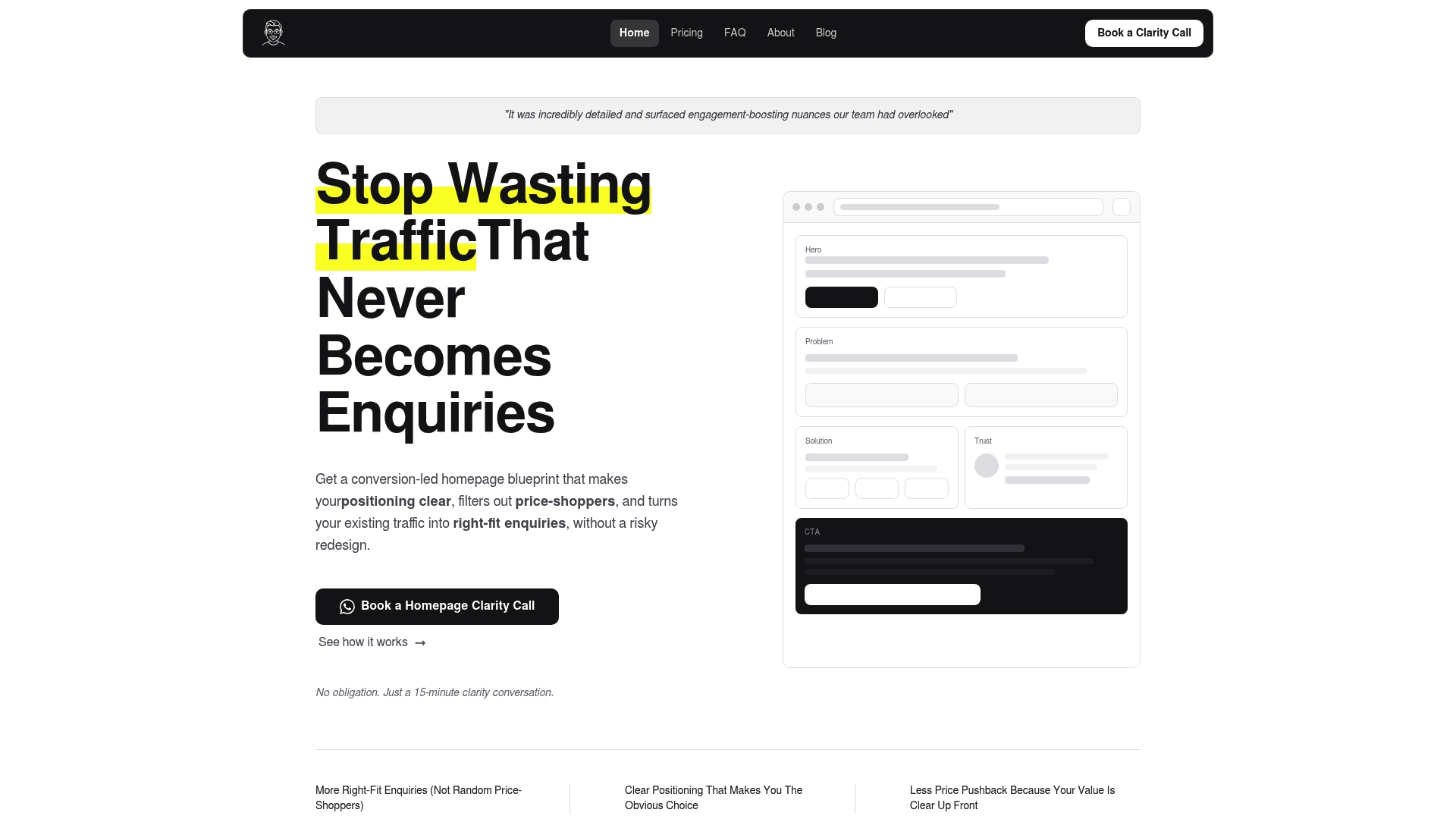
If a five second test on your own homepage turns up confused recall or a CTA nobody remembers, that is usually a messaging problem, not a reason to rebuild the whole site. Hockworks’ Homepage Blueprint starts by diagnosing exactly that kind of decision friction, then maps out the messaging, proof placement, and CTA positioning that need to change, delivered as a structured plan with a video walkthrough your team can implement directly.
- The Homepage package is a fixed-fee offering; Homepage + About is available as an add-on option.
- A Full site blueprint is available as a package for teams ready to tackle every page at once.
- Not ready to commit? The Free Website Review offers an outside read on your homepage’s potential issues.
For consulting and professional service firms specifically weighing broader systems around conversion, Sonta AI’s consulting CRM guide is a useful next stop once your homepage message is fixed. Start with the Free Website Review to see what a five second test on your own homepage would likely reveal.
Sources
- Attention web designers: You have 50 milliseconds to make a good first impression (Lindgaard et al., 2006)
- 5-Second Usability Test (NN/g video)
- How to run a 5-second test without ignoring the why (Talkful)
- Website first impressions: Why 50 ms matters (Monprez)
FAQ
What is a 5 second test?
A five second test shows participants a screen for five seconds, then asks a short set of questions to measure whether they understood the main message and remembered the call to action. It is a fast, low-cost way to check first-impression clarity before deeper usability testing.
What is the 5 user rule?
The “5 user rule” is a separate usability testing guideline suggesting that around five participants can surface most usability problems in a moderated task-based test. It does not apply directly to five second tests, which rely on larger samples, ranging from six to fifty or more, depending on whether you need a directional read or a reliable recall rate.
What are the 5 qualities of a good test?
A strong five second test uses a single representative screen, an enforced and consistent exposure time, neutral non-leading questions, a sample matched to the real audience, and a mix of recall, comprehension, tone, and confidence measures, as practitioner guidance recommends. Skipping any of these tends to produce results that are hard to act on with confidence.
What are five types of usability testing?
Common usability testing methods include moderated in-person testing, unmoderated remote testing, five second tests for first impressions, task-based usability testing, and A/B or multivariate testing. Each fits a different stage of the research pipeline, with five second tests typically run earliest to catch clarity problems before deeper testing begins.
How many people should I recruit for a five second test?
For a quick directional read, six to ten participants is usually enough to catch an obviously confusing headline or CTA. For patterns you can act on with more confidence, aim for twenty to thirty participants, and reserve thirty to fifty or more for cases where you need a defensible recall rate.
Recommended

About the author
Thiam Hock is the founder of Hockworks, a Singapore-based digital advisory focused on clarity-driven websites. He works with service businesses to design websites that guide decisions, filter the right enquiries and reduce hesitation. His perspective centres on positioning, differentiation and how visitors actually make decisions in competitive markets.
Read more about Thiam Hock →