Contact Form Fields: Give Each One an Owner and a Next Step
Choose contact form fields by tracing each one to an owner and next action. See why most forms need three, when to add more, and how to reduce friction.
The three fields every contact form needs are name, email, and message. Past that, we add a field only if it changes who handles the enquiry or what happens next. Most forms work best with three visible fields; stretch to four or five only when a dropdown, phone number, or company field genuinely routes the message somewhere specific.
TL;DR:
- Use a full name field, email input, and message box sized for three to four lines; add routing fields only when they change handling.
- Sales forms can collect company and enquiry type to route pricing or demo requests, while support forms can use email, account ID, and product.
- Keep labels visible above fields, use an email input for the correct mobile keyboard, and preserve entered answers when validation errors appear.
- Tie each visible label to its input, mark required fields clearly, and test tab order and error announcements with a keyboard and screen reader.
- Track completion rate, abandonment by field, and first response time, then fix the field where visitors leave and assign an owner to each enquiry category.
Table of Contents
- Contact Form Types and What Each One Should Collect
- Getting Name, Email, and Message Right
- How Many Fields You Really Need
- Field-Level Details That Reduce Friction
- Making Your Fields Accessible by Default
- Mistakes to Fix and What to Track Afterward
- Copy-Ready Form Templates You Can Paste In
- Our Checklist for Diagnosing Field-Driven Friction
- What I’d Prioritize if I Were Rebuilding Your Form Today
- How We Can Help With Your Homepage and Contact Form
- FAQ
- Sources
Contact Form Types and What Each One Should Collect
A general inquiry form and a sales form are not the same tool, even though they look alike. The fields you show should match what happens the moment someone hits submit.
- General inquiries: name, email, message. Nothing else earns its place unless you route replies by topic.
- Sales: name, company, email, and an enquiry type dropdown, so the right rep sees it first.
- Support: email, account ID or order number, and message, so your team can pull up the account immediately.
- Quotes: name, email, project type, and budget range, since pricing conversations need a starting point.
- Partnerships: name, organization, email, and a short message describing the proposed collaboration.
A dropdown or subject line earns its place when it sorts messages into different inboxes or priority levels, as explained in lead qualification frameworks. If every submission lands in the same queue regardless of what someone picks, the field is decoration, not routing.
Getting Name, Email, and Message Right
Small wording choices on these three fields matter more than most teams expect.
Use a single “Full name” field instead of splitting first and last name. Baymard’s input field research found that splitting identity fields adds friction without adding value for most contact use cases, since you rarely need to sort contacts alphabetically by surname.
For email, use input type="email" so mobile keyboards switch to the right layout automatically, and skip autocapitalization, since email addresses are case-sensitive in practice even when most servers ignore case. Shopify’s contact form documentation shows this pattern in its example markup.
For the message field:
- Size the textarea for three to four lines by default so it doesn’t look intimidating.
- Use placeholder copy that models a good answer, like “Tell us what you’re trying to solve.”
- Add a subject or enquiry type field only if it changes where the message goes.
Pro Tip: Skip the “Phone (optional)” field unless someone on your team will actually call. An optional field nobody uses just adds visual clutter.
How Many Fields You Really Need
NN/g’s guidance on web form design recommends starting with three core fields, name, email, and message, and adding more only when they change routing or the next step. Three fields is the sweet spot for most contact forms; stretch to four or five only when you can defend each one.
Here’s a quick protocol for deciding whether a field stays:
- Name the person or team who will act on this field’s answer.
- Describe the specific action that answer triggers (a different inbox, a priority flag, a pricing tier).
- If no one can answer step one, cut the field.
- If the action in step two doesn’t change based on the answer, cut the field.
- For anything that survives steps one through three but isn’t essential for every visitor, hide it behind a “more details” link or reveal it conditionally after a dropdown selection.
NN/g’s stakeholder engagement research frames this as a negotiation: the fastest way to kill an unnecessary field is to ask who reads the answer and what they do differently because of it. If our related post on lead qualification questions is useful here, it’s because the same logic applies: a qualification question only belongs on the form if it changes a CRM rule or a routing decision downstream.
Field-Level Details That Reduce Friction
Where you place a label and how a field behaves under someone’s thumb matters as much as which fields you include.
- Place labels above the field, not beside it, especially on mobile, where horizontal space is tight.
- Avoid placeholder-only labels. Once someone starts typing, the label disappears and they forget what they’re filling in.
- Use input masks for phone numbers or dates only when you’ve verified the format for your actual audience. Baymard’s input masking research warns that a US-style phone mask breaks for international visitors and increases abandonment rather than reducing it.
- Write error messages that say exactly what’s wrong (“Enter a valid email address”) rather than a generic “Invalid input.”
- Preserve whatever someone already typed when a validation error fires. Clearing the form is one of the fastest ways to lose a submission.
Baymard’s field-level guidance recommends minimizing the number of fields shown by default and using top-aligned labels on mobile, since side labels often get cut off or crowd the input on small screens.
Making Your Fields Accessible by Default
Accessible forms aren’t a separate project from well-designed forms, they’re the same project done correctly.
- Use a
<label>element with aforattribute that matches the input’sid, not just placeholder text or nearby copy. WCAG technique H44 specifies this exact pattern for associating labels with controls. - Keep labels visible at all times, not just before someone starts typing. Several WCAG success criteria require a visible label, not just a programmatic one.
- Group related fields, like city and postal code, with a
<fieldset>and<legend>so screen readers announce them as a set. - Set a logical tab order that matches the visual order on the page, so keyboard users move through the form the way sighted users read it.
- Mark required fields clearly, using the word “required” or an asterisk with an explanation. NN/g’s research on required field marking found that unclear marking increases confusion and lowers completion rates.
- Run the form with a keyboard only, tabbing through every field, and again with a screen reader, to confirm labels and error messages announce correctly.
Mistakes to Fix and What to Track Afterward
Most form problems trace back to a handful of repeat offenses.
- Cut fields nobody downstream reads or acts on, even if they “might be useful someday.”
- Fix labels that vanish once someone starts typing. Use real labels, not placeholder text standing in for them.
- Match input types to the data: email fields trigger the right keyboard, phone fields allow a numeric pad, dates use a date picker.
- Mark required and optional fields clearly instead of letting people guess.
Once the form itself is clean, assign an owner for every category of enquiry and set a reply-time expectation internally, even an informal one. Our post on building a post-contact roadmap covers what should happen in the hours after someone submits, which matters as much as the form design itself.
Track three numbers over time: completion rate, the specific field where people abandon, and time-to-first-response.
Pro Tip: If your drop-off happens at the same field every time, that field is your next fix, not the form in general.
Copy-Ready Form Templates You Can Paste In
Three starting points, depending on what you’re routing.
- Compact (general inquiries): Full name, Email, Message. Placeholder for message: “What can we help with?”
- Sales triage: Full name, Company, Role, Email, Enquiry type (dropdown: Pricing / Demo / Partnership), Message. Route by dropdown selection so sales sees pricing and demo requests first.
- Support: Email, Account ID, Product (dropdown), Attachment upload, Message. Allow one attachment up to a reasonable size limit, and state the accepted file types next to the upload field so people aren’t guessing.
Each of these keeps the field count tied to a specific action on your end, which is the whole point.
Our Checklist for Diagnosing Field-Driven Friction
When we review a homepage and its contact form together, we trace every field back to a person and an action: who reads this answer, and what do they do differently because of it. Fields that fail that test get cut, and the ones that survive often need better labels or placement, not more company around them.
Small fixes here, clearer labels, fewer unnecessary fields, a message prompt that matches the homepage’s actual offer, tend to lift right-fit enquiries without touching the rest of the page. A focused audit of your form and the messaging above it usually takes 30 to 60 minutes and surfaces most of the friction worth fixing. Our checklist for homepage hesitation points covers the broader diagnostic if you want to run one yourself.

What I’d Prioritize if I Were Rebuilding Your Form Today
If you only fix one thing, fix your reply speed before you fix your field count. A three-field form with a same-day response beats a polished five-field form that sits in an inbox for a week.
Test one change at a time, track where people stall, and resist the urge to add a field “just in case.” Most forms don’t fail because they’re missing data. They fail because nobody acts fast enough on what they already collected.
— Fadly
How We Can Help With Your Homepage and Contact Form
Fixing form fields gets you cleaner data, but it won’t fix a homepage that’s sending the wrong visitors to that form in the first place. We built the Homepage Blueprint for exactly that gap: a structured, actionable plan that identifies where your current homepage loses serious prospects and what to change about messaging, proof, and calls-to-action, without a full redesign.
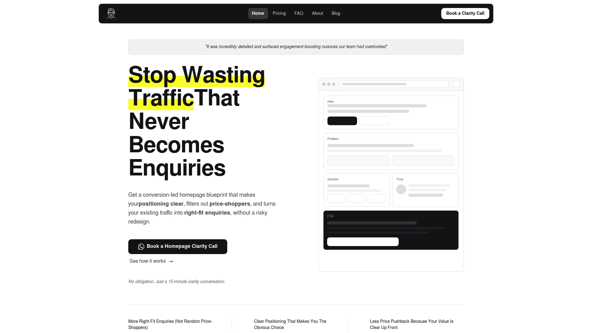
What you get from working with us:
- A diagnostic that pinpoints where visitors hesitate before they ever reach your contact form.
- A prioritized plan covering messaging, proof placement, and calls-to-action, delivered with a video walkthrough.
- Options to extend the blueprint to your About page or full site if those need the same treatment.
If you want a no-cost starting point, our Free Website Review flags the friction before you commit to anything. When you’re ready for the full plan, pricing for the Homepage Blueprint and related services starts at $480 SGD one-off.
FAQ
How do I create a contact form?
Start with three fields, full name, email, and message, using a real <label> for each input tied to its id with a matching for attribute. Add a field beyond those three only if it changes who receives the message or what happens next, and test the form on mobile before publishing it.
What are the four types of forms?
Common form types on service business websites are general inquiry, sales or quote request, support, and partnership or press forms, each collecting different fields based on what the team needs to act. A general form needs just name, email, and message, while sales or support forms typically add a routing field like company, account ID, or enquiry type.
What is the contact address on a form?
The contact address on a form usually refers to the email address or physical mailing address the business provides so submissions have a clear point of contact, separate from the form fields themselves. Some forms also display a reply-to or support email near the submit button so visitors know where their message is headed.
How do I code a contact form in HTML?
A basic HTML contact form uses <form>, <label>, and <input> elements, with each label’s for attribute matching its input’s id so screen readers announce them correctly, as shown in Shopify’s contact form documentation. Use input type="email" for the email field and a <textarea> for the message, then connect the form to your backend or form-handling service to receive submissions.
Sources
- Web form design: effectively collect user data
- 8 Recommendations for Creating Effective Input Fields – Baymard
- WCAG technique H44 — Using label elements to associate text labels with form controls
- Add a contact form — Shopify developer docs
Recommended

About the author
Thiam Hock is the founder of Hockworks, a Singapore-based digital advisory focused on clarity-driven websites. He works with service businesses to design websites that guide decisions, filter the right enquiries and reduce hesitation. His perspective centres on positioning, differentiation and how visitors actually make decisions in competitive markets.
Read more about Thiam Hock →