Sticky CTA Examples: 11 Accessible Patterns, Code, and Tests
Explore 11 sticky CTA examples, copyable patterns, accessibility fixes for keyboard and zoom, and a testing checklist tied to homepage conversion goals.
A sticky CTA is a persistent action control, usually a button or bar, that stays visible as a visitor scrolls so the next step is never more than a thumb’s reach away. We’ve found the single highest-impact use case is a bottom bar on mobile for long, decision-heavy pages like cart, checkout, or a scrolling homepage. The rule we apply first: show it after a scroll threshold, or the moment the in-page CTA disappears from view, never on page load.
TL;DR:
- Reveal a mobile sticky bar only after the hero action leaves view; keep checkout bars visible because visitors there have already committed.
- Reserve matching space below fixed bars and add bottom scroll margins to focus targets so keyboard users can reach content hidden by the bar.
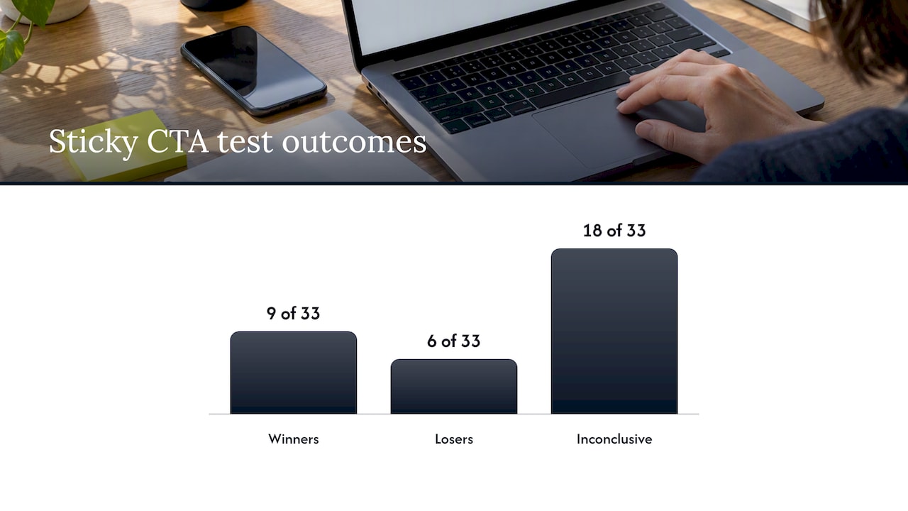
- A review of 33 sticky CTA experiments found 9 winners, 6 losers, and 18 inconclusive results, so test one change at a time.
- Keep sticky copy aligned with the hero promise, and use it only when page length or decision complexity makes a persistent action useful.
Table of Contents
- 1. Sticky CTA examples you can copy today
- 2. Design and copy patterns that increase sticky CTA effectiveness
- 3. Implementation: CSS, JS, and the accessibility fixes you must apply
- 4. Experiment design and metrics: how to test a sticky CTA properly
- 5. How Hockworks evaluates and recommends sticky CTAs in homepage blueprints
- 6. Integrating sticky CTAs with overall conversion strategy and homepage messaging
- 7. Publisher perspective: when a sticky CTA is the wrong tool
- Hockworks: homepage blueprint and free website review
- FAQ
- Sources
1. Sticky CTA examples you can copy today
Good sticky CTAs borrow proven copy and trigger logic rather than reinventing both at once. Below are patterns we see work across service and product sites, each with a placement, a trigger, sample copy, and the reasoning behind it.
- Mobile bottom booking bar. Placement: fixed to the bottom edge on mobile only. Trigger: after the hero CTA scrolls out of view. Copy: “Book your free review” with a smaller reassurance line underneath, “No pressure, 20 minutes.” It works because it echoes the hero’s promise instead of introducing a new one.
- Floating add-to-cart button. Placement: bottom-right on mobile, collapses to an icon until tapped. Trigger: scroll past the product image block. Copy: “Add to cart, $48” so price and action sit together. Shoppers get the decision data without scrolling back up.
- Sticky proceed-to-checkout bar. Placement: always visible on cart and checkout pages, not just after scroll. Copy: “Checkout (2 items)” with the running total. This page is already a commitment zone, so persistent visibility outperforms delayed reveal.
- Side “book a call” float on desktop. Placement: lower-right rail, small enough not to cover content. Trigger: appears after the second content section. Copy: “Talk to us” paired with a calendar icon. It stays available without competing with the page’s main message.
- Non-intrusive newsletter prompt. Placement: slim bottom strip, dismissible. Trigger: after the reader passes a meaningful reading threshold, such as 60% of the article. Copy: “Get one idea a week” rather than “Subscribe now.” Low-pressure phrasing suits a low-commitment ask.
- Secondary utility bar. Placement: combines a back-to-top arrow with a contact link, useful on long resource pages. Trigger: constant once the page exceeds two screen heights. Copy: icons only, with accessible labels for screen readers. This pattern supports navigation more than conversion, but it keeps a contact path open.
- Sticky pricing-page CTA. Placement: bottom bar on mobile, top-right anchor on desktop. Trigger: immediate, since pricing pages are already decision pages. Copy: “Start with Homepage” style clear wording beats vague buttons.
- Exit-intent-adjacent sticky bar. Placement: bottom bar that intensifies (slight color shift) if a visitor lingers past 90 seconds without scrolling. Trigger: dwell time, not just scroll. Copy: “Still deciding? Here’s what you get.”
- Service-page sticky quote button. Placement: bottom mobile bar on long service descriptions. Trigger: after the first case example. Copy: “Get a quote in minutes.”
- Sticky comparison-table CTA. Placement: top of a sticky table header when comparing plans. Trigger: scroll into the table. Copy: “Choose this plan” repeated per column, each tied to its own price.
- App download sticky strip. Placement: top bar on mobile browsers. Trigger: immediate, but dismissible and remembers dismissal. Copy: “Get the app” with a small icon, never covering primary navigation.
Each example above pairs a trigger with intent: readers deep in content get offers that match where they are, not where the page assumes they should be.
2. Design and copy patterns that increase sticky CTA effectiveness
A sticky CTA earns its permanent spot on screen only if it respects a few visual and verbal rules.
- Keep tap targets at least 44 by 44 pixels, and check text-to-background contrast meets accessible ratios so the button reads clearly in daylight glare.
- Write copy in first person where it fits (“Start my review”) paired with a concrete outcome, not a vague verb.
- Add one micro-reassurance line when space allows, such as “No card required” or “Takes 2 minutes.”
- Show exactly one primary action per viewport. Two competing sticky buttons split attention and neither gets clicked with confidence.
- Never duplicate a CTA that’s already visible on screen. If the hero button is in view, the sticky bar should stay hidden.
- Use bottom bars for mobile, where thumbs naturally rest, and side floats for desktop, where horizontal space is less precious than vertical scroll depth.
For more copy templates built for service businesses specifically, our guide to call to action examples and copy walks through phrasing that fits different stages of a visitor’s decision.
Pro Tip: Pair your sticky CTA’s microcopy with a short proof point, like a review count or guarantee, whenever the bar has room for a second line. It does more to reduce hesitation than a louder button color.
3. Implementation: CSS, JS, and the accessibility fixes you must apply
A sticky CTA that looks right but breaks keyboard navigation or hides focused content fails the people who need it most. The fix starts with a short list of defensive patterns.
- Build the bar with
position: fixed; bottom: 0;and reserve matching space in the document flow withscroll-padding-bottomon thehtmlelement, so a focused link or heading never lands hidden underneath the bar. WCAG technique C43 documents this exact pattern with working code. - Set
scroll-margin-bottomon frequent focus targets (form fields, skip links) so keyboard-driven scrolling clears the sticky region automatically. - Use a media query to un-fix the bar on short or narrow viewports, for example switching to
position: staticbelow a minimum height, so the CTA never eats more than its fair share of a small screen. WCAG technique C34 shows themin-heightandmin-widthquery structure for this. - Trigger the reveal with an
IntersectionObserverwatching the in-page CTA’s position, toggling a visibility class the moment it leaves the viewport rather than relying on a fixed scroll pixel count, which breaks across screen sizes. - Wrap any slide-in animation in a
prefers-reduced-motionmedia query check and fall back to an instant appearance for visitors who’ve set that preference. - Confirm the bar sits correctly in the keyboard tab order, neither trapping focus nor skipping it entirely.
If you run a CMS plugin instead of custom code, check three settings before enabling it sitewide: the mobile breakpoint, whether it collapses to an icon on small screens, and the show-after-scroll threshold. The Sticky CTA Button plugin for WordPress exposes most of these as configurable options, but accessibility behavior still needs manual verification.
4. Experiment design and metrics: how to test a sticky CTA properly
Treat every sticky CTA as a hypothesis, not a guaranteed win. Change one variable per test, whether that’s presence, position, or copy, so you know what actually moved the number.
- Track conversion rate and revenue per visitor as primary metrics; CTA click-through rate, bounce rate, and time on page as supporting signals.
- Segment results by device and page type before drawing conclusions, since mobile and cart or checkout pages tend to respond best to sticky elements.
- Expect a fair number of inconclusive results and judge practical significance, not just statistical noise, before rolling a variant out sitewide.
One documented homepage test reported a 20.4% conversion-rate lift after adding a mobile bottom sticky CTA that appeared once the hero CTA scrolled out of view, paired with reassurance microcopy. A broader review of 33 sticky CTA experiments found 9 winners, 6 losers, and 18 inconclusive results, with bottom-positioned mobile bars and cart or checkout placements showing the strongest win rates.
Roll out a win sitewide only once it repeats across more than one page type; otherwise keep it scoped to the page where it was tested.
5. How Hockworks evaluates and recommends sticky CTAs in homepage blueprints
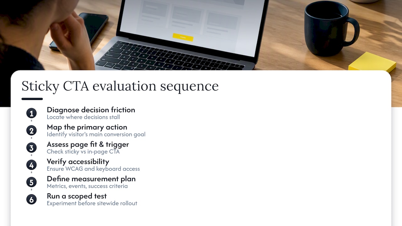
Inside a homepage blueprint, we start by diagnosing where decision friction actually happens, not where a client assumes it does. Once we map the primary action a visitor should take, we check whether a sticky CTA fits that specific page or whether an in-page CTA already does the job. Our checklist covers page fit, trigger logic, accessibility compliance, and a measurement plan before we ever recommend adding one. Small, scoped tests come before any sitewide rollout.
6. Integrating sticky CTAs with overall conversion strategy and homepage messaging
A sticky CTA only works as well as the message it’s attached to. If your homepage buries its value proposition below three scrolls of generic copy, a persistent button just gets visitors to the same unclear next step faster. The fix starts upstream: clarify what you do, who you do it for, and why that’s worth acting on, before deciding where the button sits.
Think of the sticky CTA as the closing argument, not the pitch itself. It should restate the same promise the hero section made, using the same words, so a visitor who scrolled past the top never feels like they landed on a different page. Mismatched copy between the hero and the sticky bar is one of the most common reasons a technically sound implementation still underperforms.
This also means your CTA strategy can’t live in isolation from proof placement. A sticky “Get a quote” button works harder when the page above it has already shown a specific outcome, a price range, or a concrete process step. The button is the last domino, not the whole chain.
7. Publisher perspective: when a sticky CTA is the wrong tool
Sticky CTAs earn their place on long, decision-heavy pages, not on a short orientation page where the main button is already in view. Duplicating a visible CTA just adds clutter. On thinner pages, a well-placed in-page link or a contextual banner does the job without the extra engineering. We weigh page length and decision complexity before recommending sticky over simpler alternatives.
— Fadly
Hockworks: homepage blueprint and free website review
We built our homepage blueprint process around exactly this kind of decision: where does a sticky CTA help, and where does the real problem sit further up the page, in the positioning itself? Our free website review gives you an outside look at where your current homepage loses visitors before they ever reach a button.
What you get from a full engagement:
- A decision-friction diagnosis specific to your homepage, not a generic checklist.
- A prioritized list of changes, including where a sticky CTA genuinely fits your page length and offer.
- A video walkthrough you can hand straight to a developer or designer.
Check current pricing for the homepage blueprint or start with the free review to see where your site stands.
FAQ
What are good examples of CTAs?
Strong examples pair a concrete action with a specific outcome, such as “Get a quote in minutes” or “Book your free review,” rather than a generic “Submit” or “Learn more.” The best ones match the visitor’s stage, so a cart page gets “Checkout” while an early-stage service page gets “See how it works.”
Can you give me some examples of call to action messages?
Effective messages include “Start my free review,” “Add to cart, $48,” and “Talk to us” paired with a calendar icon. Each works because it names the action and, where possible, the immediate result, rather than asking for a vague commitment.
What is a soft CTA?
A soft CTA asks for a low-commitment action, like “Get one idea a week” for a newsletter or “See how it works” instead of “Buy now.” It suits visitors who aren’t ready to purchase but are open to a smaller next step.
What makes a strong CTA?
A strong CTA states a specific action and outcome, uses a legible button with sufficient color contrast, and avoids competing with other visible buttons on the same screen. Reassurance microcopy, such as “No card required,” often reduces hesitation further.
Sources
- C43: Using CSS scroll-padding to un-obscure content | WAI | W3C
- Homepage Sticky CTA A/B Test: +20.4% Conversion Rate – CONVERTIBLES
- A sticky CTA: guaranteed conversion uplift? - Online Dialogue
Recommended

About the author
Thiam Hock is the founder of Hockworks, a Singapore-based digital advisory focused on clarity-driven websites. He works with service businesses to design websites that guide decisions, filter the right enquiries and reduce hesitation. His perspective centres on positioning, differentiation and how visitors actually make decisions in competitive markets.
Read more about Thiam Hock →