Make Your Service Mobile Homepage Convert: Replace Hero and CTA in Hours
Convert mobile visitors into right-fit enquiries. Replace vague hero copy and CTA, surface one proof point, and trim forms to 3–5 fields, then implement...

The fastest way to raise enquiry quality on mobile is to replace vague hero copy and a generic call to action with a one-line, customer-framed value statement and a specific next step. This guide focuses on messaging, proof placement, calls to action, and form design, not technical performance tuning. We’ve built this playbook from the common patterns we see auditing service-business homepages, and every step below is something you can act on this week.
TL;DR:
- Baymard found that 70% of visitors scroll nearly the entire mobile homepage, while 42% of pages risk setting incorrect expectations.
- Collect 8 to 12 phrases from prospects, identify two or three recurring problems, then use their language in the hero and a specific CTA.
- Keep the first form to 3 to 5 fields, match each keyboard to its input, and offer a phone option for visitors who prefer talking.
- Place a 10 to 15 word testimonial beside the CTA, and avoid carousels or pop-ups that push the action out of view.
- Measure mobile visits against qualified enquiries, then track how many enquiries become sales; test wording for 2 to 4 weeks when traffic permits.
Table of Contents
- Quick Mobile Homepage Checklist You Can Run Today
- How to Craft Mobile-First Positioning That Attracts Right-Fit Enquiries
- Designing CTAs and Enquiry Forms That Reduce Mobile Friction
- Where to Place Proof for Maximum Trust on a Small Screen
- Simple Experiments and Metrics to Prove Your Changes Worked
- Page Load Speed Optimization Specific to Mobile Devices
- Responsive Design Techniques and Breakpoints for Different Screen Sizes
- Touch Target Size and Spacing Guidelines to Enhance Tap Accuracy
- Navigation Design Optimized for Mobile Interactions
- Font Size and Readability Best Practices for Mobile Screens
- Image Optimization and Modern Formats to Reduce Mobile Data Usage
- What We See Most Often on Mobile Homepages That Convert Poorly
- If You Want Help: Our Homepage Blueprint
- FAQ
- Sources
Quick Mobile Homepage Checklist You Can Run Today
Most mobile homepages fail for the same handful of reasons. Before you touch anything else, scroll your own site on a phone and check it against this list.
Baymard Institute’s mobile usability research found that 70% of visitors scroll nearly the entire mobile homepage to figure out what a site offers, and 42% of mobile homepages risk setting the wrong expectations in that process. That means your entire mobile homepage, not just the hero, is doing interpretation work. Every section either clarifies or confuses.
- Hero statement: one line that names who you serve and the outcome you deliver, with no jargon.
- Supporting lines: one to three short statements under the hero that narrow scope, so visitors don’t have to guess whether you handle their specific situation.
- Primary CTA: describes exactly what happens after the tap, not a generic prompt.
- Visible service paths: your main offerings named on the page, not hidden behind a single “Services” link.
- Alternate actions: a phone number or “save for later” option for visitors who aren’t ready to fill out a form.
- Minimal forms: short enough to complete one-handed, with the right keyboard triggered for each field.
- Proof near the CTA: one testimonial line or a small row of logos, not a wall of praise.
- Clear sightlines: no promotional banner or sticky header crowding the button you actually want tapped.
Pro Tip: Print your homepage as a long screenshot and mark every element that doesn’t directly answer “what do you do” or “what happens if I tap this.” Cut or rewrite everything you marked.
How to Craft Mobile-First Positioning That Attracts Right-Fit Enquiries
Good mobile copy starts with your customers’ own words, not your internal pitch deck. Pull 8 to 12 phrases from recent sales calls, enquiry emails, or reviews, and look for the 2 or 3 problems that show up again and again. That repetition is your hero copy.
- Collect real language. Gather 8 to 12 phrases prospects actually used to describe their problem, not how you’d describe your service.
- Write one value proposition. Combine who you serve, the specific outcome you deliver, and a timeframe or context clue, for example “We help clinic owners fill cancelled appointment slots within 48 hours.”
- Add two micro-propositions. Directly under the hero, state what you do, who it’s for, and one concrete benefit, each in a single short line.
- Replace generic CTAs. Nielsen Norman Group’s research on vague prompts found that labels like “Get started” often mislead users into unexpected flows and erode trust once the click doesn’t match the promise. Swap it for something like “Get your custom quote in two days.”
- Test with real prospects, not colleagues. Google’s work with Cxpartners across more than 200 brands found that testing messaging with real users surfaces language gaps that internal reviewers miss entirely, and some brands saw double-digit mobile conversion gains once wording matched how customers actually talk.
This process takes a few hours, not a redesign, and it’s the same method used in positioning workshops before any layout gets touched.
Designing CTAs and Enquiry Forms That Reduce Mobile Friction
A button that doesn’t say what happens next is a button people avoid. Every CTA on a mobile homepage should read like a promise you intend to keep immediately after the tap.
- Place the primary CTA in the main content flow, not buried below a slider or hidden behind a scroll.
- Use a sticky bottom CTA only when it won’t clash with your browser’s own address bar or back button on smaller phones.
- Cap your first form at 3 to 5 fields. Ask for a phone or email plus one qualifying question, then follow up for the rest.
- Match input types to the field. A phone field should trigger a numeric keypad, an email field should trigger the @ symbol, and every field should allow autofill. Google’s own research on mobile keyboard input found that unnecessary fields and mismatched keyboards are a steady source of abandoned forms.
- Offer a second path. A click-to-call number or a short booking link helps visitors who’d rather talk than type, or who want to finish on a laptop later.
- Give information before asking for contact details. Don’t gate your pricing range or process overview behind a multi-step quiz; let visitors understand what they’re signing up for first.
Pro Tip: Fill out your own enquiry form on a phone, timing yourself. If it takes more than 90 seconds, you’ve already lost the visitors who were comparing you to a competitor in another tab.
Where to Place Proof for Maximum Trust on a Small Screen
Mobile screens punish anything oversized, including social proof. The goal is reassurance without pushing your call to action further down the page.
- Use short testimonial snippets, 10 to 15 words, placed right beside or just under the CTA.
- Show one compact row of client logos or badges rather than a full testimonial carousel.
- Add a one or two-line “what to expect” snapshot for higher-consideration services, so visitors know the shape of the process before they commit.
- Skip full-screen trust overlays or mandatory pop-ups that block the CTA on load.
A single focused proof point beats a wall of praise: Think with Google’s user-testing work across large-scale mobile studies has found that simplifying what visitors see and clarifying outcomes correlates with meaningfully higher mobile completion rates. The lesson carries directly to proof: one sharp line of evidence near your button does more work than ten scattered through the page.
Simple Experiments and Metrics to Prove Your Changes Worked
Don’t chase form fills. A homepage that generates more submissions but worse-fit leads has made your sales process harder, not easier.
- Track mobile visits to qualified enquiries, not raw submissions, as your primary metric.
- Watch enquiry-to-win rate as the secondary signal that tells you whether lead quality actually improved.
- A/B test headline and CTA wording when you have the traffic to support it, running each variant for 2 to 4 weeks to get a stable read.
- Use session recordings and form-drop funnels to spot exactly where visitors hesitate or abandon.
- If you can’t run a formal A/B test, compare clean before-and-after time periods and track downstream signals like appointment show rate or closed revenue, since those tell you more than a vanity spike in submissions ever will.
Page Load Speed Optimization Specific to Mobile Devices
Speed earns the right for your messaging to be read at all. If the hero never renders before someone bounces, the sharpest value proposition in the world does nothing. Google’s own mobile site speed guidance ties faster load times directly to conversion, and research cited in that playbook found that shaving even one second off load time improved conversion by as much as 27% in one study.
For a service-business homepage, the practical priorities are straightforward: compress or lazy-load anything below the fold, defer non-essential scripts like chat widgets until after the main content paints, and avoid auto-playing video in the hero, which is one of the heaviest and least necessary elements on a mobile landing view. A hero built from a single optimized image and clean text will almost always outperform one built from a video background, both in load time and in how quickly a visitor can read your offer.
Treat speed as a gate, not a goal. Once your homepage loads fast enough that visitors actually see your hero message, the messaging and proof-placement work above is what determines whether they enquire.
Responsive Design Techniques and Breakpoints for Different Screen Sizes
Responsive design means your layout rearranges itself cleanly across screen widths rather than shrinking a desktop design down to an illegible size. Most frameworks use a handful of standard breakpoints, roughly 480px for small phones, 768px for tablets, and 1024px and above for desktop, but the exact pixel values matter less than what happens at each one.
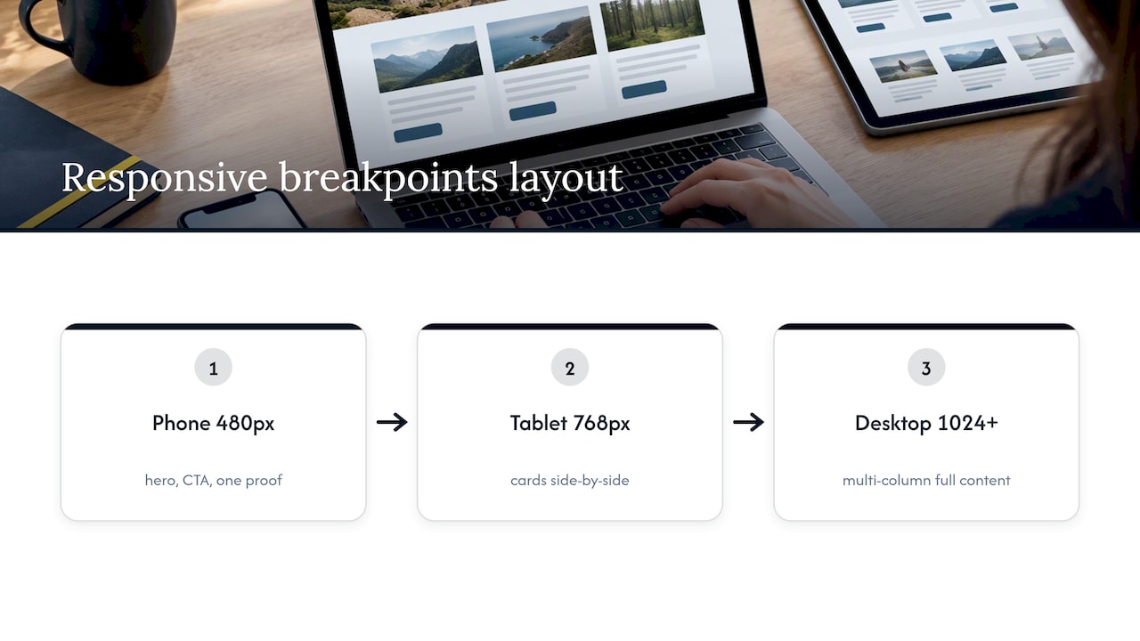
At the smallest breakpoint, your hero statement, primary CTA, and one proof point should still be visible without horizontal scrolling or text that wraps awkwardly mid-phrase. Multi-column layouts should collapse to a single column well before text starts shrinking to compensate for cramped space. Side-by-side service cards that work on a tablet often need to stack vertically on a phone, with the most relevant one surfaced first rather than left to alphabetical or arbitrary order.
Test your actual breakpoints on real devices, not just a browser’s resize tool, since phone browsers render fonts and spacing slightly differently than desktop emulators suggest. A homepage that looks fine in a narrowed browser window can still misbehave on an actual handset, particularly around sticky headers and form fields that push content off-screen when a keyboard opens.
Touch Target Size and Spacing Guidelines to Enhance Tap Accuracy
A button that’s technically clickable but hard to hit accurately costs you enquiries just as surely as confusing copy does. The widely used baseline for tappable elements is a minimum of 44 by 44 pixels, a size that comfortably accommodates the average adult fingertip without forcing a second attempt.
Spacing matters as much as size. Two CTAs or links placed too close together invite mis-taps, especially in a navigation bar or a row of service links. Give at least 8 pixels of breathing room between adjacent tappable elements, more if they sit in a dense area like a footer or a multi-link menu.
Pay particular attention to form elements. A checkbox or radio button that’s sized for a mouse cursor is often frustrating on a touchscreen; enlarge the tappable area around small controls even if the visible icon stays compact. The same applies to close buttons on any modal or overlay: make them generously sized, since a visitor who can’t easily dismiss a pop-up is a visitor who leaves the page instead.
Navigation Design Optimized for Mobile Interactions
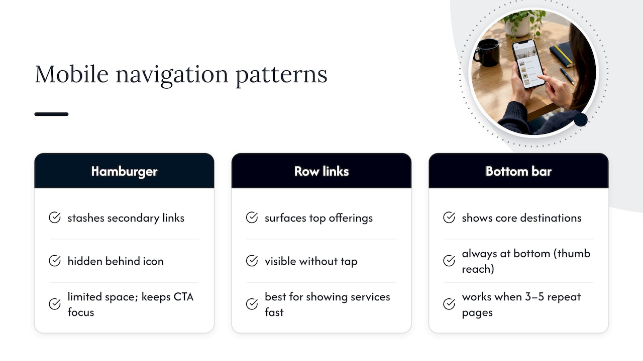
Mobile navigation has to do more with less space, which is why the hamburger menu became the default pattern for stashing secondary links. Used well, it keeps the homepage focused on your value proposition and CTA rather than a desktop-style menu bar competing for attention at the top of the screen.
The risk, and one we flagged earlier in the checklist, is collapsing everything behind that icon, including the service paths visitors need to confirm you handle their situation. Baymard’s research on homepage and category navigation recommends surfacing a meaningful share of your top-level offerings directly on the page rather than forcing every visitor to open a menu to find out what you do. A short row of service links or icons beneath the hero, visible without any tap, does more for conversion than a tidier-looking but emptier top section.
Bottom navigation bars, common in apps and increasingly on mobile websites, work well when you have 3 to 5 core destinations a visitor returns to repeatedly, such as Services, Pricing, Contact, and About. They keep the most important actions within thumb reach at the bottom of the screen rather than requiring a stretch to the top. Whichever pattern you choose, the test is simple: can a new visitor tell what you offer and how to take the next step within the first few seconds, without opening a menu at all?
Font Size and Readability Best Practices for Mobile Screens
Text that’s comfortable to read on a laptop can be genuinely straining on a phone held at arm’s length on a train. A practical floor for mobile body text is 16 pixels, with headlines scaled up clearly enough to establish hierarchy at a glance, since visitors are scanning, not reading line by line.
Line length matters almost as much as size. On a narrow mobile viewport, keep lines short enough that the eye doesn’t lose its place jumping back to the start, and use generous line spacing, roughly 1.4 to 1.6 times the font size, so paragraphs don’t feel cramped. Avoid long unbroken paragraphs entirely; break your value proposition, micro-propositions, and proof points into short, separate lines rather than a dense block.
Contrast deserves equal attention. Light gray text on a white background might look sleek on a high-end monitor, but it disappears in direct sunlight on a phone screen, which is where a meaningful share of your mobile visitors will actually be reading it. Stick to dark text on light backgrounds or the reverse, with enough contrast that the words are legible even in poor lighting, and reserve your boldest, highest-contrast styling for the one line you most need someone to read: your hero statement and your CTA.
Image Optimization and Modern Formats to Reduce Mobile Data Usage
Images are usually the heaviest assets on a homepage, and mobile visitors are more likely to be on a constrained connection or a limited data plan than desktop users browsing on office Wi-Fi. Every image you add to the hero or proof section should earn its place and its file size.
Modern formats like WebP and AVIF typically produce noticeably smaller files than JPEG or PNG at equivalent visual quality, and most current browsers support WebP without issue. Pair the format choice with proper compression and resizing. There’s no reason to serve a 3,000-pixel-wide photo to a phone screen that displays it at 400 pixels; serve an image sized for the device requesting it, using responsive image techniques that let the browser pick the right version.
Lazy-loading anything below the fold, your logo row, case snapshots, and footer images, keeps the initial page weight focused on what visitors need immediately: your hero message and CTA. A client logo strip or a testimonial headshot doesn’t need to load before someone has even seen your value proposition. Treat every image as a trade-off between the trust or clarity it adds and the load time it costs, and cut anything decorative that isn’t earning its weight.
What We See Most Often on Mobile Homepages That Convert Poorly
Across the homepages we review, three problems repeat constantly: a CTA that doesn’t say what happens next, hero copy that leads with features instead of outcomes, and an initial form long enough to feel like an application. None of these require a redesign to fix.
In one case, swapping a generic “Learn More” button for a CTA naming the specific next step, alongside trimming the first form down to two fields, was enough to noticeably shift the quality of enquiries coming through, without changing the layout underneath.
— Fadly
If You Want Help: Our Homepage Blueprint
We build conversion-focused homepage blueprints specifically for service businesses that already get mobile traffic but aren’t getting enough right-fit enquiries from it. Rather than a full redesign, we diagnose where visitors hesitate and hand you a structured plan covering messaging, proof placement, and calls to action, with a video walkthrough so your team can implement it directly.
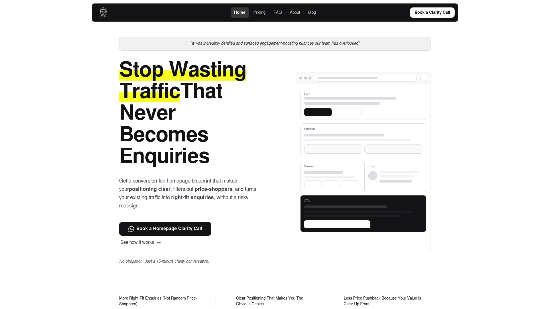
If you want a second pair of eyes on your current homepage first, our free website review is a low-commitment place to start. When you’re ready to move forward, the Homepage blueprint is priced at 480 SGD one-off, or you can book a short call to talk through fit before committing to anything.
FAQ
What is mobile homepage optimization for a service business?
It means shaping your homepage’s messaging, proof placement, calls to action, and form design specifically to convert mobile visitors into qualified enquiries. The focus is on what visitors read and tap, not on backend code or server configuration.
What’s the single biggest mistake on mobile homepages?
A vague call to action paired with feature-led hero copy is the most common issue we see. Research on CTA wording found that generic prompts like get started can mislead visitors into flows that don’t match their expectations, which damages trust before the conversation even begins.
How long should a mobile enquiry form be?
Keep your first form to 3 to 5 fields, typically a phone number or email address plus one qualifying question. Longer forms can follow once a lead is warm, but a long initial form on mobile discourages visitors who are still deciding whether to commit.
How much does a Hockworks homepage blueprint cost?
The Homepage blueprint is 480 SGD one-off, with a Homepage plus About option at 680 SGD one-off and a Full site option at 2000 SGD one-off. A Monthly Retainer for ongoing optimization starts from 1200 SGD per month.
How do I know if my homepage changes actually worked?
Track mobile visits against qualified enquiries, not raw form submissions, since a spike in form fills can still mean worse-fit leads. Run A/B tests for 2 to 4 weeks where traffic allows, or compare clean before-and-after periods using enquiry-to-win rate as your real signal of success.
Sources
- Mobile homepage usability — Baymard research
- Get started stops users — Nielsen Norman Group
- Lessons from user testing with 200+ brands — Think with Google
- Handling compounding in mobile keyboard input — Google research
Recommended

About the author
Thiam Hock is the founder of Hockworks, a Singapore-based digital advisory focused on clarity-driven websites. He works with service businesses to design websites that guide decisions, filter the right enquiries and reduce hesitation. His perspective centres on positioning, differentiation and how visitors actually make decisions in competitive markets.
Read more about Thiam Hock →