Messaging Hierarchy: 7 Step Homepage Blueprint for Service Teams
A practical, eyetracking informed 7 step homepage blueprint for service marketing teams. Prioritize clarity over cleverness to get more right fit enquiries.
Messaging hierarchy is the deliberate order and visual weighting of messages so the reader sees the single most important thing first: the primary value and the next action. The rule that matters most is clarity over cleverness. If you only change one thing on a page today, make the headline say exactly what you do and for whom, before you worry about how clever it sounds.
TL;DR:
- Most visitors scan web pages using headings and visual cues, making proper hierarchy critical for guiding attention and reducing bounce rates.
- Frontloading the main value in headlines with bold, large text above the fold helps visitors quickly understand your offer and increases engagement.
- Testing through heatmaps, scroll tracking, and A/B experiments ensures the intended message receives priority attention and filters out the wrong-fit traffic.
- For quick-hit formats like billboards and direct mail, focus on a single clear idea with minimal words to capture attention instantly.
- Consistency across all channels in prioritizing core messages ensures a seamless buyer journey and prevents confusion or disjointed communication.
Table of Contents
- What Messaging Hierarchy Is and Why It Matters
- Core Principles of an Effective Messaging Hierarchy
- Step-by-Step: Building a Messaging Hierarchy for Your Homepage
- Short-Form Contexts: Billboards, Direct Mail, and Other Low-Attention Placements
- Common Mistakes and Quick Fixes
- How a Messaging-Focused Homepage Blueprint Changes Enquiry Quality
- The Role of Audience Segmentation in Shaping Messaging Hierarchy
- Tools and Methods to Test and Optimize Messaging Hierarchy
- Integrating Messaging Hierarchy Across Multi-Channel Marketing
- Why Explicit Conclusions Beat Cleverness Under Load
- How We Can Help: A Free Review and a Homepage Blueprint
- FAQ
- Sources
What Messaging Hierarchy Is and Why It Matters
Messaging hierarchy works on two layers at once. The verbal layer decides which message comes first, second, and third. The visual layer decides which message looks biggest, boldest, and closest to where eyes land first. Together they tell a reader what matters most without forcing them to work for it.
This isn’t guesswork. Eyetracking research shows that people scan web pages rather than read them start to finish, which means headings, chunking, and visual signifiers do most of the work of guiding attention. Nielsen Norman Group has documented a specific scanning behavior called the “layer-cake pattern”, where readers skip down through headings like layers in a cake, stopping only when a subheading signals relevance.
When the hierarchy is right, readers find what they need faster and retain more of it. When it’s wrong, they bounce, or worse, they stay and misread your offer. For a business page, that gap shows up as:
- Visitors who leave without understanding what you actually do.
- Enquiries from people who were never a good fit in the first place.
- Longer sales conversations spent re-explaining what the homepage should have made obvious.
Core Principles of an Effective Messaging Hierarchy
A good hierarchy follows a small set of rules, applied consistently rather than cleverly.
Put your primary value and your primary call to action above the fold. Attention concentrates in the top screenfuls of any page, so whatever sits there carries the most weight whether you planned it or not.
Frontload the important words. A headline that opens with the benefit beats one that opens with a setup. Readers scanning headings use the first few words to decide whether to keep reading, and headlines that frontload meaning reduce the effort required to understand them.
Use typographic and proximity cues to create visual weight. Size, boldness, whitespace, and position all tell a reader what to look at first, often before they’ve read a single word.
Chunk content under descriptive subheadings. Subheadings function as a page’s mini-structure: a scanning reader should be able to tell what a section contains without reading the paragraph underneath it.
- State the one thing you want a visitor to understand before anything else.
- Make that statement the largest, highest, boldest text on the page.
- Support it with one clarifying line, not three competing ones.
- Write subheadings as statements, not vague labels.
Pro Tip: Write your headline last. Draft the page first, then compress its single biggest point into one sentence a stranger could repeat back to you.
Step-by-Step: Building a Messaging Hierarchy for Your Homepage
Rewriting a homepage around a clear hierarchy is mechanical once you know the order of operations.
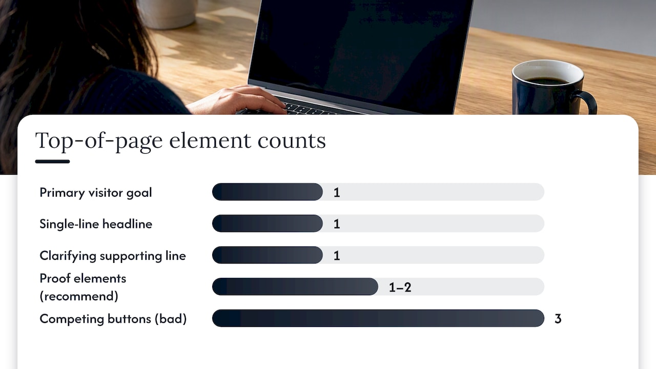
- Pick one primary visitor goal. Not three, not five: the one outcome most of your traffic actually wants.
- Write a single-line headline that states that value plainly, with no wordplay standing between the reader and the meaning.
- Add one clarifying supporting line underneath it that narrows who it’s for and sets expectations for what happens next.
- Place one or two proof elements directly below that line: a credential, a result, a recognizable client type. Save deeper detail for lower sections.
- Make your call to action visually dominant and singular above the fold. One primary action beats three competing buttons.
- Run a three-second glance test: show the top of the page to someone unfamiliar with it and ask what you do and what they’d click.
- A/B test headline variants and track enquiry quality, not just click volume, since a headline that attracts more clicks but worse-fit leads has made things worse.
Pro Tip: Ask your glance-test subject to repeat your value proposition in their own words. If they paraphrase it accurately, your hierarchy is working.
This sequence mirrors how eyetracking studies describe scanning patterns: readers move through headings and chunks looking for the one that answers their question, then slow down to read once they find it.
Short-Form Contexts: Billboards, Direct Mail, and Other Low-Attention Placements
Messaging hierarchy tightens considerably when dwell time drops to seconds instead of minutes. A reader glancing at a billboard from a moving car, or flipping past a direct mail piece on their way to the recycling bin, has no patience for a second idea competing with the first.
In these formats, keep the headline short and built around a single idea. A crowded message with two competing thoughts usually registers as none. Favor one visual focus per piece rather than several smaller elements asking for equal attention.
- Keep headlines to a handful of words wherever the format allows it.
- Communicate one idea, not a summary of everything you offer.
- Use brand-only messaging when recognition is the goal, and benefit-first copy when the goal is a specific action.
- Treat the visual as part of the message, not decoration around it.
The same layer-cake logic applies here in miniature: the first thing someone perceives has to be the most important thing, because there often isn’t a second look.
Common Mistakes and Quick Fixes
Most broken hierarchies share the same handful of problems.
- Trying to say everything at once. A homepage that lists five value propositions with equal weight gives the reader none. Fix: pick the single message that matters most to your actual buyer and let everything else support it.
- A clever but vague headline. Wordplay that requires a second read to decode loses visitors before they get the joke. Fix: frontload the concrete benefit and save the wit for a secondary line, if at all.
- Too many calls to action above the fold. When “Book a Call,” “Learn More,” and “Get a Quote” all compete for the same pixel space, none of them wins. Fix: consolidate to one primary action and test it.
- Weak, generic subheadings. Labels like “Our Approach” tell a scanning reader nothing. Fix: write subheadings as specific statements that let someone find the answer without reading the paragraph.
How a Messaging-Focused Homepage Blueprint Changes Enquiry Quality
When we work through a homepage, we start by identifying exactly where decision friction creeps in: the point where a visitor who should enquire instead hesitates or leaves. That diagnosis usually traces back to a broken hierarchy rather than bad design.
A typical blueprint reorders the page around one headline that states the core value, a clarifying subhead that narrows fit, proof placed where scanning readers will actually see it, and a single prioritized call to action. The goal isn’t a prettier homepage: it’s a page that filters for the right visitors before they ever pick up the phone, which tends to mean more right-fit enquiries and fewer conversations that start with a price objection.
The Role of Audience Segmentation in Shaping Messaging Hierarchy
A hierarchy that works for one audience can misfire for another, because priority is relative to what the reader already knows and wants. A buyer evaluating three vendors reads a homepage differently than someone who found you through a referral and already trusts you.
Segmentation shapes which message earns the top spot. A page serving both enterprise buyers and small business owners has to choose: either build separate landing paths with their own hierarchies, or find the one message broad enough to matter to both without diluting it for either. Trying to serve every segment with a single generic headline is often where the “say everything at once” mistake originates.
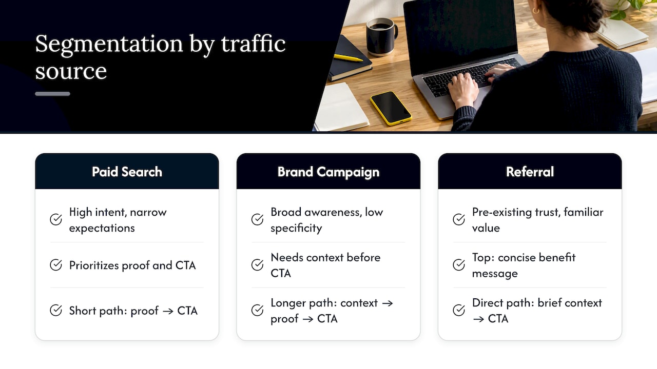
Practical segmentation starts with your actual traffic sources. Paid search visitors often arrive with high intent and narrow expectations, so the hierarchy can move faster toward proof and action. Visitors from a broader brand campaign may need more context before a call to action feels earned. Reviewing where your traffic originates, and what each source already believes, tells you which message deserves the top layer for that specific path.
Tools and Methods to Test and Optimize Messaging Hierarchy
Testing a hierarchy means measuring whether the right message gets noticed first, not just whether a page converts.
Heatmaps and scroll-depth tools show whether attention actually lands where you intended, confirming or contradicting the scanning patterns the research predicts. Session recordings reveal the moments visitors hesitate, which often point to a competing message pulling focus away from the primary one.
A/B testing remains the most direct method: run two headline or layout variants and compare not just click rate but enquiry quality, since a version that generates more clicks from the wrong audience has made the page worse, not better. Five-second and three-second usability tests, where a new viewer glances at a page and reports back what they understood, catch hierarchy problems that analytics alone miss.
Some teams now use AI-assisted platforms to speed up early-stage message discovery and variant generation before human testing narrows the field; tools like Betterpresence are built for this kind of automated groundwork. Whatever tools you use, the measure that matters is whether the intended primary message is the one visitors actually report back.
Integrating Messaging Hierarchy Across Multi-Channel Marketing
A hierarchy built for a homepage doesn’t automatically survive the trip to an email subject line, a paid ad, or a trade show banner. Each channel compresses or expands the same core message differently, and consistency matters more than uniformity.
The discipline worth keeping across channels is the order of priority, not the exact wording. If your homepage leads with speed of service, your ad copy, email subject lines, and even a printed card at a conference should lead with the same priority, even if the phrasing adapts to the format. A concise digital business card, the kind of tool Ecocard provides for in-person networking, works on the same principle as a homepage headline: one clear message, one clear next step, delivered in the handful of seconds someone actually looks at it.
Breaking that consistency confuses the buyer’s journey. Someone who clicks an ad promising fast turnaround shouldn’t land on a homepage leading with a different value entirely. Treat your messaging hierarchy as a single decision tree that gets adapted per channel, not rewritten from scratch each time.
Why Explicit Conclusions Beat Cleverness Under Load
Readers making a decision under time pressure don’t reward subtlety. An explicit conclusion acts as a shortcut: it tells a busy visitor what to conclude instead of asking them to infer it, and that shortcut gets rewarded with trust rather than seen as condescending.
My practical rule for any brief: state the main point as a declarative sentence a reader could repeat verbatim, before a single clever word gets added.
— Fadly
How We Can Help: A Free Review and a Homepage Blueprint
If you run an established service business that already gets traffic but not enough right-fit enquiries, a messaging hierarchy problem is usually hiding in plain sight on your homepage.
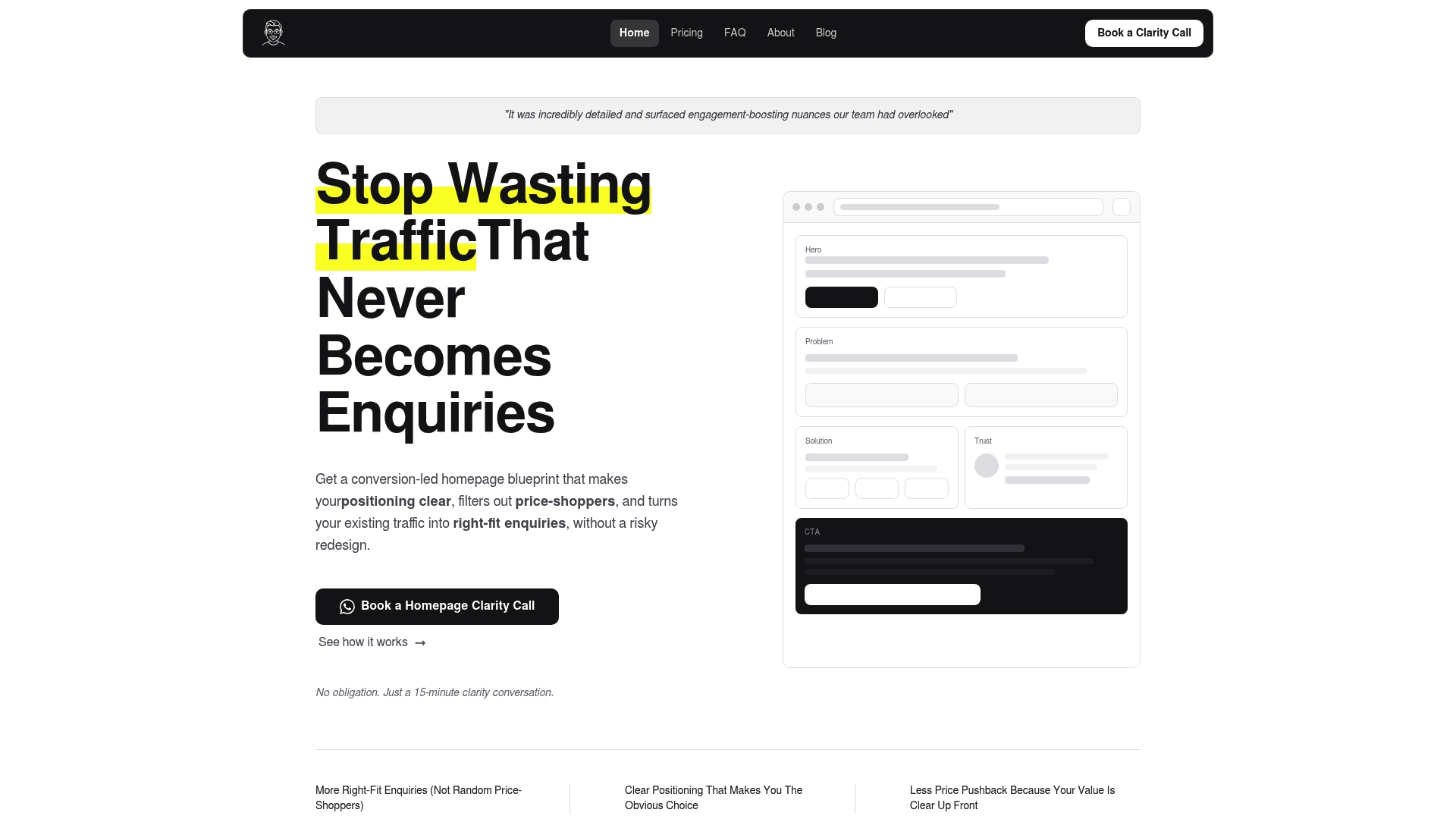
We offer a Free Website Review that gives you a short diagnostic of where your current page confuses or loses visitors, plus the priorities we’d tackle first. From there, our Homepage Blueprint lays out the headline, proof placement, and call-to-action structure needed to turn more of your traffic into the enquiries worth having.
FAQ
What is messaging hierarchy?
Messaging hierarchy is the deliberate ordering and visual weighting of your messages so the most important one reaches the reader first. It combines word choice, placement, and design elements like size and proximity to guide attention toward a primary value and a primary action.
What is hierarchy in communication?
Hierarchy in communication refers to ranking information by importance so the recipient processes the most critical point first, rather than treating every detail as equally weighted. In written and visual communication, this ranking is expressed through structure, such as headings, order, and emphasis, not just word choice.
What are five common types of messages?
Common message types in business communication include informational, persuasive, instructional, transactional, and relational messages, though definitions vary across communication frameworks. In a messaging hierarchy context, what matters more than the type is which single message earns top priority for a given reader.
What are the different types of hierarchy?
In content and design, hierarchy typically refers to visual hierarchy (size, color, and placement guiding the eye) and information hierarchy (the logical order in which ideas are presented). Scanning research also describes specific reading patterns, including the layer-cake pattern, where structure determines which hierarchy a reader actually follows.
How much does a homepage messaging rewrite cost?
Pricing depends on scope: a Homepage blueprint is 480 SGD one-off, a Homepage plus About package is 680 SGD one-off, and a Full site blueprint is 2000 SGD one-off. A Monthly Retainer for ongoing optimization starts from 1200 SGD per month.
Sources
- The Layer-Cake Pattern of Scanning Content on the Web - NN/G
- How people read on the web (eyetracking evidence) - ISO
Recommended

About the author
Thiam Hock is the founder of Hockworks, a Singapore-based digital advisory focused on clarity-driven websites. He works with service businesses to design websites that guide decisions, filter the right enquiries and reduce hesitation. His perspective centres on positioning, differentiation and how visitors actually make decisions in competitive markets.
Read more about Thiam Hock →