When every appointment slot matters, the wrong enquiry is expensive.
Your website isn't helping the right patients decide. Over time, your team get stretched, ad costs climb, and the right patients end up choosing someone else. There's a fix for that.
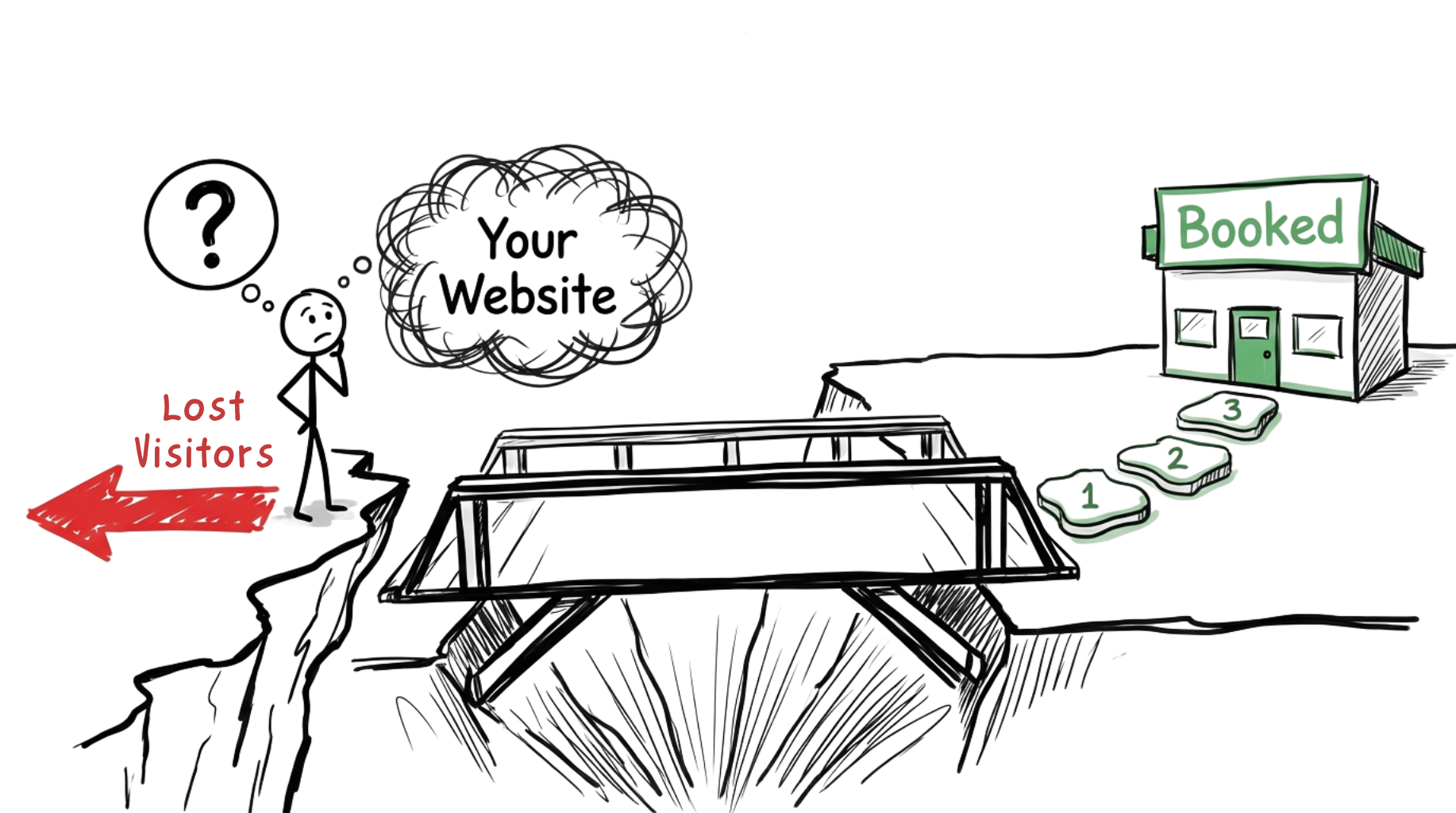
Two problems that cost clinics more than they realise
Problem 1: Inconsistent conversions despite traffic
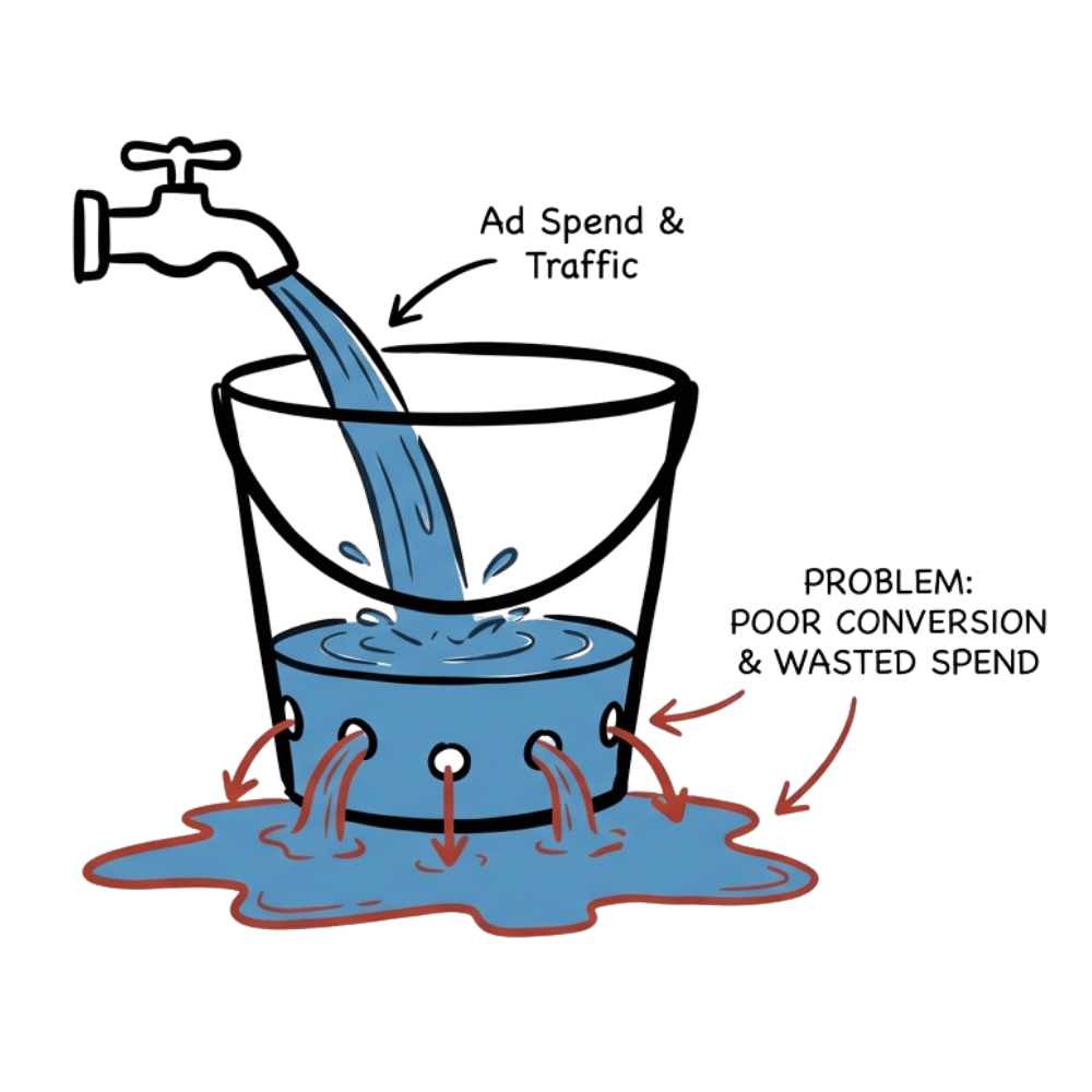
- You're paying for ads. People land on your site. But most leave without booking.
- When bookings stay inconsistent, schedules feel unpredictable, teams hesitate to hire, and you wonder if the issue is pricing, positioning, or something deeper.
- Doubling your conversion rate is as good as cutting patient acquisition cost in half: same traffic, twice the bookings.
- Most clinics invest thousands in ads and SEO. Yet the page where patients decide (your website) gets the least scrutiny. A small lift in clarity can mean more right patients booking without increasing spend.
You don't need more visitors. You need more of the right visitors to take the next step.
Problem 2: Wrong-fit enquiries that waste your team's time
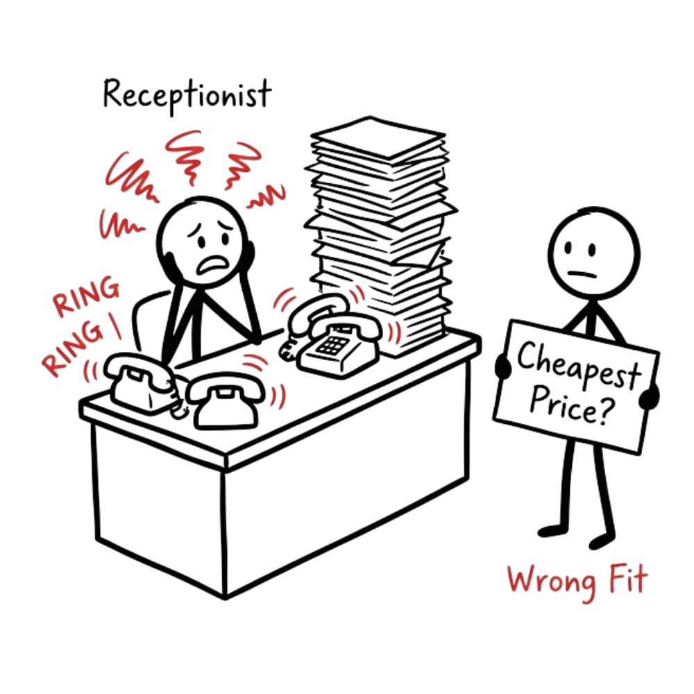
- Your front desk answers the same basic questions over and over from people who aren't ready or aren't a fit.
- Price shoppers who compare five clinics and choose the cheapest.
- People enquiring about services you don't even offer.
- Patients who book but no-show because they were never serious.
- Over time it changes the tone of your clinic: front desk staff become guarded, and the right patients can feel the tension too.
Every wrong-fit enquiry costs time, energy, and focus that should go to real patients.
A good clinic shouldn't lose the right patients because its website didn't communicate clearly.
What most clinics try first
When bookings are low or enquiry quality drops, the instinct is to fix what's visible. But the real issue is usually invisible.
These changes treat the symptom. The actual problem is friction: the doubts, confusion, and uncertainty your website creates at the exact moment a patient is trying to decide.
Your website has one job: help patients decide.
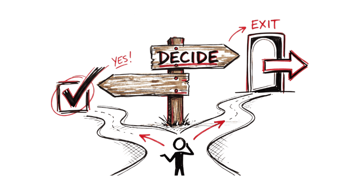
When someone lands on your clinic's website, they're not ready to book. They're trying to answer a basic question: "Should I move forward here, or move on?"
Your website either helps them answer that clearly, or forces them to figure it out on their own. When the answer isn't clear, they take the safest path: they leave. And you never know they were ready. You just see another bounce in your analytics.
This is what friction looks like. Not slow loading times or ugly design. It's internal doubt. "Is this clinic right for someone like me?" "Will I be pushed into an expensive treatment plan?" "What actually happens if I book?" "Is this just a sales consultation?"
These doubts stack up. A patient can read your entire website, nod along, and still not book. Not because they're uninterested. Because nothing on the page resolved their uncertainty.
At the same time, patients who are not a fit reach out anyway, because your website didn't filter them out early enough. The result: your team spends time on conversations that go nowhere.
What friction looks like on clinic websites
Whether you're in dental, fertility, aesthetic, or specialist practice, these patterns show up everywhere. Here's the difference between a website that creates doubt and one that creates clarity.
Creates doubt
- Book Consultation
- We'll contact you
Creates clarity
- Book a 15-min call
- Our coordinator calls within 24 hours
- We confirm suitability first
- No obligation
- No treatment commitment
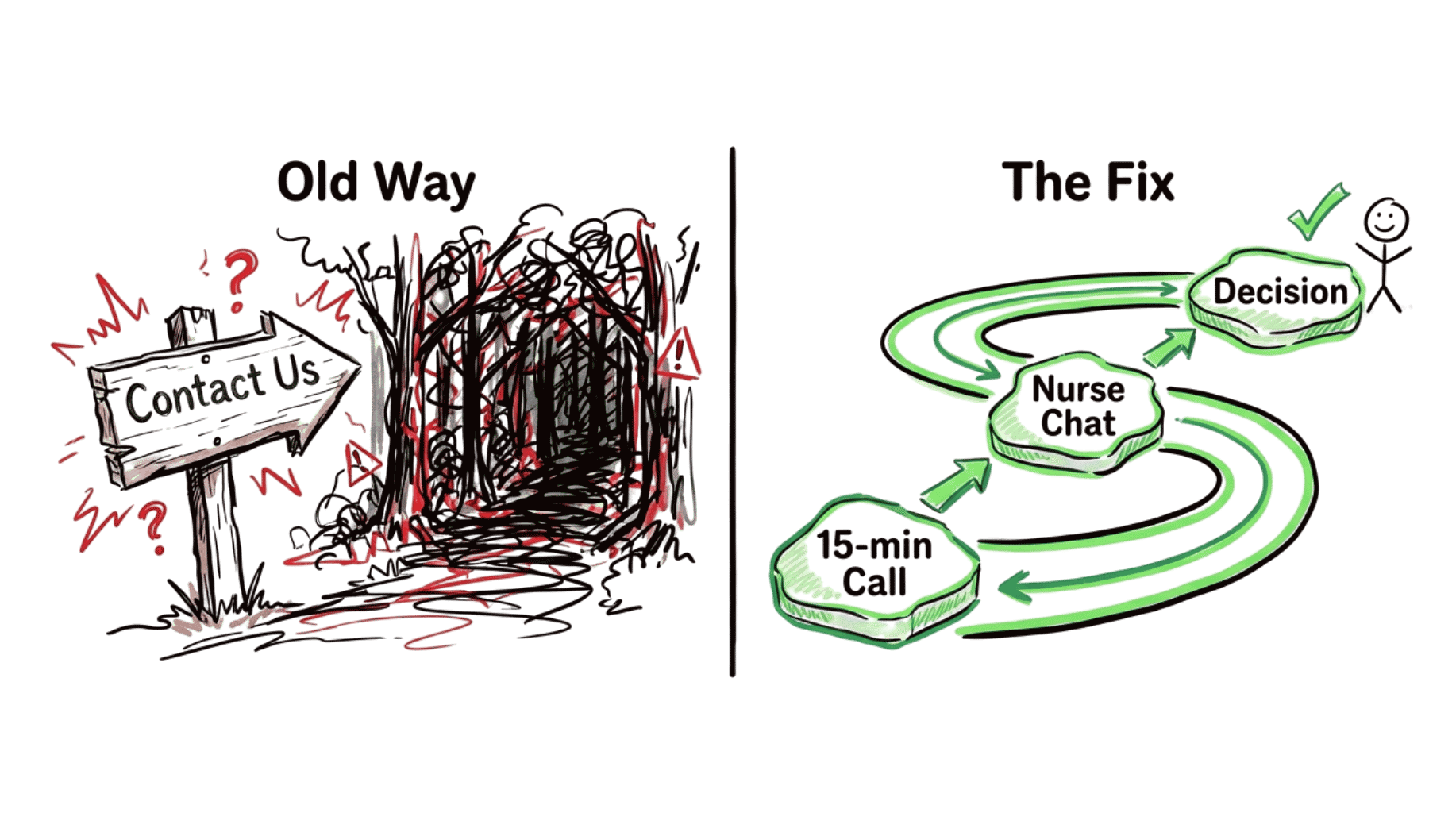
What this looks like in a specialty clinic
A clinic was already getting enquiries. But many patients hesitated. Some never booked. Others booked and cancelled. The front desk kept answering the same anxious questions: "What happens at the first visit?" "Will I be pushed into treatment?" "Is this just a sales consult?" Nothing was technically wrong with the website. On paper, everything looked fine. In reality, patients were hesitating at the final step — and choosing someone else who felt clearer. It simply didn't resolve those doubts.
When the first step was clarified (who it was for, what would happen, whether there was obligation), something subtle changed.
- Fewer uncertain enquiries.
- Fewer time-wasters.
- More patients booking because they felt safe enough to move forward.
Before
"Contact us for more information"
After
"Book a 15-minute call. Our coordinator explains the process and answers your questions. No obligation."
Before
"We offer the latest dental implant technology"
After
"Not sure if implants are right for you? Here's how we help you decide, starting with a short suitability check. No push for a full treatment plan."
Before
"Book a consultation. We'll get back to you."
After
"Book a 15-min call. We'll explain what the first visit involves, whether there's a consultation fee, and if this is the right fit. No package pitch."
None of these require a redesign. They require understanding where patients hesitate and removing that friction before they reach your front desk.
A different starting point
- Layouts and colour schemes
- Stock photos of smiling patients
- SEO tactics or ad strategies
- Feature lists or service catalogues
Where does friction exist on your website, and where are filters missing?
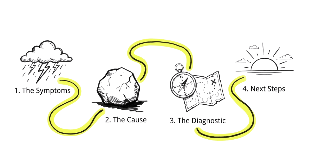
Friction is anything that makes a patient hesitate: unclear next steps, vague messaging, missing answers to obvious questions. Filters are what help wrong-fit patients self-select out early, so your team only talks to people who are genuinely a fit. When both are handled well, the right patients book with confidence, and the wrong ones leave quietly.
What I look for in the first 5 minutes
- Does the website help a patient answer "Is this for someone like me?"
- Are the obvious questions answered before they have to ask?
- Does it explain what happens after booking, step by step?
- Is pricing or fee structure addressed honestly enough to filter price shoppers?
- Is the first visit experience described so patients know what to expect?
- Does it explain who the treatment is (and isn't) for?
How I can help your clinic

Thiam Hock
Founder, HockWorks
Decision-focused website methodology: your website has one job (help visitors decide). Applied across service industries.
I spent more than a decade in finance and consulting, where I learned to think in systems: what's actually driving the outcome, versus what just looks like it should. That lens is why I don't start with design or traffic. I start with the moment your patient decides.
After watching too many businesses, including clinics, spend on websites that looked good but didn't convert. The issue was rarely the build. It was that the site didn't resolve the doubts that make people hesitate or the wrong people reach out.
Today I help clinic owners get clarity on that moment: where friction is costing you the right patients, and where missing filters are costing you time on the wrong ones.
Which is why I focus on the one moment that matters most: when a patient decides whether to book or walk away. Get that right, and the rest follows.
My approach draws from proven communication principles used across thousands of businesses - adapted specifically for clinics where patients need clarity and reassurance before they book.
StoryBrand (Donald Miller)
Clarify your message so patients understand exactly what you do, how it helps them, and what to do next. Used by over 10,000 businesses.
Endless Customers (Marcus Sheridan)
Answer the real questions your patients are already asking (about cost, process, recovery, comparisons) so they trust you before they ever walk in.
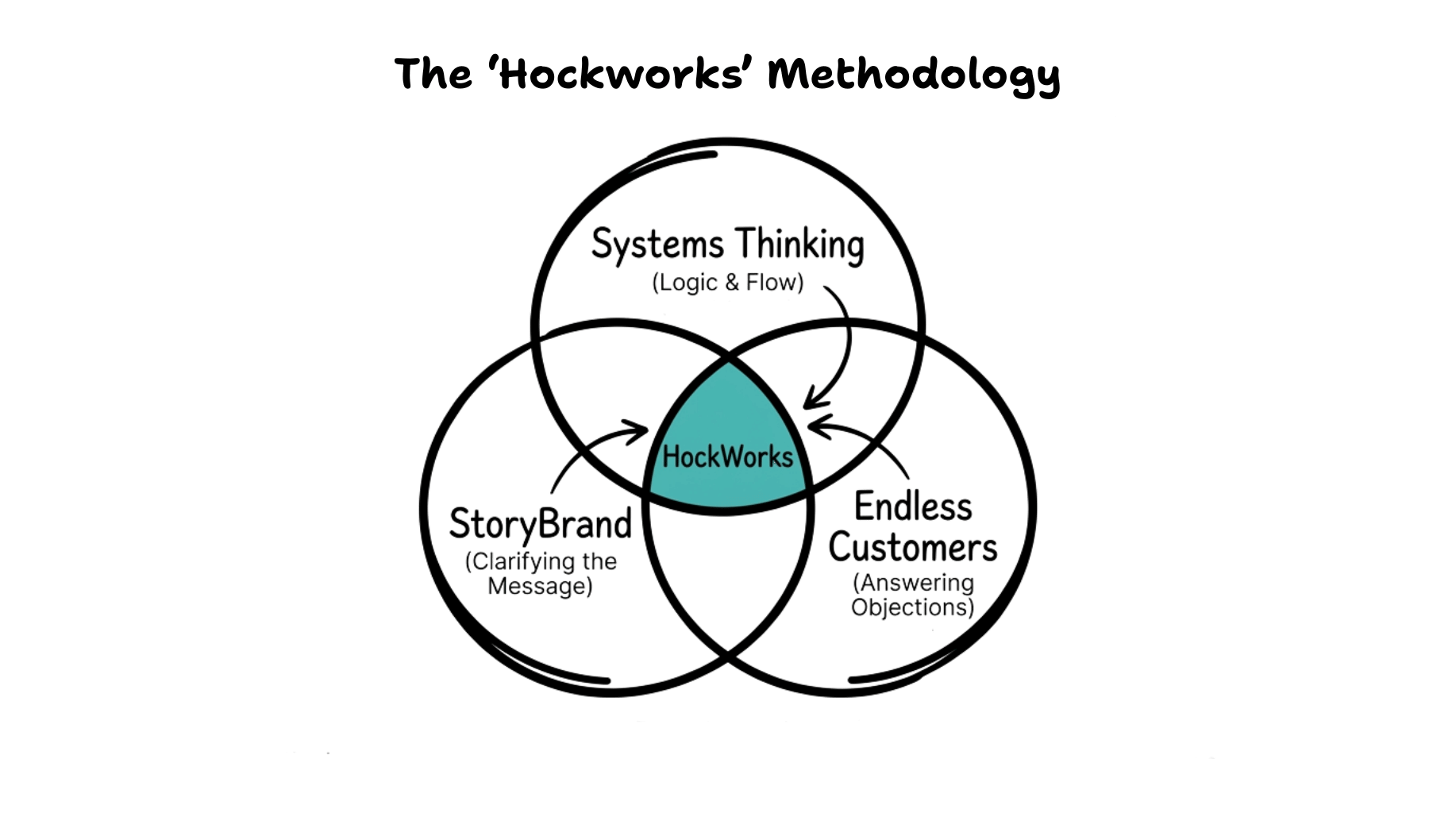
I apply these principles specifically to clinics: dental, fertility, aesthetic, and specialist practices where patients need clarity, reassurance, and trust before they'll book.
Three simple steps
Book a short conversation
We look at your clinic's website together. I'll identify where patients are likely hesitating and where wrong-fit enquiries are slipping through.
Get a clear picture of what's happening
You'll understand the specific friction points and missing filters on your site, not guesses or theories, and whether they're worth addressing now.
Decide your next step with clarity
Fix it yourself with a clearer map. Work with someone else with better criteria. Or explore working together. All three are valid outcomes.
The call is designed so you leave with something useful even if you never work with me.
- Stop guessing why the right patients don't book. You'll know where the real blockages are instead of throwing fixes at the wall.
- Spend less time on wrong-fit enquiries. When your site does more of the filtering, your team can focus on patients who are ready.
- Decide with confidence. You'll know whether it's worth investing in changes now, later, or with someone else, so you're not stuck in "we'll think about it".
This conversation is useful if...
- If you're already investing in ads or getting enquiries, but bookings feel inconsistent
- You suspect patients hesitate on your website, but can't pinpoint why
- You're getting enquiries from people who are never going to be your patients
- You want clarity before committing time or money to a website project
This may not be a good fit if...
- You're mainly looking for the cheapest website provider
- You want guaranteed results without diagnosis
- You're looking for a quick redesign without thinking through what's actually causing the problem
- Your clinic is brand new and doesn't have traffic yet
Being upfront here saves us both time.
See where your patients hesitate

In 15 minutes, you'll know where friction exists on your website and what's worth fixing. If you don't get that clarity, we stop there. No pitch, no obligation.
Book a free 15-min callYou don't need to decide anything today. This is simply a way to see if there's a clearer path forward for your clinic's website.